Modern Grotesque Body

Sharp Opinion + One More
Creates crisp high-hierarchy contrast beneath Sharp Opinion headlines across menus, websites and labels.
Inspect One More specimenDisclosure: MakerFileHub may earn a commission from qualifying purchases via paid links on this page. How our links work.
Heavy upright slab
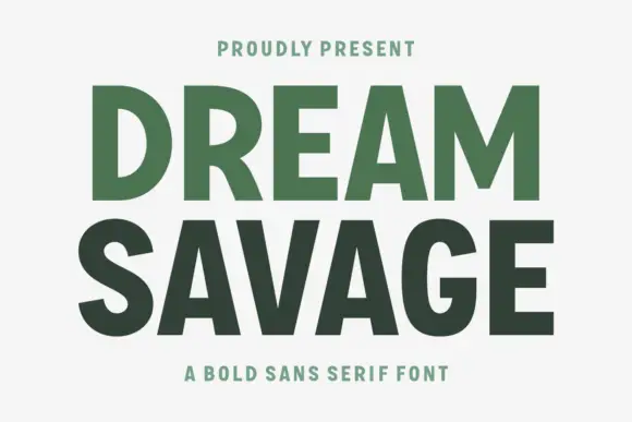
Sharp Opinion is a heavy upright slab in white on a mottled olive ground: wide capitals with tall rounded bowls, blunt slab feet and a firm even stroke, set in two lines with a small tracked line above and a plain line beneath.
Paid link
Get this fontProject & layout blueprintsAt-a-glance maker compatibility
Sturdy stroke walls and open counters weed cleanly on adhesive vinyl, HTV apparel film, and cut cardstock.
Visual anatomy & craft review
The two words are stacked and the drawing is a heavy upright slab: the bowls are tall and rounded, the feet are blunt and square, and the stroke is even, so the block reads as a modern editorial slab rather than as a period face. That construction sets a moderate size floor, because the round bowls close first, and the plate sets the words large enough that the feet can be judged. The mottled olive ground is staging that gives the white a soft edge, and the tracked line above and the plain line beneath are product copy. Because the letters are wide and heavy, the face suits a cover line, a poster and a label, and the blunt feet mean it holds at small sizes better than a face with fine serifs, which makes it usable for a heading in a document as well as for display.
Slab, heavy, upright, bold
Two-font hierarchy recipes
Tested contrast partners — pairing Sharp Opinion with grounded secondary typography.
Sharp Opinion + One More
Creates crisp high-hierarchy contrast beneath Sharp Opinion headlines across menus, websites and labels.
Inspect One More specimen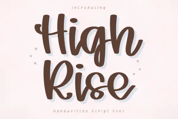
Sharp Opinion + High Rise
Adds a warm human signature touch for 1-to-3-word callouts without competing against structured serif capitals.
Inspect High Rise specimenPractical applications
Concrete hierarchy, scale and production guidance tailored to Sharp Opinion’s stroke geometry.
A heavy slab gives a journal a cover with weight, and the blunt feet hold at newsstand distance. An opinion journal should carry weight.
Hierarchy & layout recipe
Set the title at 90 mm cap height across 195 mm, the issue in a 9 pt sans, and the date at 8 pt. Print one ink on a matte stock and keep 22 mm margins.
Pre-production check
Check the title at 90 mm, where a round bowl can fill; proof it. Confirm the 8 pt date survives lamination and that the title clears the trim.
A heavy slab names an argument, and the wide letters fill a poster with two words. Two words are enough for a debate poster.
Hierarchy & layout recipe
A2 poster: the night at 100 mm cap height, the speakers in a 22 mm slab, and the venue at 11 mm. Keep 28 mm margins and print two colours on a light stock.
Pre-production check
Check the A2 at five metres, where a blunt foot can read as a print fault; keep the feet even. Confirm the 11 mm venue reads at two metres and that the speakers' names have priority.
A heavy slab gives a bag a shelf presence, and the blunt feet survive a small die with a dark ink. A bag needs a shelf presence at arm's length.
Hierarchy & layout recipe
Print a 70 by 100 mm label: the roaster at 14 pt, the blend at 9 pt, and the weight at 7.5 pt. Keep 5 mm inside the die and keep the smallest counter above 1.5 mm.
Pre-production check
Check the 14 pt name on a bag, where a round bowl can close; keep it open. Confirm the 7.5 pt weight reads at arm's length and that the label takes a fold.
Technical & licence verification
Confirm included OTF/TTF/WOFF formats, full glyph tables and licence coverage on the live store page before batch production.
Closest visual alternatives
Matched across letterform anatomy, stroke behaviour and craft applications.
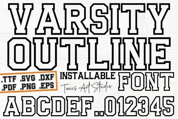
Outlined athletic capitals with clipped corners and broad squared feet
Ab Varsity Outline is an athletic slab in which the capitals keep a white interior inside a heavy dark outline, the outer corners clip away, the feet square off broad and the O and R turn polygonal, so a team name reads as a stitched patch letter without the fill.
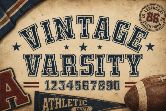
Weathered outlined college capitals
Vintage Varsity is a weathered collegiate display in navy outline on aged tan paper: arched capitals, double-line letterforms and a printed wear that leaves speckles across the strokes.
Ideas for this font
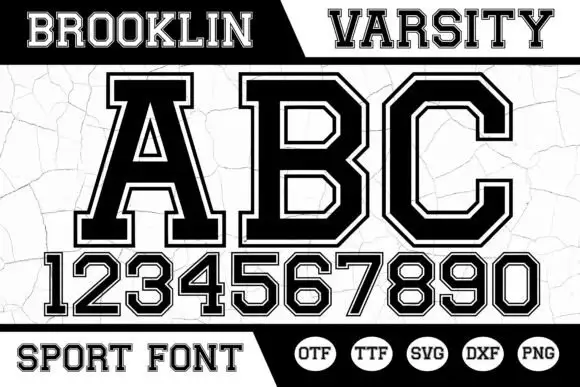
Angular bordered athletic capitals with matched numerals
Brooklin Varsity is an athletic display face: heavy capitals with sharp inner corners, a white inline border running inside each stroke, and a full numeral set drawn to the same construction.
Ideas for this font
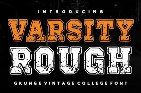
Distressed varsity college slab
Varsity Rough is a distressed varsity slab in orange and white on a dark street: heavy square serifs, wide flat-topped caps, chipped edges and a speckled fill, presented in two inks on two lines with a tracked credit beneath, so the pair reads as a worn college jersey print.
Ideas for this font
Same independent foundry
Allow optional Google Analytics to measure visits and catalogue actions. Your search words and notes are not included. Privacy & storage