Modern Grotesque Body

Ab Varsity Outline + Mansory
Creates crisp high-hierarchy contrast beneath Ab Varsity Outline headlines across menus, websites and labels.
Inspect Mansory specimenDisclosure: MakerFileHub may earn a commission from qualifying purchases via paid links on this page. How our links work.
Outlined athletic capitals with clipped corners and broad squared feet
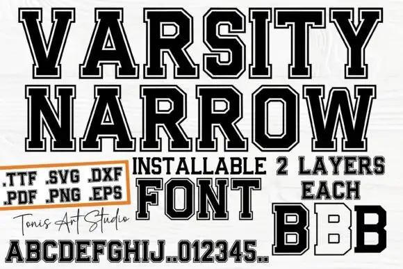
Ab Varsity Outline is an athletic slab in which the capitals keep a white interior inside a heavy dark outline, the outer corners clip away, the feet square off broad and the O and R turn polygonal, so a team name reads as a stitched patch letter without the fill.
Paid link
Get this fontProject & layout blueprintsAt-a-glance maker compatibility
Sturdy stroke walls and open counters weed cleanly on adhesive vinyl, HTV apparel film, and cut cardstock.
Visual anatomy & craft review
The O closes as a polygon rather than an oval, the R keeps a straight leg, the feet widen into squared slabs and every outer corner takes a small clip that breaks the silhouette. The open interior is the character: it lets a garment colour show through the letter while the outline holds the shape, which is why the sample sets a large title over an alphabet and numeral row. Because the outline carries the whole form, the face needs 30 mm of letter height before the inner edge survives, and a two-colour print should keep the outline heavier than the gap. The alphabet and numerals under the title in the sample are specimens of the same face, not separate artwork.
Outlined · Athletic · Clipped
Two-font hierarchy recipes
Tested contrast partners — pairing Ab Varsity Outline with grounded secondary typography.
Ab Varsity Outline + Mansory
Creates crisp high-hierarchy contrast beneath Ab Varsity Outline headlines across menus, websites and labels.
Inspect Mansory specimen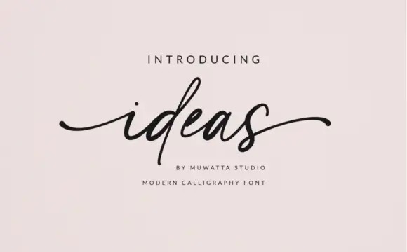
Ab Varsity Outline + Ideas
Adds a warm human signature touch for 1-to-3-word callouts without competing against structured serif capitals.
Inspect Ideas specimenPractical applications
Concrete hierarchy, scale and production guidance tailored to Ab Varsity Outline’s stroke geometry.
The outline leaves the shirt colour inside the letters, and the clipped corners keep the blocks crisp at 85 mm across a printed chest in one ink. A light shirt shows the outline best.
Hierarchy & layout recipe
Print a 300 mm chest print: set the name at 85 mm in capitals, keep the outline at 4 mm minimum, keep every interior gap at 6 mm, and keep 40 mm of clear shirt beneath for the number.
Pre-production check
An outline thinner than 3 mm breaks up on a shirt weave; check the film at full size and thicken the outline rather than shrinking the interior.
The athletic blocks read across a field, and the open interior keeps the letter legible at 60 mm on a printed banner in two inks. The open interior also saves ink on a long run.
Hierarchy & layout recipe
Print a 1200 by 600 mm banner: set the name at 60 mm, keep every clip at 4 mm, keep 30 mm of margin from the welded edge, and set the league line in a 16 mm condensed caps beneath.
Pre-production check
A banner hem sewn across an outline cuts the letter in half; check the template and keep all type 25 mm inside the hem line.
The outlined caps give a club label its edge, and the polygonal bowls stay open at 22 pt on a 60 mm panel in two colours. Two colours keep the outline and the fill from muddying.
Hierarchy & layout recipe
Print a 60 by 40 mm label: set the club name at 22 pt in capitals, keep the outline at 1.5 mm, keep the interior at 2 mm, and set the division in a 6 pt caps beneath with 4 mm of clear ground.
Pre-production check
Two outlines set closer than 3 mm merge into a single dark shape; check the proof and open the letter spacing to 3 mm.
Technical & licence verification
Confirm included OTF/TTF/WOFF formats, full glyph tables and licence coverage on the live store page before batch production.
Closest visual alternatives
Matched across letterform anatomy, stroke behaviour and craft applications.
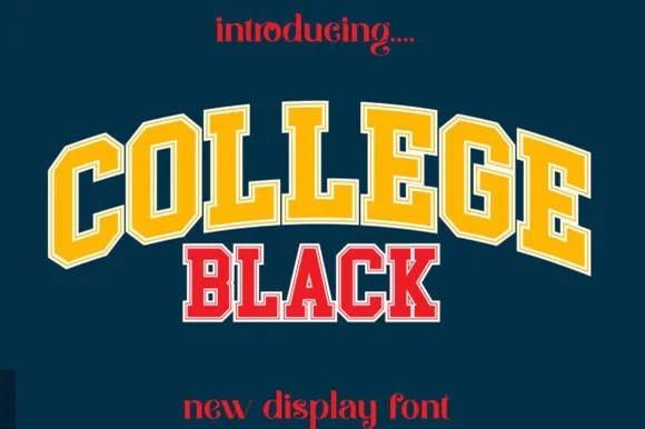
Double-outlined varsity jersey display
College Black pairs heavy collegiate slab capitals with a built-in athletic border framing, where wide stable letterforms and generous counter openings keep arched headlines crisp on jerseys, pennants and party backdrops.
Ideas for this font
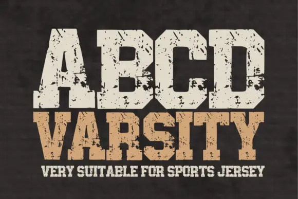
Wide athletic capitals with chamfered bowls and rough chips through the slabs
Abcd Varsity is a wide athletic slab in which the flat ends sit close, the bowls chamfer at the corners and irregular chips eat through the heavy slabs, so a two-word title reads as a weathered collegiate board.
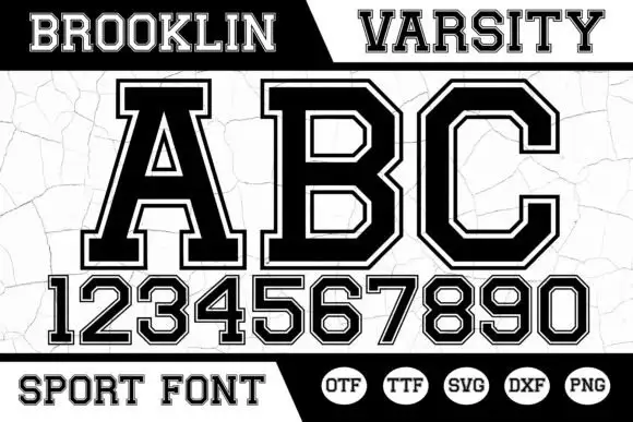
Angular bordered athletic capitals with matched numerals
Brooklin Varsity is an athletic display face: heavy capitals with sharp inner corners, a white inline border running inside each stroke, and a full numeral set drawn to the same construction.
Ideas for this font
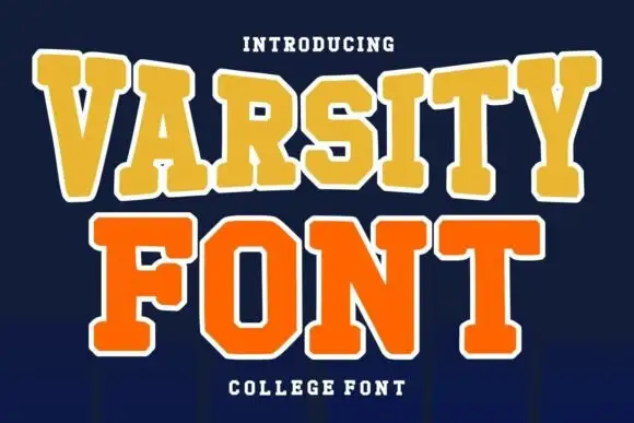
Layered college slab with arched line
Varsity Font is a layered college slab in gold and orange on navy: wide square serifs, flat-topped caps, a heavy white outline on both lines and a slight arch across the top, so the pair reads as an embroidered team patch rather than a plain headline.
Ideas for this font
Same independent foundry
Allow optional Google Analytics to measure visits and catalogue actions. Your search words and notes are not included. Privacy & storage