Modern Grotesque Body

Scholar Typeface + Furion
Creates crisp high-hierarchy contrast beneath Scholar Typeface headlines across menus, websites and labels.
Inspect Furion specimenDisclosure: MakerFileHub may earn a commission from qualifying purchases via paid links on this page. How our links work.
Editorial serif with a sharp italic
Scholar Typeface is an editorial serif in black and red on white: a high-contrast roman with sharp bracketed serifs for the first word and a matching italic in red for the second, with a credit line in small capitals beneath.
Paid link
Get this fontProject & layout blueprintsAt-a-glance maker compatibility
Sturdy stroke walls and open counters weed cleanly on adhesive vinyl, HTV apparel film, and cut cardstock.
Visual anatomy & craft review
Two words are set one above the other and the pair is a roman and its italic: the roman carries a strong contrast, sharp serifs that taper to points, a narrow A and a tall x-height, while the italic leans with a single-storey a, a rounded e and a swash on the final letter that lifts above the line. The italic is printed in red against the black roman, which separates the two styles without a change of size, and the two words overlap slightly so the pair reads as one composition rather than two lines. A small capital credit line runs along the foot in two blocks with a thin rule between them, and a caption in italic sits at the head. The ground is a plain white sheet. Scholar Typeface is a serif for editorial covers, academic titles, packaging and branding, and it needs a large size and a clean page; it works as text as well as display, though the hairlines want good paper.
Editorial, contrasted, sharp
Two-font hierarchy recipes
Tested contrast partners — pairing Scholar Typeface with grounded secondary typography.
Scholar Typeface + Furion
Creates crisp high-hierarchy contrast beneath Scholar Typeface headlines across menus, websites and labels.
Inspect Furion specimen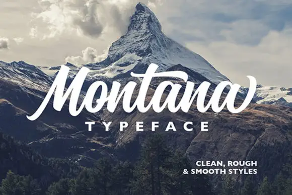
Scholar Typeface + Montana
Adds a warm human signature touch for 1-to-3-word callouts without competing against structured serif capitals.
Inspect Montana specimenPractical applications
Concrete hierarchy, scale and production guidance tailored to Scholar Typeface’s stroke geometry.
A contrasted serif with a sharp italic gives a scholarly book a modern cover, and the two styles can split a title from a subtitle.
Hierarchy & layout recipe
Print a 152 by 229 mm cover: set the title at 44 pt in the roman, set the subtitle at 26 pt in the italic with 18 mm of clear ground, and hold 14 mm of margin on all four sides.
Pre-production check
The italic swash can collide with the roman above; set the pair in position and proof one cover before printing.
A serif with a proper italic handles a title and a quotation on one page without a second family, which is what a course booklet needs.
Hierarchy & layout recipe
Print an A4 page at 210 by 297 mm: set the heading at 30 pt in the roman, set the quotation at 11 pt in the italic with 12 mm of clear ground, and hold 22 mm of margin on all four sides.
Pre-production check
Hairline joins at eleven points can look grey; run one page on the actual paper stock before the print run.
An editorial serif gives a publisher's imprint a considered look, and the italic can carry the city or the year on a narrow label.
Hierarchy & layout recipe
Print a 70 by 30 mm label: set the imprint at 9 pt in the roman, set the year at 8 pt in the italic with 4 mm of clear ground, and hold 3 mm of margin on all four sides.
Pre-production check
Two styles on a small label can look crowded; print one label and check the gaps before the order.
Technical & licence verification
Confirm included OTF/TTF/WOFF formats, full glyph tables and licence coverage on the live store page before batch production.
Closest visual alternatives
Matched across letterform anatomy, stroke behaviour and craft applications.
Narrow typewriter face
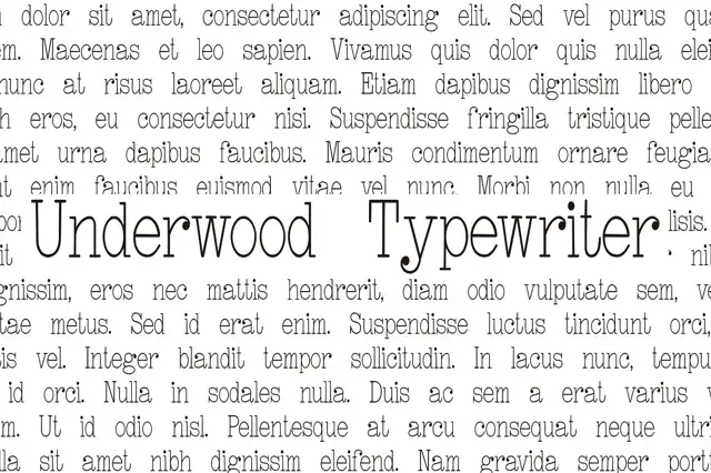
Underwood Typewriter is a narrow typewriter face in black on a page of typeset Latin: the face appears as one line set inside a justified block of grey body text, so it is judged against running copy rather than alone, and the letters are thin with uneven contours and slab feet.
Ideas for this font
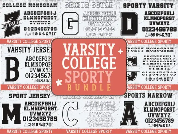
Nine-cut varsity college bundle
Varsity College Sporty is a nine-cut bundle of college slabs shown as a specimen grid: solid, inline, outline, shadowed and narrow cuts, each panel carrying an alphabet and a digit set, with a centred title card in salmon, so the sheet reads as a team-kit library rather than one typeface.
Ideas for this font
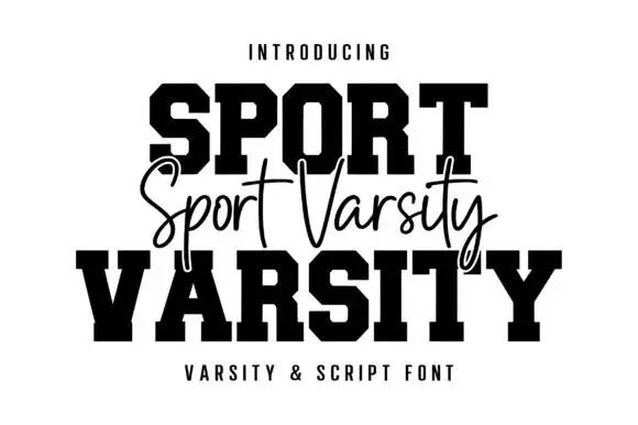
Varsity blocks with fine script
Sport Varsity pairs heavy clipped-corner slab capitals with a much thinner flowing script, where the block O has a tall angular counter and the script crosses the centre with long t bars, a deep y loop and a sweeping entry stroke from the left.
Ideas for this font

Layered varsity capitals with an inline stroke and outlined numbers
Varsity Spirit is a layered varsity capital alphabet in which each letter carries an inline stroke, a keyline and a set of matching numerals, so a team name reads as the appliqué on a college jacket.
Ideas for this font
Same independent foundry
Allow optional Google Analytics to measure visits and catalogue actions. Your search words and notes are not included. Privacy & storage