Modern Grotesque Body

Lemon and Orange + Kohilo
Creates crisp high-hierarchy contrast beneath Lemon and Orange headlines across menus, websites and labels.
Inspect Kohilo specimenDisclosure: MakerFileHub may earn a commission from qualifying purchases via paid links on this page. How our links work.
Rounded retro serif with loops
Lemon and Orange is a heavy rounded serif in cream on orange: fat stems with curled terminals, a looping O whose stroke escapes the bowl, a drawn ampersand and a swash that runs under the second word, with a small illustration of fruit above and two tracked lines beneath.
Paid link
Get this fontProject & layout blueprintsAt-a-glance maker compatibility
Sturdy stroke walls and open counters weed cleanly on adhesive vinyl, HTV apparel film, and cut cardstock.
Visual anatomy & craft review
The two words are stacked with an ampersand and the drawing is a rounded retro serif: the terminals curl, the O loops out of its bowl, and a swash connects the second line to the first, so the phrase reads as one drawn object. That construction is a display decision, and the plate sets it large enough that the loops read as shapes. The drawn fruit above and the two tracked lines beneath are product styling — one names the designer, the other the style — and the orange ground keeps the cream readable at a glance. Because the bowls are heavy, the face works at display sizes and on packaging, and the plate shows how a two-word title with a connective behaves at full width, which is the test a buyer actually needs.
Serif, retro, rounded, playful
Two-font hierarchy recipes
Tested contrast partners — pairing Lemon and Orange with grounded secondary typography.
Lemon and Orange + Kohilo
Creates crisp high-hierarchy contrast beneath Lemon and Orange headlines across menus, websites and labels.
Inspect Kohilo specimen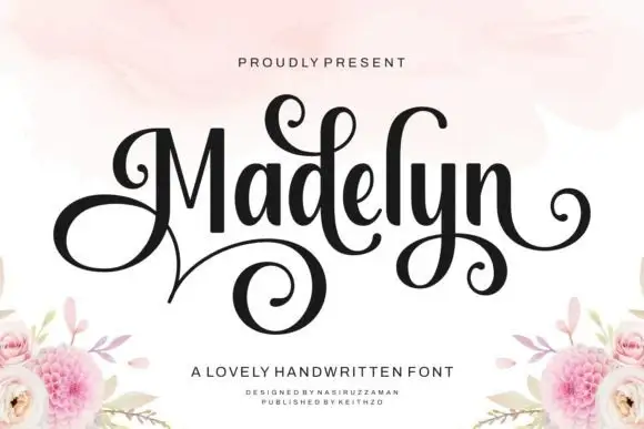
Lemon and Orange + Madelyn
Adds a warm human signature touch for 1-to-3-word callouts without competing against structured serif capitals.
Inspect Madelyn specimenPractical applications
Concrete hierarchy, scale and production guidance tailored to Lemon and Orange’s stroke geometry.
A rounded retro serif reads as a fruit label, and the thick stems hold on a small pack where a thin script would fill with fibre.
Hierarchy & layout recipe
Print a 65 by 90 mm label: the brand at 16 pt, the flavour at 8 pt, and the volume at 6 pt. Keep 5 mm inside the die and print two colours on a white stock.
Pre-production check
Check the 16 pt brand on a curved bottle, where the loops can overcrowd; keep the entry above 3 mm. Confirm the 6 pt volume reads on the shelf and that the label holds in a cooler.
A retro serif reads as a neighbourhood counter, and the heavy strokes hold on a board that shoppers read from across a market aisle.
Hierarchy & layout recipe
Paint a 900 by 400 mm board: the bar at 100 mm cap height, the menu at 26 mm, and the prices at 22 mm. Keep 25 mm margins and paint two colours on a light board.
Pre-production check
Check the board at four metres, where the swash can merge with the menu line; keep 20 mm clear. Confirm the 22 mm prices read at two metres and that the paint holds outdoors.
A rounded retro face sets a party in a warm voice, and the loops give the greeting a single gesture without extra decoration.
Hierarchy & layout recipe
A6 card: the greeting at 26 pt, the details at 9 pt, and the date at 8 pt. Keep 14 mm margins, print two colours on a cream card and check the swash against the trim.
Pre-production check
Check the 26 pt greeting at home-print resolution, where a curl can fill; keep the loop above 0.8 mm. Confirm the 9 pt details keep a 4.5:1 contrast and that the card folds flat.
Technical & licence verification
Confirm included OTF/TTF/WOFF formats, full glyph tables and licence coverage on the live store page before batch production.
Closest visual alternatives
Matched across letterform anatomy, stroke behaviour and craft applications.
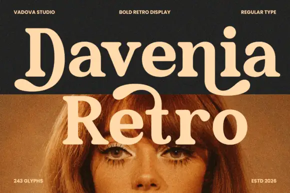
Heavy soft serif lettering with a broad D tail and hooked n ending
Davenia Retro sets a bold serif with high-waisted bowls, a round shoulder and a D that opens into a swash, so a two-word title looks like a printed poster from the early seventies.
Ideas for this font
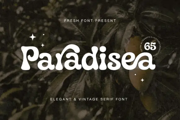
Soft heavy serif with curled entries
Paradisea is a soft heavy serif in cream over dark foliage: fat stems with round terminals, curled entries on the P and the d and a high waist, set as one word with two tracked notes above and beneath and a round badge at the right naming the alternates.
Ideas for this font
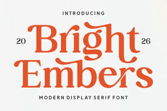
Substantial serif with wavy upper bars and curled lower terminals
Bright Embers is a substantial serif in which the bowls stay broad, the stems hold firm, selected upper bars wave and the t and final s turn into low outward curves, so a two-row heading reads as warm editorial lettering.
Ideas for this font
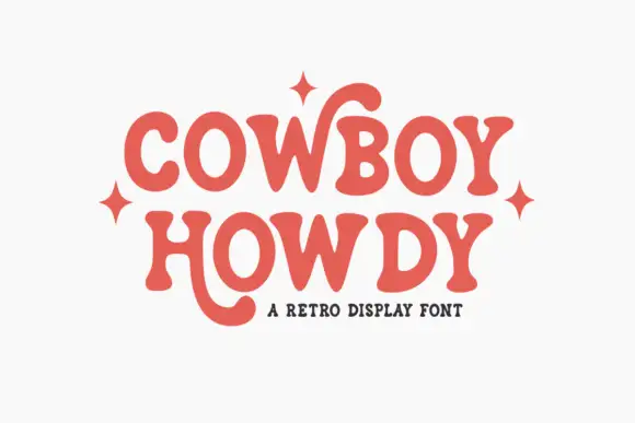
Soft retro serif with curling letter tails
Cowboy Howdy uses rounded heavy serif forms and open circular bowls in a warm coral red, where the Y of the upper word throws a tall curl high above the cap line and the H of the lower word drops a long rounded tail beneath the baseline.
Ideas for this font
Same independent foundry
Allow optional Google Analytics to measure visits and catalogue actions. Your search words and notes are not included. Privacy & storage