Neutral Sans Workhorse

Camping + Godthem
Lets Camping own the focal silhouette while handling secondary copy, sizing and subheads cleanly.
Inspect Godthem specimenDisclosure: MakerFileHub may earn a commission from qualifying purchases via paid links on this page. How our links work.
Broad capitals containing small guitar, campfire, sign, tree and caravan-like motifs
Camping sets heavy block capitals and fills their counters and gaps with small camping icons: a guitar, a campfire, a signpost, a caravan and a pine, so the word reads as a set of badges.
Paid link
Get this fontProject & layout blueprintsAt-a-glance maker compatibility
Sturdy stroke walls and open counters weed cleanly on adhesive vinyl, HTV apparel film, and cut cardstock.
Visual anatomy & craft review
CAMP fills the top line in huge white blocks, and each letter carries an icon in place of a counter; CAMPING runs underneath at a smaller size with the same treatment. The background is a dark photograph of gear, which lets the white shapes stand forward without any outline. Strokes are square and even, so the icons have flat edges to sit against, and the result reads as a cut-paper collage. Because the icons are glyphs, the face types them wherever a letter goes, which means a different word shows a different set of props, and that is worth checking before a design depends on one image.
Broad capitals containing small guitar, campfire, sign, tree and caravan-like motifs
Two-font hierarchy recipes
Tested contrast partners — pairing Camping with grounded secondary typography.
Camping + Godthem
Lets Camping own the focal silhouette while handling secondary copy, sizing and subheads cleanly.
Inspect Godthem specimen
Camping + Stanza
Grounds bold display lettering with classic typographic authority on posters, badges and apparel.
Inspect Stanza specimenPractical applications
Concrete hierarchy, scale and production guidance tailored to Camping’s stroke geometry.
The icons say what the site is without a photograph, and the heavy blocks read from a car window on the approach road into the field.
Hierarchy & layout recipe
Print a 900 by 400 mm board: set the site name at 90 mm on one row, keep 30 mm of clear ground beneath before the pitch numbers at 16 mm, and keep 34 mm of border so no icon is cut.
Pre-production check
Icons sit inside the letters; check the artwork before resizing the sign board. Order one sample before committing to the run.
The icons give a plain jar a trail character, and the block letters keep a short product name clear at small label size.
Hierarchy & layout recipe
Print a 60 by 60 mm jar label: set the product at 16 pt on one row, keep 8 mm of clear ground beneath before the weight at 5 pt, and keep 5 mm from the lettering to the label edge.
Pre-production check
Small icons merge at label size; check the printed label before the batch. Test it on the real material before the run is booked.
The cut-paper look suits a club notice board, and the icons start a conversation with children before they read the words.
Hierarchy & layout recipe
Print an A3 poster: set the club name at 80 pt across one row, keep 24 mm of clear ground beneath before the meeting time at 16 pt, and keep 26 mm of border all round the sheet.
Pre-production check
Busy interiors need contrast; check a proof at final size before the school print order. Verify the result on the printed piece, then approve.
Technical & licence verification
Confirm included OTF/TTF/WOFF formats, full glyph tables and licence coverage on the live store page before batch production.
Closest visual alternatives
Matched across letterform anatomy, stroke behaviour and craft applications.
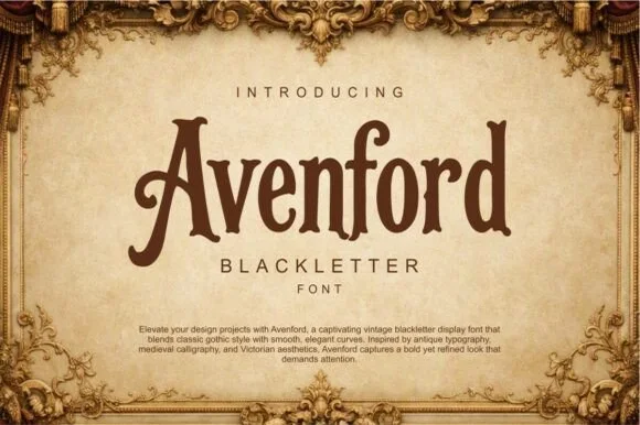
Smooth vintage Victorian blackletter
Avenford softens traditional gothic blackletter with smooth Victorian curves and open counters, presented for heritage labels, coffee roasters and book covers, where rounded arch transitions and a graceful sweeping crossbar on the A replace the spiked angles of a stricter gothic.
Ideas for this font
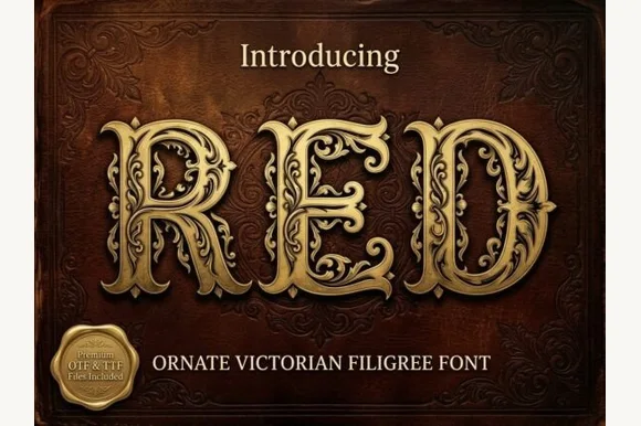
Ornate Victorian capitals with filigree
Red is an ornate Victorian display face in gold on a dark red damask ground: capitals built from heavy stems wrapped in filigree scrollwork, with small leaves and curls growing out of every curve, and a drop shadow that lifts them off the leather.
Ideas for this font
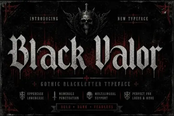
Broad blackletter with curved a shoulders and hooked capitals
Black Valor sets a gothic blackletter in distressed white on a black ground, with broad strokes, curled lowercase shoulders and hooked capitals whose ends finish in fine diamond points.
Ideas for this font
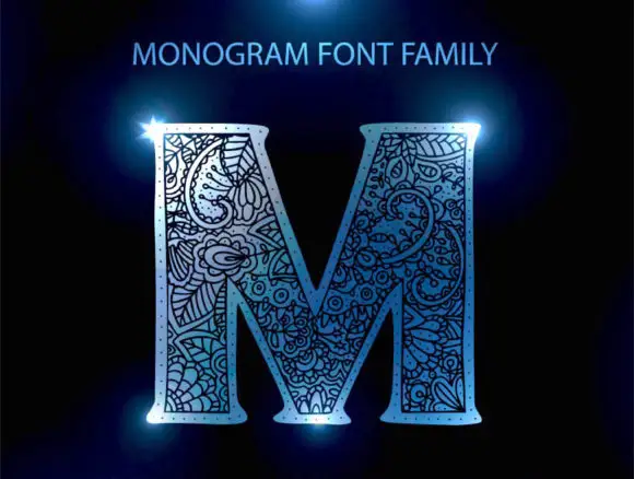
Floral-packed monogram initial
Monogram Font Family is a single ornate initial in pale blue on black: a broad serif M whose every stroke is packed with curling floral and paisley-like linework, lit with a blue flare at two corners and labelled above with the family name.
Same independent foundry
Allow optional Google Analytics to measure visits and catalogue actions. Your search words and notes are not included. Privacy & storage