Neutral Sans Workhorse

Potrero + Swaraga
Lets Potrero own the focal silhouette while handling secondary copy, sizing and subheads cleanly.
Inspect Swaraga specimenDisclosure: MakerFileHub may earn a commission from qualifying purchases via paid links on this page. How our links work.
Layered retro travel display with inline
Potrero is a wide retro display built as a double line: a heavy sans skeleton with a hollow inline core, wrapped by an outer contour, set in salmon and yellow over a screen-printed tropical scene and used twice at different sizes on the same page.
Paid link
Get this fontProject & layout blueprintsAt-a-glance maker compatibility
Sturdy stroke walls and open counters weed cleanly on adhesive vinyl, HTV apparel film, and cut cardstock.
Visual anatomy & craft review
The headline takes the middle of the poster in outline caps with a yellow outer contour and a salmon inner fill, so each letter carries three values at once, and the same face returns above and below in solid salmon at a fifth of the size, which is how a period travel poster actually used one typeface. The letters are wide and square-shouldered, the S and the R curl their terminals slightly, and the O and the C stay nearly circular, all of which reads as mid-century signage rather than a novelty face. Spacing is tight so the contour of one letter nearly meets the next, which is what creates the continuous band of colour across the word. The ground is a flat illustration of palms, a tiki post, a mountain and water, printed in four flat inks with visible misregistration, and the whole thing is framed by a roughened edge, so the type has to hold against a busy field.
Retro, layered, travel, printed
Two-font hierarchy recipes
Tested contrast partners — pairing Potrero with grounded secondary typography.
Potrero + Swaraga
Lets Potrero own the focal silhouette while handling secondary copy, sizing and subheads cleanly.
Inspect Swaraga specimen
Potrero + Aureline
Grounds bold display lettering with classic typographic authority on posters, badges and apparel.
Inspect Aureline specimenPractical applications
Concrete hierarchy, scale and production guidance tailored to Potrero’s stroke geometry.
A layered retro display carries a seasonal, printed-poster feeling that a clean sans cannot, and the contour makes the headline read from across a car park.
Hierarchy & layout recipe
A2 portrait: the name at 120 mm cap height in the mid band with a 3 mm outer contour, the two supporting lines in the solid cut at 24 mm above and below, and the date in a condensed sans at 12 mm at the foot. Keep the contour off the illustration's darkest area by adding a 15 mm flat panel behind the word.
Pre-production check
Check the contour at full size: the 3 mm wrap must not close the counters of the O and the C, and the supporting lines must stay at least 20 mm from the contour. Read the poster from ten metres in daylight to confirm the two inks do not merge at that value.
A travel-poster face gives a bottle a sense of place without an illustration, and the inline construction prints cheaply as two flat inks on a paper label.
Hierarchy & layout recipe
Print a 90 by 60 mm label: the phrase at 18 pt in the solid cut, the age statement in a 7 pt condensed sans, and a 1.5 mm rule beneath the phrase. Keep 5 mm of clear kraft above and below the type so the inline never reads as a printing fault.
Pre-production check
Check the inline at 18 pt on uncoated paper, where the hollow core can fill with ink if the plate is over-inked; proof with the actual press. Confirm the 7 pt statement stays outside the label's curve and that the two inks register within 0.2 mm.
A layered retro face sets a nostalgic tone that suits a feature about long lunches, and the inline keeps a big headline from becoming a solid block of colour on newsprint.
Hierarchy & layout recipe
Spread cover: the phrase at 90 pt across the full width in two flat inks, the standfirst in a 10 pt serif beneath with 12 mm of air, and the folio left in the outer margin. Keep the illustration to the lower third so the headline sits on flat colour.
Pre-production check
Check the registration of the two inks on the press sheet, where the inline shifts by up to 0.3 mm and can pinch the contour. Confirm the headline reads on uncoated newsprint, which absorbs the salmon and lowers the contrast against the panel.
Technical & licence verification
Confirm included OTF/TTF/WOFF formats, full glyph tables and licence coverage on the live store page before batch production.
Closest visual alternatives
Matched across letterform anatomy, stroke behaviour and craft applications.
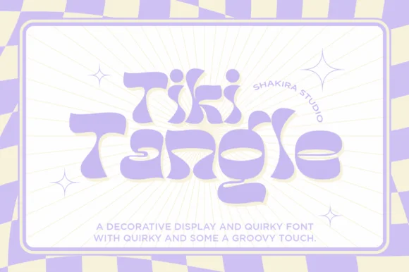
Wavy retro surf display with flared groovy curves
Tiki Tangle is a wavy retro display in which the letters bounce along a loose line, the curves flare at the terminals and the counters stay open, so a short phrase reads as a nineteen-sixties surf poster without any distress.
Ideas for this font
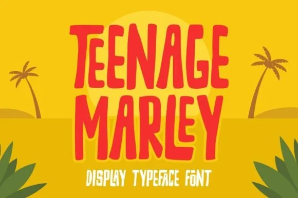
Tall hand-cut tropical tiki & surf poster display
Teenage Marley is a tall, upbeat hand-cut display typeface with dancing tropical stems, tapered brush curves, and breezy island poster rhythm.
Ideas for this font
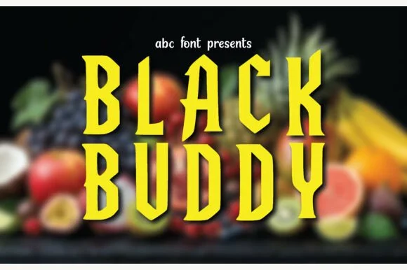
Tall hand-carved tiki-totem & woodcut condensed display
Black Buddy is a tall, condensed wood-carved display font featuring angular adze-chiseled strokes and notched tropical spurs.
Ideas for this font
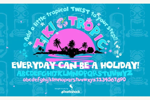
Classic Polynesian carved-wood & surf-shack display (Full charset)
Tiki Tropic (by Sharkshock) is a full-featured tropical wood-carved display font covering A–Z, playful lowercase, and 0–9 numerals.
Ideas for this font
Same independent foundry
Allow optional Google Analytics to measure visits and catalogue actions. Your search words and notes are not included. Privacy & storage