Editorial Serif Anchor

Planner + Kernova
Anchors Planner's fluid strokes with crisp Roman proportions on wedding suites, headers and packaging.
Inspect Kernova specimenDisclosure: MakerFileHub may earn a commission from qualifying purchases via paid links on this page. How our links work.
Modern handwritten script with high contrast
Planner is a modern handwritten script in white on a dark lantern-lit ground: a rounded connected hand with strong thick-to-thin contrast, tall looping ascenders on the P and the l, and a final r that lifts into a long curved tail.
Paid link
Get this fontProject & layout blueprintsAt-a-glance maker compatibility
Weld or Unite overlapping script joins into one continuous vector path before sending to the blade.
Visual anatomy & craft review
The word is set large across the middle and the drawing is a brush-pen script rather than a calligraphy: the downstrokes are heavy and the upstrokes thin, the joins are continuous, and the loop of the P rises above the rest of the word while the l repeats the gesture, which gives the line two high points. The lowercase is narrow and sits low, so the word reads as one horizontal sweep, and the final r trails into a tail that curves back under the last letter. The contrast is high enough that the face needs a size of roughly 24 pt or more to hold, which the sample respects by setting it once at display scale. The ground is a dark photograph with a burning lantern, and the white script is the only bright element; the two caption lines are set in small caps, keeping the specimen quiet around the script.
Modern, handwritten, contrasted, elegant
Two-font hierarchy recipes
Tested contrast partners — pairing Planner with grounded secondary typography.
Planner + Kernova
Anchors Planner's fluid strokes with crisp Roman proportions on wedding suites, headers and packaging.
Inspect Kernova specimen
Planner + Limited Coffee
Keeps small-scale dates, URLs, nutrition facts and care instructions crisp and legible below script titles.
Inspect Limited Coffee specimenPractical applications
Concrete hierarchy, scale and production guidance tailored to Planner’s stroke geometry.
A contrasted script gives a pull quote a voice that a serif cannot, and the heavy downstrokes keep it readable at the size a magazine sets a quote.
Hierarchy & layout recipe
Set the quote at 36 pt across a 100 mm measure, the attribution in an 8 pt sans caps at 8 mm, and a 0.5 pt rule above at 14 mm. Keep the script to two lines and place it on a plain field so the hairlines stay crisp.
Pre-production check
Check the two-line setting, where the tall loops can collide with the line above; add leading rather than reducing the size. Confirm the 8 pt attribution keeps a 4.5:1 contrast and that the rule clears the tallest loop by 10 mm.
A contrasted script suits a modern ceremony with a romantic tone, and the narrow lowercase keeps a long double surname on one line at a usable size.
Hierarchy & layout recipe
A5 portrait: the names at 28 pt, the details in a 9 pt sans beneath, and the date at 8 pt caps. Keep 20 mm margins and print one ink on a smooth stock so the hairlines hold; avoid a textured paper for this face.
Pre-production check
Check the hairlines at 28 pt on the chosen stock, where a thin upstroke can break; proof before the run. Confirm the 8 pt date keeps a 4.5:1 contrast and that the final tail clears the trim on the right.
A contrasted script gives a bridal boutique a mark that reads as a signature, and the heavy downstrokes survive on a bag and a label where fine calligraphy would fail.
Hierarchy & layout recipe
Set the mark at 34 pt on the bag, 16 pt on the label, and 80 mm wide for the window. Keep the mark one colour and build a simplified version without the final tail for the smallest application.
Pre-production check
Check the 16 pt label version, where the hairlines thin below a printable weight; increase the weight for the label. Confirm the window decal weeds cleanly at 80 mm and that the mark holds against a pale shopfront.
Technical & licence verification
Confirm included OTF/TTF/WOFF formats, full glyph tables and licence coverage on the live store page before batch production.
Closest visual alternatives
Matched across letterform anatomy, stroke behaviour and craft applications.
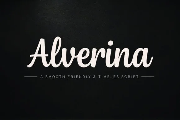
Warm thick-ribbon upright friendly script (Cricut & puff-HTV ready!)
Alverina is a warm, bold-stroke handwritten script with upright rhythm and sturdy connectors that cut and weed cleanly on vinyl, HTV, and wood!
Ideas for this font
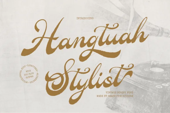
Bold retro sign-painter brush script with underline swashes
Hangtuah is a thick, slanted vintage sign-painter script featuring bold brush strokes, dynamic swash capitals, and retro underline tails.
Ideas for this font
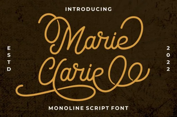
Vintage neon-sign & badge monoline script
Marie Clarie is a smooth, medium-fine monoline script featuring oversized vintage ribbon loops on capitals and spiraled terminal flourishes.
Ideas for this font

Thick rounded brush script with plump loops and wide transitions
Sweet Boho is a thick rounded brush script in which the strokes stay plump, the joins widen into soft transitions and the loops of S, B and h open wide, so a short phrase holds a large amount of ink on a craft blank.
Ideas for this font
Same independent foundry
Allow optional Google Analytics to measure visits and catalogue actions. Your search words and notes are not included. Privacy & storage