Neutral Sans Workhorse

Noby + Prime Nordic
Lets Noby own the focal silhouette while handling secondary copy, sizing and subheads cleanly.
Inspect Prime Nordic specimenDisclosure: MakerFileHub may earn a commission from qualifying purchases via paid links on this page. How our links work.
Chunky rounded kids display
Noby is a chunky rounded display in black on pink: very heavy uniform strokes, round counters, a bouncy baseline, and wide lowercase that pairs with the caps, shown with a badge listing the character sets it includes.
Paid link
Get this fontProject & layout blueprintsAt-a-glance maker compatibility
Sturdy stroke walls and open counters weed cleanly on adhesive vinyl, HTV apparel film, and cut cardstock.
Visual anatomy & craft review
The word is set at hero size in black on a pink field, and the drawing is a soft, heavy display: the strokes are thick and round-ended, the counters are small circles and ovals, and the letters bounce slightly so the baseline is not a straight line. The lowercase is as wide as the capitals, which means a label and a headline can sit in the same voice, and the ascenders on the b and the y are short, keeping the word compact. The specimen is decorated heavily around the type with a rainbow, unicorns, hearts and stars, but none of that ornament touches the letterforms, so the face itself stays neutral and reusable. A badge at the lower right lists the character sets in small rounded caps, which is exactly what a buyer of a craft font wants to check before downloading.
Chunky, cute, rounded, playful
Two-font hierarchy recipes
Tested contrast partners — pairing Noby with grounded secondary typography.
Noby + Prime Nordic
Lets Noby own the focal silhouette while handling secondary copy, sizing and subheads cleanly.
Inspect Prime Nordic specimen
Noby + Stanza
Grounds bold display lettering with classic typographic authority on posters, badges and apparel.
Inspect Stanza specimenPractical applications
Concrete hierarchy, scale and production guidance tailored to Noby’s stroke geometry.
A heavy rounded display reads as friendly before a child parses the words, and the wide lowercase lets the invitation carry a name and a line of detail in one voice.
Hierarchy & layout recipe
A6 card: the name at 34 pt, the details at 12 pt in the same face, and a heart motif at the top. Keep 12 mm margins so the bounce never pushes a letter into the trim, and print black on a bright ground so the chunky shapes stay crisp.
Pre-production check
Check the 34 pt name on a home printer, where the small counters of the o and the a can fill; keep the type above 20 pt for home output. Confirm the 12 pt details read at arm's length and that the bounce does not make the baseline look like a printing error.
A rounded chunky face reads as encouraging to small children and their parents, and the wide lowercase keeps names legible when they are printed at the size a certificate uses.
Hierarchy & layout recipe
A4 landscape: the title at 60 pt, the child's name at 36 pt, and the date at 14 pt in the same face. Keep 30 mm margins and print on white card so the black shapes carry the design without any illustration.
Pre-production check
Check the 36 pt name at print size, where a long name can run past the certificate's centre line; allow the name to wrap rather than shrinking it. Confirm the 14 pt date reads at arm's length and that the counters stay open on the school's printer.
A heavy rounded face reads as soft and safe on a garment label, and the wide lowercase means a size or a care line can be set in the same voice without a second typeface.
Hierarchy & layout recipe
Print a 40 by 60 mm label: the brand at 14 pt, the size at 9 pt in the same face, and the care line in a 6 pt sans. Keep the brand inside a 30 mm field so the bounce stays clear of the seam allowance.
Pre-production check
Check the 14 pt brand on a woven label, where the small counters can close in the weave; use a printed label instead of woven for this face. Confirm the 6 pt care line is legible on the inner label and that the size reads at a glance.
Technical & licence verification
Confirm included OTF/TTF/WOFF formats, full glyph tables and licence coverage on the live store page before batch production.
Closest visual alternatives
Matched across letterform anatomy, stroke behaviour and craft applications.
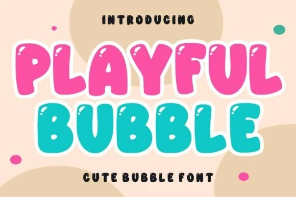
Inflated bubble display with specular highlights
Playful Bubble is a cute bubble display in pink and teal on cream: inflated capitals with heavy white outlines, small specular highlights on each letter and a bouncy baseline, shown as two stacked lines with dots and blobs around them.
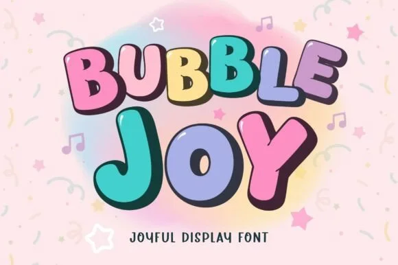
Stackable two-style cartoon bubble duo (Regular & Outline)
Bubble Joy is a two-style bouncy bubble family (Regular & Outline) engineered so solid fills and cartoon borders stack in exact registration.
Ideas for this font
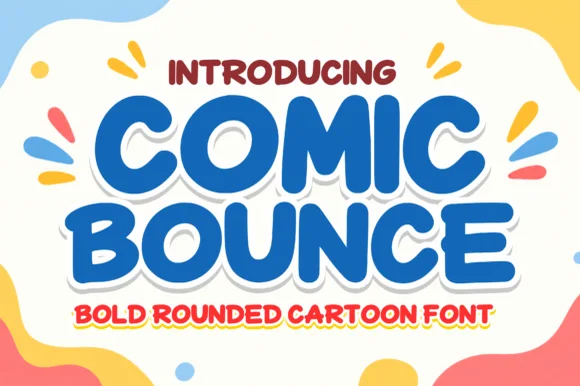
Chunky marshmallow-rounded cartoon headline sans
Comic Bounce is a thick, solid single-layer cartoon display font with puffy rounded strokes, playful tilt, and clean open counters.
Ideas for this font
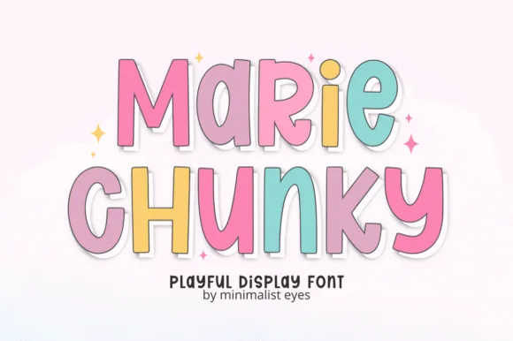
Tall bouncy pastel sticker cartoon sans
Marie Chunky is a tall, lively cartoon display font mixing uppercase and lowercase bubble shapes inside crisp outline borders!
Ideas for this font
Same independent foundry
Allow optional Google Analytics to measure visits and catalogue actions. Your search words and notes are not included. Privacy & storage