Neutral Sans Workhorse

Nice Boho + Borsen
Lets Nice Boho own the focal silhouette while handling secondary copy, sizing and subheads cleanly.
Inspect Borsen specimenDisclosure: MakerFileHub may earn a commission from qualifying purchases via paid links on this page. How our links work.
Bubble display with heart counters
Nice Boho is a bubble display in pink with a heavy black outline: fat rounded letters, counters cut as hearts on three letters, a tight baseline and a small heart divider under the lockup, so the pair reads as a sticker sheet rather than a text face.
Paid link
Get this fontProject & layout blueprintsAt-a-glance maker compatibility
Weld or Unite overlapping script joins into one continuous vector path before sending to the blade.
Visual anatomy & craft review
The two words are stacked and each letter is an inflated shape: the strokes bulge, the joins are fully round, and the hearts in the counters turn the word into a decorated object without adding an illustration. The outline is heavy and even, which is what makes the letters read as cut vinyl, and the tight spacing lets the pair form a single block. Because the shapes are fat and the counters small, the face needs a display size, and the specimen sets both words large on a pale ground with a small tracked caption beneath. The palette is one pink plus the black contour, which is the honest way to show a sticker face, and nothing else appears on the page.
Bubbly, cute, outlined, playful
Two-font hierarchy recipes
Tested contrast partners — pairing Nice Boho with grounded secondary typography.
Nice Boho + Borsen
Lets Nice Boho own the focal silhouette while handling secondary copy, sizing and subheads cleanly.
Inspect Borsen specimen
Nice Boho + Alerigue
Grounds bold display lettering with classic typographic authority on posters, badges and apparel.
Inspect Alerigue specimenPractical applications
Concrete hierarchy, scale and production guidance tailored to Nice Boho’s stroke geometry.
A fat outlined display cuts cleanly in card, and the heart counters give a topper a decorative detail that survives the blade where a thin flourish would not.
Hierarchy & layout recipe
Cut a 150 mm topper: the name at 55 mm cap height with a 3.5 mm outline, heart counters at least 8 mm across, and two 3 mm tabs at the base. Keep 6 mm between letters so the blade can clear the gaps.
Pre-production check
Check the cut file at 150 mm, where a 3.5 mm outline can snap in card; widen the outline for the topper. Confirm the topper stands in a 200 mm cake and that the hearts stay open at that size.
A bubbly outlined face reads as a friendly party card, and the heavy contour keeps the letters legible on a patterned ground where a flat fill would vibrate.
Hierarchy & layout recipe
A6 card: the name at 28 pt with a 1.2 mm outline, the details in a 9 pt rounded sans, and a small heart divider. Keep 12 mm margins and print two colours on a white card so the outline stays open.
Pre-production check
Check the 28 pt name, where a heart counter can close; keep the size above 24 pt. Confirm the 9 pt details keep a 4.5:1 contrast and that the outline does not merge with a neighbouring letter.
A sticker-style display is a product in itself, and a small brand can sell a decorated set without commissioning illustrations for each item.
Hierarchy & layout recipe
Die-cut 50 mm stickers: the phrase at 14 pt with a 1.5 mm outline, the brand at 5 pt, and 2 mm clear to the die. Keep the heart counters at least 4 mm across and test one sticker on a curved bottle.
Pre-production check
Check the 14 pt phrase, where a heart counter can fill; enlarge it for the die. Confirm the sticker adheres to a curved surface and that the outline clears the die on every letter.
Technical & licence verification
Confirm included OTF/TTF/WOFF formats, full glyph tables and licence coverage on the live store page before batch production.
Closest visual alternatives
Matched across letterform anatomy, stroke behaviour and craft applications.
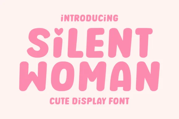
Soft chubby bubble sans with heart-notched lowercase i!
Silent Woman is a sweet, chubby rounded bubble display font featuring an adorable heart-shaped top notch on lowercase 'i'!
Ideas for this font
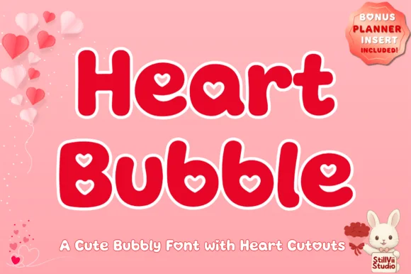
Plump kawaii bubble display with heart-shaped counters
Heart Bubble is a cheerful rounded bubble display font where enclosed letter counters and i-dots are shaped as crisp upright hearts.
Ideas for this font
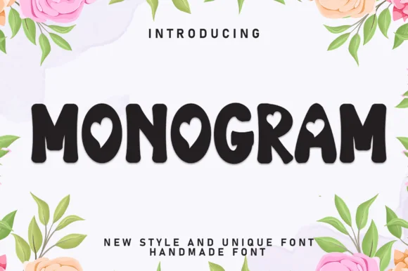
Bold rounded caps with heart counters
Monogram is a bold rounded display in near-black on a floral ground: fat caps with soft corners, hearts cut into three counters, a heavy even stroke and tight spacing, with a tracked caption beneath, so the pair reads as a decorated sticker rather than a text face.
Ideas for this font
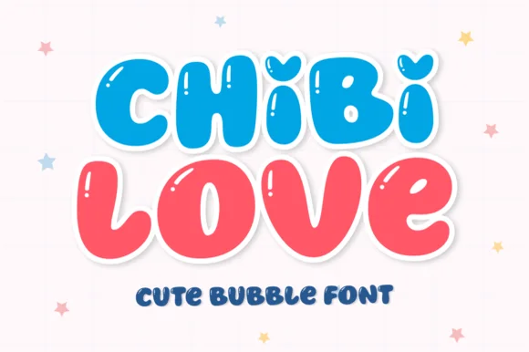
Squishy kawaii bubble sans with heart-dotted i!
Chibi Love is a bouncy, jelly-plump bubble display font topping lowercase 'i' with adorable chubby hearts!
Ideas for this font
Same independent foundry
Allow optional Google Analytics to measure visits and catalogue actions. Your search words and notes are not included. Privacy & storage