Modern Grotesque Body

Idealistic Thinking + Limited Coffee
Creates crisp high-hierarchy contrast beneath Idealistic Thinking headlines across menus, websites and labels.
Inspect Limited Coffee specimenDisclosure: MakerFileHub may earn a commission from qualifying purchases via paid links on this page. How our links work.
High-contrast mixed case with a delicate looping join and an open descender bowl
Idealistic Thinking is a high-contrast serif in which fine hairlines meet broad verticals, the serifs finish sharp, a thin loop rises over the s-t area and the lower g drops into a large open bowl, so a short headline reads as fashion editorial.
Paid link
Get this fontProject & layout blueprintsAt-a-glance maker compatibility
Crisp hairline serifs shine on stationery, foil stamping, and packaging; add slight offset for small decals.
Visual anatomy & craft review
The s and t share a rising loop, the g opens a wide bowl below the baseline, the hairline joins thin at every junction and the serifs cut sharp rather than bracketed. The looping join is the character: it ties two letters into one stroke, which is why the sample overlays a pale yellow line on a muted portrait. Because the hairlines are fine, the face wants coated stock from 14 pt and holds up in vinyl from 1.5 inches; the loop should be checked in the file so it lands where the proof shows it. The portrait and the muted tones are photography; the pale lettering is the face.
Contrasting · Looping · Editorial
Two-font hierarchy recipes
Tested contrast partners — pairing Idealistic Thinking with grounded secondary typography.
Idealistic Thinking + Limited Coffee
Creates crisp high-hierarchy contrast beneath Idealistic Thinking headlines across menus, websites and labels.
Inspect Limited Coffee specimen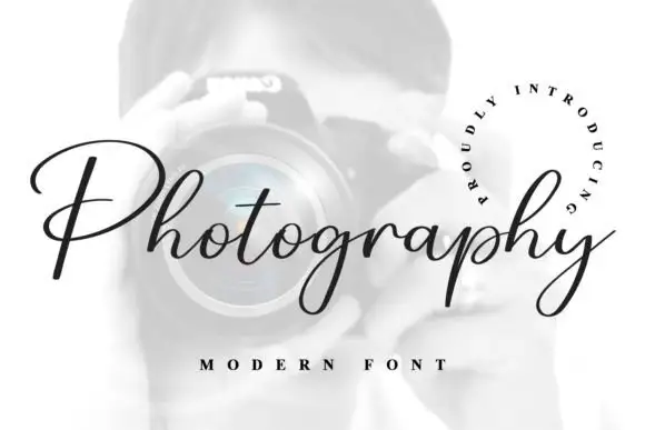
Idealistic Thinking + Photography Font
Adds a warm human signature touch for 1-to-3-word callouts without competing against structured serif capitals.
Inspect Photography Font specimenPractical applications
Concrete hierarchy, scale and production guidance tailored to Idealistic Thinking’s stroke geometry.
The looping join sets a cover line apart, and the fine contrast holds a two-word title at 58 pt over a muted portrait band.
Hierarchy & layout recipe
Print an A4 cover: set the title at 58 pt on the calmest band of the portrait, keep 18 mm of clear ground beneath for the standfirst, and set the standfirst at 10 pt in a serif.
Pre-production check
Hairlines printed over a bright highlight vanish; check the cover proof and move the title to a shadowed band.
The contrast gives a wordmark elegance, and the sharp serifs stay crisp at 26 pt on a coated carton printed in a single ink.
Hierarchy & layout recipe
Print a 55 by 90 mm carton: set the wordmark at 26 pt, keep 10 mm of clear space around it, and set the volume in a 6 pt caps at the foot of the panel.
Pre-production check
A fine serif printed on an uncoated carton spreads at the points; check the proof and keep the wordmark at 24 pt or above on coated stock.
The editorial serif suits a contemporary suite, and the open descender keeps a pair of names clear at 24 pt on heavy card.
Hierarchy & layout recipe
Print a 130 by 180 mm card: set the names at 24 pt, keep 18 mm beneath for the g bowl, and set the venue at 9 pt in a neutral serif in the lower third.
Pre-production check
A descender bowl printed into a venue line collides with it; check the proof and keep 15 mm of clear ground.
Technical & licence verification
Confirm included OTF/TTF/WOFF formats, full glyph tables and licence coverage on the live store page before batch production.
Closest visual alternatives
Matched across letterform anatomy, stroke behaviour and craft applications.
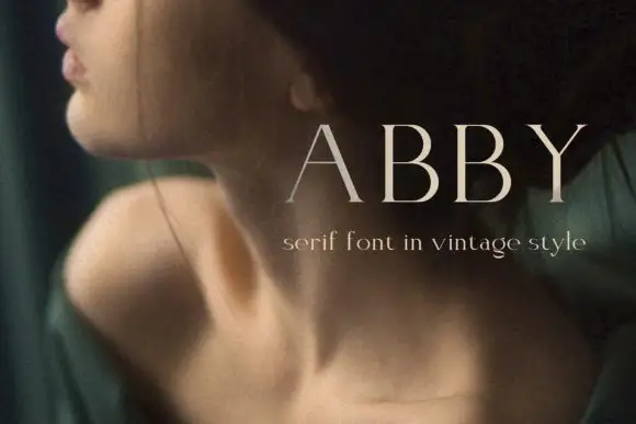
Light widely spaced capitals with fine serifs and broad open counters
Elegant Font Abby shows a pale uppercase ABBY against a dark portrait photograph, where long fine strokes, broad open counters and delicate horizontal serifs keep the two B forms nearly identical and visibly restrained.
Ideas for this font

Light high-contrast mixed case with wide open curves
Grandeur shows a light mixed-case serif with thin hairlines, broad round bowls and a wide open rhythm: the capital G trails a long fine lower spur and the d stem rises well above the lowercase line.
Ideas for this font
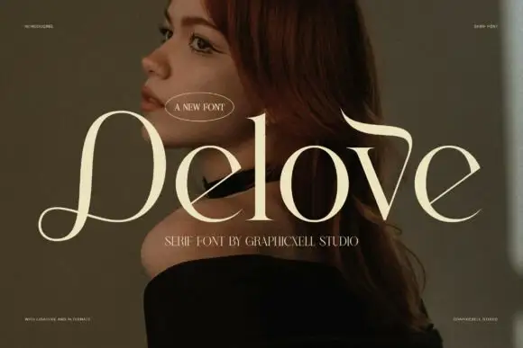
Fine broad serif with a looping initial and a hooked ascending extension
Delove is a fine luxury serif in which the bowls stay large and round, the hairlines thin to almost nothing, the D opens a low looping entry and a long extension curls over the v, so a name reads as couture lettering.
Ideas for this font

High-contrast luxury serif with a swash descender and ball terminals
Bulgary is a high-contrast luxury serif in which the thick stems swell against hairlines, the terminals finish as small balls and the y drops a wide swash, so a single word carries the weight of a film title.
Ideas for this font
Same independent foundry
Allow optional Google Analytics to measure visits and catalogue actions. Your search words and notes are not included. Privacy & storage