Modern Grotesque Body

Amori + Saltriver Grotesk
Creates crisp high-hierarchy contrast beneath Amori headlines across menus, websites and labels.
Inspect Saltriver Grotesk specimenDisclosure: MakerFileHub may earn a commission from qualifying purchases via paid links on this page. How our links work.
Right-leaning fine capitals with long curved diagonal endings and high contrast
Amori is a fine capital serif in which the letters lean to the right, the diagonals run out into long curves and the contrast between stems and hairlines is extreme, so a single word reads as a refined calligraphic mark.
Paid link
Get this fontProject & layout blueprintsAt-a-glance maker compatibility
Crisp hairline serifs shine on stationery, foil stamping, and packaging; add slight offset for small decals.
Visual anatomy & craft review
The A carries a hairline left stroke and a heavy right, the M shows three heavy verticals with fine joins, the O closes an oval counter and the R finishes its leg in a curve that continues past the letter, all at a light overall weight with a rightward lean across every character. The leaking diagonals are the character: the legs of the A and the R extend into fine curves, which is what lets four letters fill a wide plate without extra ornament. Because the hairlines are real hairlines, the face wants 26 pt minimum and a coated stock. The cream ground, the dark ink, the four small caption blocks are presentation; the serif is the word shown.
Calligraphic · Leaning · Contrasted
Two-font hierarchy recipes
Tested contrast partners — pairing Amori with grounded secondary typography.
Amori + Saltriver Grotesk
Creates crisp high-hierarchy contrast beneath Amori headlines across menus, websites and labels.
Inspect Saltriver Grotesk specimen
Amori + Honey
Adds a warm human signature touch for 1-to-3-word callouts without competing against structured serif capitals.
Inspect Honey specimenPractical applications
Concrete hierarchy, scale and production guidance tailored to Amori’s stroke geometry.
The leaning capitals give a mark the register of a French label, and the fine curves still read at 16 pt on a coated carton.
Hierarchy & layout recipe
Print a 50 by 70 mm coated carton panel: set the brand at 16 pt, set the volume in a 5 pt caps sans beneath, and keep 6 mm of margin so the curved leg of the R is not cut by the panel edge.
Pre-production check
Hairlines under 0.12 mm drop out on a carton board; check a printed dummy and thicken the hairlines rather than the heavy stems.
The leaning word fills an opening spread at 84 pt, and the extreme contrast gives the pages a couture calm rather than a newsy shout.
Hierarchy & layout recipe
Print an A4 spread: set the title at 84 pt across the left page, set the standfirst in a 10 pt serif at 14 pt leading, and hold 20 mm below the title so the curved leg does not touch the text column.
Pre-production check
A long curved leg can cross a column rule; check the imposed spread and lift the title rather than shortening the curve.
The fine capitals read on a tall bottle label at 14 pt, and the lean gives a small label the composure of a couture house at retail.
Hierarchy & layout recipe
Print a 35 by 85 mm coated label: set the name at 14 pt, set the concentration in a 4.5 pt caps sans at the foot, and keep 5 mm of margin so the curve of the R sits on the flat of the label rather than on the bottle curve.
Pre-production check
A curved label distorts a fine diagonal; check one labelled bottle and keep the lettering inside the flat central band.
Technical & licence verification
Confirm included OTF/TTF/WOFF formats, full glyph tables and licence coverage on the live store page before batch production.
Closest visual alternatives
Matched across letterform anatomy, stroke behaviour and craft applications.

Curly ornamental serif
Sparky Dream sets two gold rows of curled serif lettering on a night sky, where large spirals rise above the words, a wide curl sits between the rows and a low figure-eight flourish drops beneath the second word so the outer silhouette fills most of the square field.
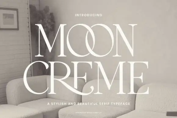
Fine contrasting capitals with overlapping circular bowls
Moon Creme shows tall white serif capitals with fine hairlines and broad round O forms on a muted interior photograph, where the two O letters overlap into a single linked shape and the R leg of the lower row sweeps beneath the following letters before curling away.
Ideas for this font

High-contrast mixed case with a delicate looping join and an open descender bowl
Idealistic Thinking is a high-contrast serif in which fine hairlines meet broad verticals, the serifs finish sharp, a thin loop rises over the s-t area and the lower g drops into a large open bowl, so a short headline reads as fashion editorial.
Ideas for this font

Light high-contrast mixed case with wide open curves
Grandeur shows a light mixed-case serif with thin hairlines, broad round bowls and a wide open rhythm: the capital G trails a long fine lower spur and the d stem rises well above the lowercase line.
Ideas for this font
Same independent foundry
Allow optional Google Analytics to measure visits and catalogue actions. Your search words and notes are not included. Privacy & storage