High-Contrast Display Serif

Holistic + The Bilstein Editorial
Pairs sculptural editorial warmth with Holistic's clean modern geometry.
Inspect The Bilstein Editorial specimenDisclosure: MakerFileHub may earn a commission from qualifying purchases via paid links on this page. How our links work.
Textured block capitals with a looping script overlay
Holistic pairs tall textured block capitals with a narrow looping script that runs across them, plus a photographic backdrop of fruit and foliage.
Paid link
Get this fontProject & layout blueprintsAt-a-glance maker compatibility
Weld or Unite overlapping script joins into one continuous vector path before sending to the blade.
Visual anatomy & craft review
The capital line is drawn with heavy stems and visible internal texture, so the letters read as printed blocks rather than as vector shapes, and the script above crosses them at an angle, which is what gives the sample its layered, stamped feel. Because the two voices overlap, the script's thin strokes sit directly on the heavy caps, so contrast does the work instead of colour separation. The capitals are narrow and evenly spaced, while the script is wide and looping, which is a deliberate proportion mismatch. The fruit, scissors and table surface behind the card are photography, and the small tracked line at the top is a label face that belongs to the collection rather than to either display alphabet.
Layered · Textured · Bold
Two-font hierarchy recipes
Tested contrast partners — pairing Holistic with grounded secondary typography.
Holistic + The Bilstein Editorial
Pairs sculptural editorial warmth with Holistic's clean modern geometry.
Inspect The Bilstein Editorial specimen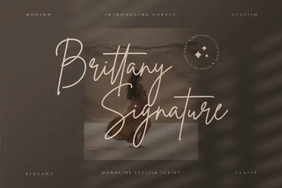
Holistic + Brittany Signature Script
Introduces organic movement on pull-quotes, signatures and gift tags.
Inspect Brittany Signature Script specimenPractical applications
Concrete hierarchy, scale and production guidance tailored to Holistic’s stroke geometry.
A layered lockup gives a stall header two levels of information in one block, so the product name and the message read together from a distance.
Hierarchy & layout recipe
Print the capitals at 3-inch height across a 90 cm banner, overlay the script at 40 percent of that height, and keep the overlap to the upper third so the caps stay readable.
Pre-production check
Layered artwork needs both layers as separate files; a flattened PNG will not let your printer adjust the registration.
The textured caps carry the dish name while the script adds a handwritten credit line, which is the hierarchy a recipe card needs.
Hierarchy & layout recipe
Set the dish name at 24 pt, place the script at 16 pt crossing the top third of the capitals, and keep the ingredient list at 10 pt in a plain face below both.
Pre-production check
Texture in the caps prints lighter than it looks on screen, so proof the card on uncoated stock.
A two-layer lockup works on a narrow band because both voices can occupy the same horizontal space without a second panel.
Hierarchy & layout recipe
Keep the capitals at 14 pt and the script at 20 pt on a 70 mm band, keep the overlap inside the middle half of the band, and leave 5 mm clear at each end.
Pre-production check
At band size the texture disappears, so decide whether the caps still work as flat shapes before printing.
Technical & licence verification
Confirm included OTF/TTF/WOFF formats, full glyph tables and licence coverage on the live store page before batch production.
Closest visual alternatives
Matched across letterform anatomy, stroke behaviour and craft applications.
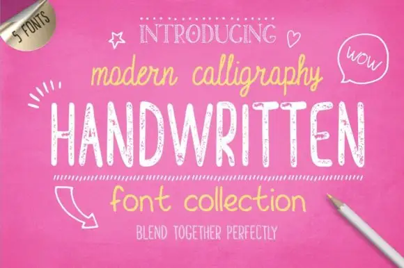
Bundle of five hand-drawn cuts with matching alternates and varied weights
Handwritten Font Collection is a five-cut hand-drawn set in which a slim script, a textured hand and a rounded print share one informal voice, and each cut arrives with an alternate style, so a document can stagger its pages without a second family.
Ideas for this font
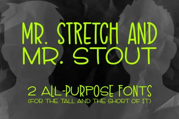
Tall and wide monoline capitals
Mr. Stretch and Mr. Stout is a pair of monoline capital faces in lime green on grey: one very tall and narrow, the other wide and short, presented as an answer to a layout problem rather than as a decorative set.
Ideas for this font
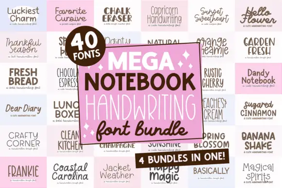
Forty notebook handwriting faces in one set
Mega Notebook Handwriting Bundle is a set of forty handwriting faces laid out on a grid of pale tiles: each tile shows a name in a different hand, from tidy print to looped cursive, with a pink panel in the middle naming the bundle and its contents.
Ideas for this font
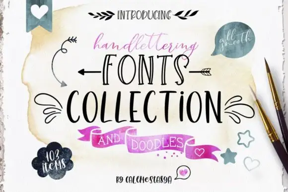
Ten-font hand-lettering bundle with drawn doodle elements
Handlettering Fonts Collection is a ten-font bundle rather than one alphabet: three scripts with italics, two decorative all-caps faces, a serif, a sans and a set of drawn doodles.
Allow optional Google Analytics to measure visits and catalogue actions. Your search words and notes are not included. Privacy & storage