Neutral Sans Workhorse

Mouth + Clyne Sans
Lets Mouth own the focal silhouette while handling secondary copy, sizing and subheads cleanly.
Inspect Clyne Sans specimenDisclosure: MakerFileHub may earn a commission from qualifying purchases via paid links on this page. How our links work.
Pattern-banded display
Mouth is a broad display face in black on a torn cream sheet: heavy sans capitals whose fills are cut into fine bands of angular line patterns, with small animal figures set into a few letters, an outlined pill badge at the upper right and a tracked line beneath.
Paid link
Get this fontProject & layout blueprintsAt-a-glance maker compatibility
Sturdy stroke walls and open counters weed cleanly on adhesive vinyl, HTV apparel film, and cut cardstock.
Visual anatomy & craft review
The word spans the sheet and the drawing is a broad sans whose counters and strokes are filled with fine geometric bands rather than left solid, so the face reads as a woven pattern at a distance and as lettering close up. That construction sets a size floor, because the bands close when the letters shrink, and the plate sets the word large enough that each band reads separately. The small animal figures worked into the letters are part of the drawing rather than a texture, and the torn sheet and the carved masks around it are staging that place the face in a craft context. Because the strokes are heavy, the face works at display sizes on fabric and wood, and the outlined pill badge lists the file formats, which is the information a crafter checks before cutting.
Decorative, patterned, ethnic, bold
Two-font hierarchy recipes
Tested contrast partners — pairing Mouth with grounded secondary typography.
Mouth + Clyne Sans
Lets Mouth own the focal silhouette while handling secondary copy, sizing and subheads cleanly.
Inspect Clyne Sans specimen
Mouth + Medvilea Editorial
Grounds bold display lettering with classic typographic authority on posters, badges and apparel.
Inspect Medvilea Editorial specimenPractical applications
Concrete hierarchy, scale and production guidance tailored to Mouth’s stroke geometry.
A patterned display reads as a woven label, and the fine bands survive a small print when the fill is kept above the closing size.
Hierarchy & layout recipe
Print a 70 by 50 mm label: the brand at 13 pt, the product at 8 pt, and the weight at 6 pt. Keep 4 mm inside the die and print one ink on a textured stock.
Pre-production check
Check the 13 pt brand on a small label, where the bands can fill; keep the bands above 0.4 mm. Confirm the 6 pt weight reads at arm's length and that the label peels cleanly.
A patterned face marks an occasion with craft detail, and the heavy shapes print cleanly on a home printer at card size.
Hierarchy & layout recipe
A6 card: the greeting at 26 pt, the details at 9 pt, and the date at 8 pt. Keep 14 mm margins and print one ink on a cream card so the bands stay open.
Pre-production check
Check the 26 pt greeting at home-print resolution, where the bands can merge; keep them above 0.6 mm. Confirm the 9 pt details keep a 4.5:1 contrast and that the card folds flat.
A patterned display gives a cover an unmistakable texture, and the heavy letters hold at thumbnail size where a fine pattern would fade.
Hierarchy & layout recipe
Set the title at 85 mm cap height across 195 mm, the subtitle in a 12 pt serif, and the author at 8.5 pt. Print one ink on a textured stock and keep the title in the upper half.
Pre-production check
Check the title at 85 mm, where the bands can clot at the joins; keep them separate. Confirm the 8.5 pt author survives lamination and that the title clears the trim.
Technical & licence verification
Confirm included OTF/TTF/WOFF formats, full glyph tables and licence coverage on the live store page before batch production.
Closest visual alternatives
Matched across letterform anatomy, stroke behaviour and craft applications.
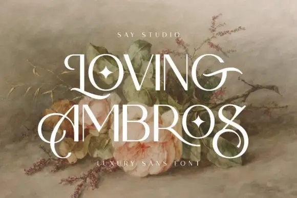
Fine display with circular swashes
Loving Ambros is a fine display face in cream over a still-life of roses and branches: tall letters drawn with hairline stems, large circular swashes that leave the L and the A and loop over the following words, inset four-point stars in the counters, and a tracked credit beneath.
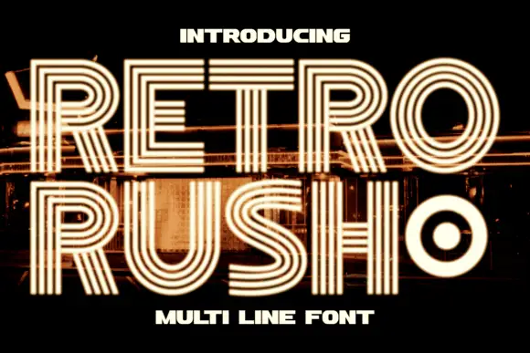
Geometric capitals built from parallel lines with a rounded inner counter
Retro Rush is a geometric capital alphabet in which every stroke is drawn as several parallel lines, so a word reads as a neon tube sign or a striped poster from the late seventies.
Ideas for this font
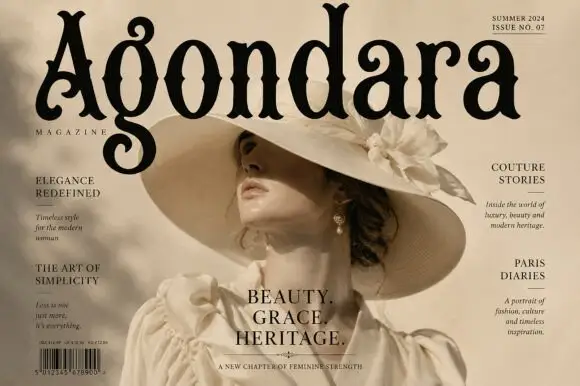
Condensed ornamental gothic with forked top terminals and spiral descenders
Agondara is a condensed ornamental gothic in which the strokes curve heavily, the top terminals fork into points, the bowls end in inward curls and the g drops into a large spiral, so a masthead reads as a heritage fashion title.
Ideas for this font
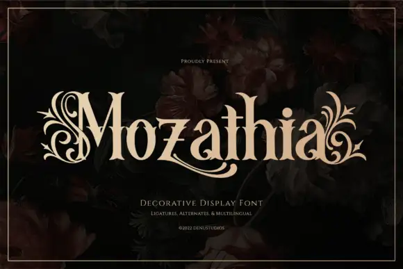
High-contrast serif with botanical flourishes
Mozathia is a high-contrast serif display in cream over a dark floral still life: mixed case with curling botanical flourishes that spring from the first and last letters, fine joins, a swollen stroke through the middle and short serifs, set as one word with a line above and two lines beneath.
Ideas for this font
Same independent foundry
Allow optional Google Analytics to measure visits and catalogue actions. Your search words and notes are not included. Privacy & storage