High-Contrast Display Serif

Grynd + Grandeur – Elegant Classic Serif
Pairs sculptural editorial warmth with Grynd's clean modern geometry.
Inspect Grandeur – Elegant Classic Serif specimenDisclosure: MakerFileHub may earn a commission from qualifying purchases via paid links on this page. How our links work.
Angular geometric skate-deck lettering with cut corners and a shadow offset
Grynd sets a black word in angular geometric forms with several corners sliced away, a heavy even stroke and a pale shadow offset behind every letter, over a deck graphic.
Paid link
Get this fontProject & layout blueprintsAt-a-glance maker compatibility
Sturdy stroke walls and open counters weed cleanly on adhesive vinyl, HTV apparel film, and cut cardstock.
Visual anatomy & craft review
The corners cut at repeated angles, the strokes stay heavy and equal, the outer silhouette steps rather than curves and the shadow repeats the outline behind. The sliced corner is the character: each letter looks cut from a panel rather than drawn, which is why the sample keeps the word short and wide. Because the cuts are small, keep 30 pt before they fill in, and treat the shadow as part of the layout rather than an effect you assume the files contain.
Angular · Geometric · Deck
Two-font hierarchy recipes
Tested contrast partners — pairing Grynd with grounded secondary typography.
Grynd + Grandeur – Elegant Classic Serif
Pairs sculptural editorial warmth with Grynd's clean modern geometry.
Inspect Grandeur – Elegant Classic Serif specimen
Grynd + Bunglon
Introduces organic movement on pull-quotes, signatures and gift tags.
Inspect Bunglon specimenPractical applications
Concrete hierarchy, scale and production guidance tailored to Grynd’s stroke geometry.
The cut corners suit a board graphic, and the heavy strokes stay solid at 34 mm on a 200 mm panel in one colour, so every sliced edge survives a vinyl cut without a supporter or a second pass.
Hierarchy & layout recipe
Cut a 200 mm deck graphic: set the shop name at 34 mm, keep every cut corner at 3 mm minimum so the plate holds, and keep 12 mm of clear vinyl around the outermost letter.
Pre-production check
A cut corner under 1.5 mm breaks at the vinyl edge; check the die file and hold the word at 30 mm or above.
The angular caps set a loud feature title, and the even stroke holds a two-word heading at 58 pt across a page, with enough room left under the heading for the offset shadow to fall inside the margin.
Hierarchy & layout recipe
Print a 210 mm page: set the title at 58 pt on one row, keep 16 mm of clear ground beneath before the standfirst at 10 pt, and keep the block within the column so the shadow offset still fits.
Pre-production check
A shadow offset printed on a full-bleed edge is trimmed away; check the sheet and keep 10 mm of margin.
The deck lettering gives a club sign energy, and the heavy forms read at 48 pt on a board, which is far enough above the cut-corner threshold that the corners still show as corners from the street.
Hierarchy & layout recipe
Print a 500 by 250 mm board: set the club name at 48 pt, keep 22 mm of border so the cut corners stay inside, and set the meeting times in a 14 pt caps on a plain band beneath.
Pre-production check
Angular caps at 24 pt on a distant board read as blocks; check the mounted sign and hold the name at 44 pt or above.
Technical & licence verification
Confirm included OTF/TTF/WOFF formats, full glyph tables and licence coverage on the live store page before batch production.
Closest visual alternatives
Matched across letterform anatomy, stroke behaviour and craft applications.

Tall distressed vintage capitals with speckled edges and tight fit
Modern Vintage is a tall capital alphabet with a distressed print texture, tight letterfit and vertical proportions, so a word reads as letterpress that has been used a hundred times.
Ideas for this font
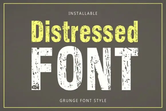
Tall condensed sans with chipped, distressed texture
Distressed is a tall condensed sans whose strokes are eaten away by irregular chips, so the letters look printed, worn and flaked rather than cleanly drawn.
Ideas for this font
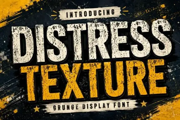
Tall heavy capitals with dense chipped texture and flat terminals
Distress Texture is a heavy tall sans in capitals only, its strokes eaten by dense irregular chips and its terminals cut flat, so a word looks stencilled, weathered and printed through a mask.
Ideas for this font
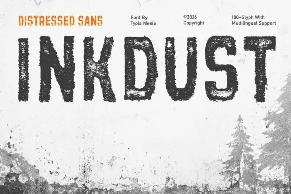
Narrow distressed capitals with broken interiors and ragged edges
Inkdust is a narrow distressed sans in which the stems stay tall, the bowls stay simple and heavy erosion breaks the fill with white gaps and ragged edges, so a single name reads as paint worn off a shipping crate.
Same independent foundry
Allow optional Google Analytics to measure visits and catalogue actions. Your search words and notes are not included. Privacy & storage