Neutral Sans Workhorse

Midnight Halloween + Sailors
Lets Midnight Halloween own the focal silhouette while handling secondary copy, sizing and subheads cleanly.
Inspect Sailors specimenDisclosure: MakerFileHub may earn a commission from qualifying purchases via paid links on this page. How our links work.
Pinched-waist pointed display
Midnight Halloween is a tall display in yellow and white over a dark red illustrated scene: capitals with pinched waists, pointed serif ends, high contrast and a slight inward curve on the stems, set in two lines with a small line above and beneath, against a silhouette of a house, crosses and a cat.
Paid link
Get this fontProject & layout blueprintsAt-a-glance maker compatibility
Sturdy stroke walls and open counters weed cleanly on adhesive vinyl, HTV apparel film, and cut cardstock.
Visual anatomy & craft review
The plate is a poster scene, and the type is the brightest object in it, which is the correct hierarchy for a themed face. The drawing is a tall display with pinched waists and pointed ends, so the letters read as a Victorian poster cut rather than as blackletter, and the pinch gives each stem a shadow that holds against the busy background. That construction sets a moderate size floor, because the waists thin first, and the two lines are set at different colours to separate them without a change of face. The silhouette is staging, and the two small lines are product copy. It suits a poster, a cover and a sign for a seasonal event.
Display, tall, gothic, dramatic
Two-font hierarchy recipes
Tested contrast partners — pairing Midnight Halloween with grounded secondary typography.
Midnight Halloween + Sailors
Lets Midnight Halloween own the focal silhouette while handling secondary copy, sizing and subheads cleanly.
Inspect Sailors specimen
Midnight Halloween + Mewah
Grounds bold display lettering with classic typographic authority on posters, badges and apparel.
Inspect Mewah specimenPractical applications
Concrete hierarchy, scale and production guidance tailored to Midnight Halloween’s stroke geometry.
A pinched display sets a seasonal poster, and the pointed ends read against a dark illustration where a soft face would merge.
Hierarchy & layout recipe
A1 poster: the event at 200 mm cap height, the date in a 24 mm sans, and the venue at 12 mm. Keep 30 mm margins and print two colours on a dark stock.
Pre-production check
Check the A1 at six metres, where a pinched waist can break; keep it above 3 mm. Confirm the 12 mm venue reads at two metres and that the title clears the silhouette.
A tall pinched title fills a cover, and the pointed ends give a silhouette that survives at thumbnail size. The points keep a silhouette at thumbnail size.
Hierarchy & layout recipe
Set the title at 95 mm cap height across 180 mm, the editor in a 12 pt serif, and the imprint at 8 pt. Print two colours on a textured stock and keep 22 mm margins at the head.
Pre-production check
Check the title at 95 mm, where a point can clot; keep the counters open. Confirm the 8 pt imprint survives lamination and that the title clears the trim by 12 mm.
A pinched display gives a shop a seasonal sign, and the pointed ends hold under a light box where a thin face would disappear.
Hierarchy & layout recipe
Cut 900 by 320 mm vinyl: the shop at 110 mm cap height, the line in a 22 mm serif, and a 4 mm contour. Keep 24 mm margins and apply to a clean pane at dusk.
Pre-production check
Check the cut at 110 mm, where a 4 mm point can tear on weeding; widen it to 6 mm. Confirm the 22 mm line reads at two metres and that the title clears the door frame.
Technical & licence verification
Confirm included OTF/TTF/WOFF formats, full glyph tables and licence coverage on the live store page before batch production.
Closest visual alternatives
Matched across letterform anatomy, stroke behaviour and craft applications.
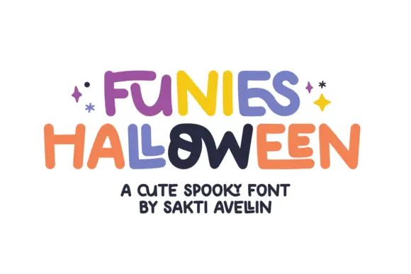
Loose rounded lettering with varied heights and uneven crossbars
Funies Halloween is a loose rounded display alphabet in which the letters bounce above and below the baseline, the heights vary and the crossbars sit at different levels, so a word reads as something cut out and taped down.
Ideas for this font
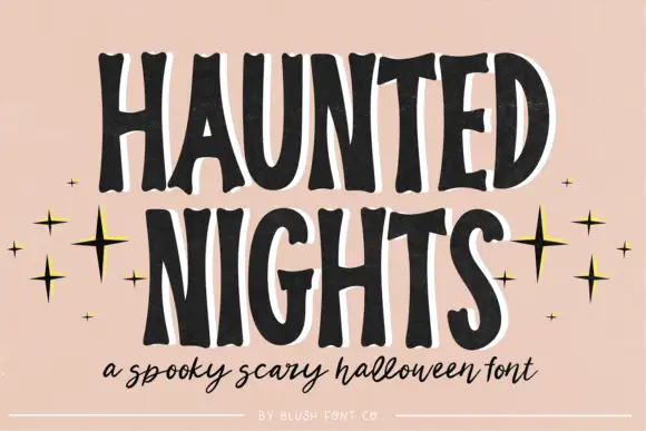
Tall irregular spooky capitals with wobbly contours
Haunted Nights is a tall irregular capital alphabet in which the stems wobble, the counters sag and the outline breaks unevenly, so a two-word greeting reads as lettering cut quickly for a porch sign.
Ideas for this font
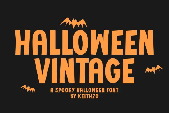
Plain Halloween capitals with irregular vertical rhythm and flat terminals
Halloween Vintage is a plain capital alphabet in which the letters are condensed, the vertical rhythm shifts slightly and the terminals stay flat, so a word reads as cut paper lettering rather than as a decorated seasonal face.
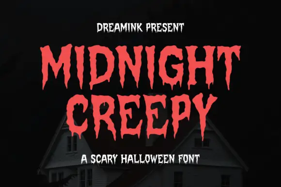
Display
Midnight Creepy is a horror display face in which every stroke melts: the caps are heavy and irregular, and the bottoms of the letters run down into long drips that end in rounded drops.
Same independent foundry
Allow optional Google Analytics to measure visits and catalogue actions. Your search words and notes are not included. Privacy & storage