Editorial Serif Anchor

Peach Eyes + Gorga
Anchors Peach Eyes's fluid strokes with crisp Roman proportions on wedding suites, headers and packaging.
Inspect Gorga specimenDisclosure: MakerFileHub may earn a commission from qualifying purchases via paid links on this page. How our links work.
Heavy soft separate lowercase
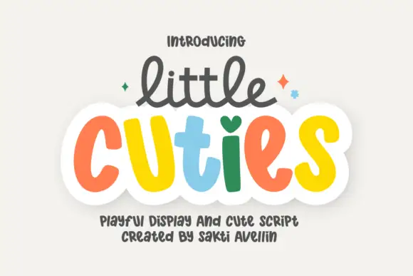
Peach Eyes is a soft handwritten display in lowercase with fat rounded strokes and a different pastel colour on each letter, shown with drawn sparkles on a cream ground.
Paid link
Get this fontProject & layout blueprintsAt-a-glance maker compatibility
Weld or Unite overlapping script joins into one continuous vector path before sending to the blade.
Visual anatomy & craft review
Peach in the top row and eyes below it are both set in a thick, rounded, slightly irregular lowercase, and no two letters share a colour: olive, brick red, dusty teal, mustard and orange alternate across the two words so the line reads as a colour sequence rather than as a single text. The strokes are wide and blunt with rounded ends, the counters are small and slightly off-centre, and the baselines of the two rows do not quite agree, which keeps the pair looking drawn. Drawn sparkles sit at the corners and a two-line caption at the foot names the face and the designer. The construction is a friendly hand-lettered display for parties, packaging and social graphics: the letter-by-letter colouring is the design, so it suits a short phrase at a large size and loses its point if set in one colour at a small size.
A cheerful multicolour handwritten display
Two-font hierarchy recipes
Tested contrast partners — pairing Peach Eyes with grounded secondary typography.
Peach Eyes + Gorga
Anchors Peach Eyes's fluid strokes with crisp Roman proportions on wedding suites, headers and packaging.
Inspect Gorga specimen
Peach Eyes + Bargain Condensed
Keeps small-scale dates, URLs, nutrition facts and care instructions crisp and legible below script titles.
Inspect Bargain Condensed specimenPractical applications
Concrete hierarchy, scale and production guidance tailored to Peach Eyes’s stroke geometry.
Alternating colours hold a child's attention across the front of a card, and the fat strokes stay legible even when printed small.
Hierarchy & layout recipe
Print a 105 by 148 mm card: set the greeting at 36 pt across two rows, keep 14 mm of clear ground beneath before the name at 10 pt, and hold 12 mm of margin at the card edge.
Pre-production check
Colour contrast between letters can drop on a home printer; print one card on the actual machine and check each letter separates before the batch.
A bright hand-lettered word sells a product to the parent and the child at once, and the irregularity reads as made in small batches.
Hierarchy & layout recipe
Print a 60 by 40 mm label: set the product name at 14 pt on one row, keep 5 mm of clear ground beneath before the weight at 4 pt, and hold 4 mm from the widest letter to the die line.
Pre-production check
Pastel inks shift on kraft stock; print one label on the real material and check the palette before the order.
The colours make the banner readable from a distance before anyone reads the words, which is what a fete needs at its entrance.
Hierarchy & layout recipe
Print a 900 by 400 mm banner: set the fete name at 150 pt across two rows, keep 30 mm of clear ground beneath before the date at 26 pt, and hold 26 mm of border on all four sides.
Pre-production check
Wide banners make the letter colours read as noise; print one at the final size and check the sequence before the order.
Technical & licence verification
Confirm included OTF/TTF/WOFF formats, full glyph tables and licence coverage on the live store page before batch production.
Closest visual alternatives
Matched across letterform anatomy, stroke behaviour and craft applications.
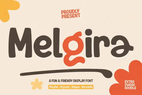
Heavy rounded display sans with a swash accent
Melgira draws a wide black rounded alphabet and then breaks its own rhythm with a lower-case pair whose descender swells into a long sweeping underline beneath the word.
Ideas for this font
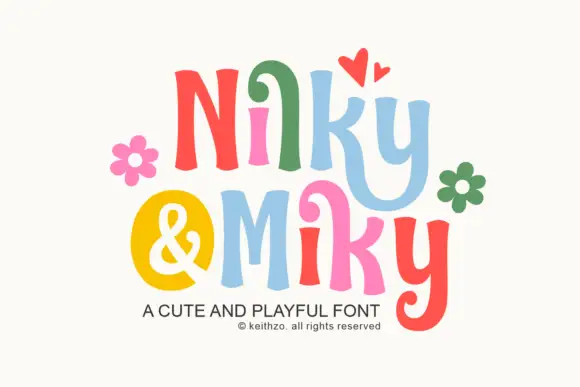
Bouncy curled display print
Nilky and Miky shows separate letters in six colours, each one flared at the ends and slightly tilted, with a curled inner stroke on the k and a deep hook on the y, while a yellow disc holds the ampersand between the two words and flowers and hearts sit around the row.
Ideas for this font
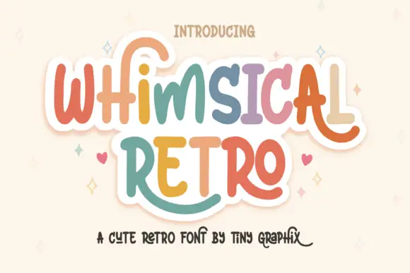
Rounded upright letters with long curled terminals
Whimsical Retro mixes soft upright letterforms with unusually long curled terminals, set over a pastel layered fill inside a thin outline on a warm paper ground.
Ideas for this font
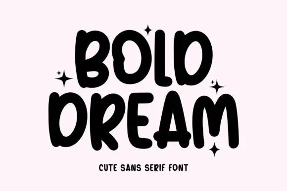
Heavy uneven capitals with a looped B, bulbous M and projecting crossbars
Bold Dream is a heavy hand-lettered capital set in which the strokes lean at slightly different angles, the B loops, the M builds deep soft arches and the A pushes its crossbar out, so a stacked phrase reads as written with a fat marker.
Ideas for this font
Same independent foundry
Allow optional Google Analytics to measure visits and catalogue actions. Your search words and notes are not included. Privacy & storage