High-Contrast Display Serif

Margaretha + Alerigue
Pairs sculptural editorial warmth with Margaretha's clean modern geometry.
Inspect Alerigue specimenDisclosure: MakerFileHub may earn a commission from qualifying purchases via paid links on this page. How our links work.
Handwritten script and sans pair
Margaretha is a handwritten duo in near-black and terracotta on cream: a connected script with big looping flourishes and a curled entry on the first letter, paired with a light sans in the same weight, with a small leaf ornament above and a two-line caption beneath naming both parts.
Paid link
Get this fontProject & layout blueprintsAt-a-glance maker compatibility
Weld or Unite overlapping script joins into one continuous vector path before sending to the blade.
Visual anatomy & craft review
The plate shows both voices doing their proper jobs: the script carries the name at a display size with flourishes that reach across the word, and the sans handles the explanatory lines at a fraction of the size. The script is drawn with a swelling stroke and long open loops, so the flourishes read as structure rather than ornament, and the loose spacing lets them overlap the following letters without collision. Because the script is heavy enough for a card but not for body text, the sans is the part a buyer will use most, and the specimen sets it small and light to prove it reads. The palette is two inks on cream, with the leaf in terracotta, which keeps the plate warm without a third voice.
Duo, handwritten, elegant, versatile
Two-font hierarchy recipes
Tested contrast partners — pairing Margaretha with grounded secondary typography.
Margaretha + Alerigue
Pairs sculptural editorial warmth with Margaretha's clean modern geometry.
Inspect Alerigue specimen
Margaretha + Esmeralda
Introduces organic movement on pull-quotes, signatures and gift tags.
Inspect Esmeralda specimenPractical applications
Concrete hierarchy, scale and production guidance tailored to Margaretha’s stroke geometry.
A script and sans pair covers the names and the details in one purchase, and the light sans keeps the small print readable when the script would not.
Hierarchy & layout recipe
A5 invitation: the names in the script at 30 pt, the request in the sans at 9.5 pt, and the venue at 8 pt. Keep 22 mm margins, leave 12 mm clear for the flourishes, and print two inks on a cream card.
Pre-production check
Check the 30 pt script names, where a flourish can cross the trim; pull the lockup inward by 5 mm. Confirm the 9.5 pt request reads at arm's length and that the sans matches the script's weight optically.
A duo gives a small maker a mark and a descriptor that look designed together, and the light sans prints cleanly at the tiny sizes a label needs.
Hierarchy & layout recipe
Print a 60 by 80 mm label: the brand in the script at 15 pt, the scent in the sans at 7 pt, and the weight at 6 pt. Keep 4 mm inside the die and print two inks on a kraft stock.
Pre-production check
Check the 7 pt sans on kraft, where a light stroke can fill with fibre; keep the size above 6.5 pt. Confirm the script brand reads at arm's length and that the die clears the lowest flourish.
A script and sans pair lets a single card carry a decorative greeting and a legible message, which is what a hand-made seller needs at low volume.
Hierarchy & layout recipe
A6 folded card: the greeting in the script at 26 pt, the message in the sans at 9 pt at 13 pt leading, and a small leaf. Keep 14 mm margins and print two inks on a cream card.
Pre-production check
Check the 9 pt message at table distance, where a light sans can grey out; deepen the ink. Confirm the greeting reads across the table and that the card folds without cracking.
Technical & licence verification
Confirm included OTF/TTF/WOFF formats, full glyph tables and licence coverage on the live store page before batch production.
Closest visual alternatives
Matched across letterform anatomy, stroke behaviour and craft applications.
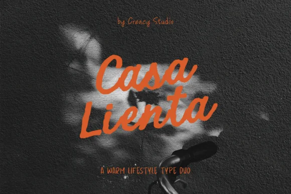
Warm lifestyle brush script + tall condensed handwritten sans duo
Casa Lienta is a warm Mediterranean-lifestyle font duo pairing an expressive thick brush script with a tall, slender handwritten all-caps sans!
Ideas for this font
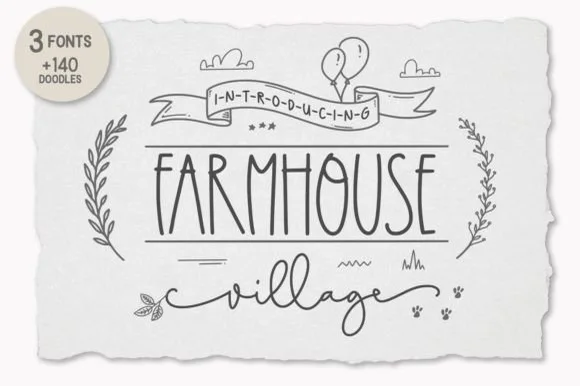
3-font farmhouse family (Tall Sans, Script & 140+ Doodles)
Farmhouse Village is a complete 3-font cottage toolkit bundling a tall narrow farmhouse sans, a winged monoline script, and 140+ hand-drawn doodles!
Ideas for this font
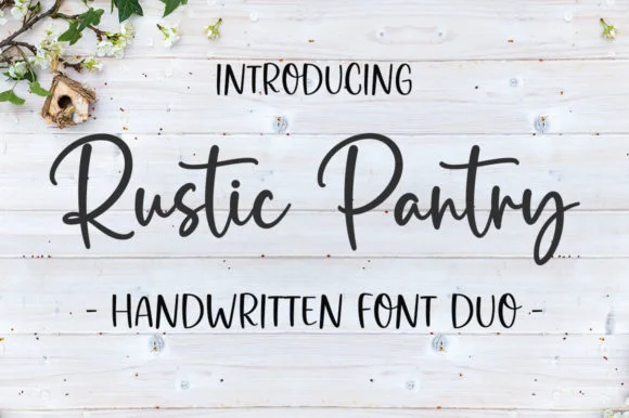
Bouncy farmhouse brush script & tall skinny marker sans duo
Rustic Pantry is a coordinated farmhouse font duo pairing a lively bouncy cursive script with a tall, narrow hand-drawn uppercase sans.
Ideas for this font
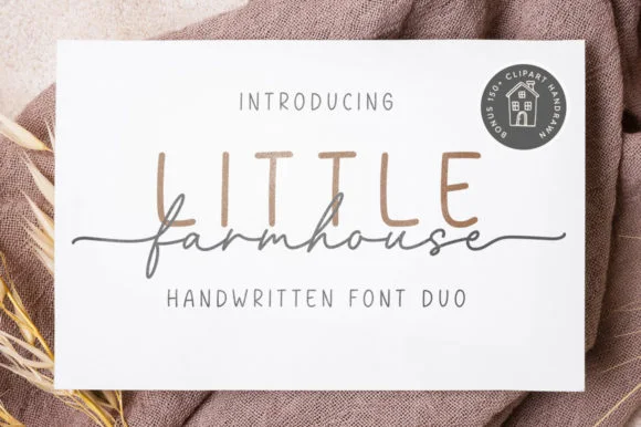
Tall minimalist sans & wide fine-line farmhouse script duo
Little Farmhouse pairs a tall, narrow rounded sans-serif with a delicate, wide-tracked monoline cursive.
Ideas for this font
Same independent foundry
Allow optional Google Analytics to measure visits and catalogue actions. Your search words and notes are not included. Privacy & storage