Editorial Serif Anchor

Love Valentine + The Lumina Awesome
Anchors Love Valentine's fluid strokes with crisp Roman proportions on wedding suites, headers and packaging.
Inspect The Lumina Awesome specimenDisclosure: MakerFileHub may earn a commission from qualifying purchases via paid links on this page. How our links work.
Cute handwritten condensed caps
Love Valentine is a cute handwritten display in red with a white outline on pale pink: condensed capitals with small nub serifs at the top of each stem, rounded corners, uneven heights, and a narrow rhythm, so the pair reads as a friendly card lettering.
Paid link
Get this fontProject & layout blueprintsAt-a-glance maker compatibility
Weld or Unite overlapping script joins into one continuous vector path before sending to the blade.
Visual anatomy & craft review
The two words are stacked and the drawing is a hand-printed capital rather than a script: the stems are narrow and tall, the corners are rounded, and each stem carries a small nub at the top, which acts like a tiny serif and keeps the letters from reading as a modern sans. Heights drift by a couple of millimetres and the widths vary, which is what makes the pair look drawn, and the white outline separates the red from the pink ground without a plate. Spacing is tight but the counters stay open, so the words hold at card sizes. The ground carries a garland of hearts at the top and a row of heart stems along the bottom, and the two captions are set in a rounded handwritten face, so the page reads as a seasonal card rather than a specimen.
Cute, handwritten, condensed, playful
Two-font hierarchy recipes
Tested contrast partners — pairing Love Valentine with grounded secondary typography.
Love Valentine + The Lumina Awesome
Anchors Love Valentine's fluid strokes with crisp Roman proportions on wedding suites, headers and packaging.
Inspect The Lumina Awesome specimen
Love Valentine + Cenura
Keeps small-scale dates, URLs, nutrition facts and care instructions crisp and legible below script titles.
Inspect Cenura specimenPractical applications
Concrete hierarchy, scale and production guidance tailored to Love Valentine’s stroke geometry.
A hand-printed capital reads as friendly rather than formal, and the white outline keeps the red lettering legible on a pink card where a plain red would vibrate.
Hierarchy & layout recipe
A6 card: the phrase at 32 pt with a 1.5 mm white outline, the offer in a 9 pt rounded sans, and a heart garland at the head. Keep 12 mm margins and print two inks so the outline stays clean on a home printer.
Pre-production check
Check the 32 pt outline on a home printer, where a 1.5 mm white stroke can fill; increase the gap between letters. Confirm the 9 pt offer keeps a 4.5:1 contrast and that the nub serifs survive at that size.
A cute red display suits a birthday that falls in February, and the condensed letters fit a long name across a banner without shrinking the height.
Hierarchy & layout recipe
Print 700 by 400 mm: the name at 120 mm cap height with a 4 mm outline, the details in a 24 mm rounded sans, and a heart row along the bottom. Keep 25 mm margins and print on a pale ground so the outline reads.
Pre-production check
Check the banner at four metres, where the outline can close the gaps between letters; keep the spacing at least one outline width. Confirm the 24 mm details read at two metres and that the heart row does not crowd the type.
A hand-printed capital is easy for children to read and looks decorated without an illustration, which suits a class party where the labels are printed at home.
Hierarchy & layout recipe
Print A4 sheets: each name at 22 pt, the food in a 10 pt rounded sans, and a 1 mm outline. Keep 8 mm between the lines and print on white card so the red and the outline both read.
Pre-production check
Check the 22 pt names on a home printer, where a small nub serif can disappear; keep the type above 18 pt. Confirm the 10 pt food labels read at arm's length and that the outline does not merge two neighbouring letters.
Technical & licence verification
Confirm included OTF/TTF/WOFF formats, full glyph tables and licence coverage on the live store page before batch production.
Closest visual alternatives
Matched across letterform anatomy, stroke behaviour and craft applications.
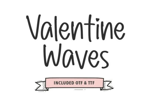
Thin quirky handwriting caps
Valentine Waves is a thin handwriting face in dark grey on white: tall caps and lowercase with uneven heights, an open A and V, a long-tailed W and a slight lean, set in two lines above a hand-drawn ribbon carrying the file formats.
Ideas for this font
Tall quirky rounded sans
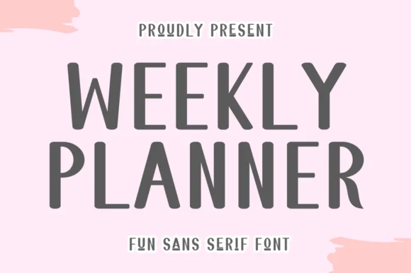
Weekly Planner is a tall rounded sans in grey on pink: narrow upright letters with rounded terminals, an open R leg, a bowed W and a curled L, presented in two stacked lines with a tracked caption beneath, so the pair reads as a planner cover rather than a neutral sans.
Ideas for this font
Playful tall curved classroom marker print
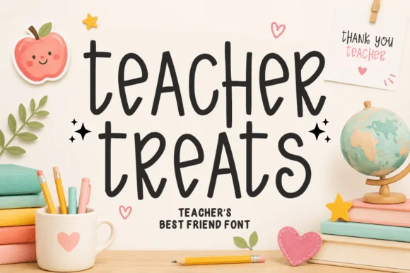
Teacher Treats is a tall, whimsical hand-drawn marker font featuring gently curled ascenders and airy, disconnected mixed-case print.
Ideas for this font
Narrow handwritten caps
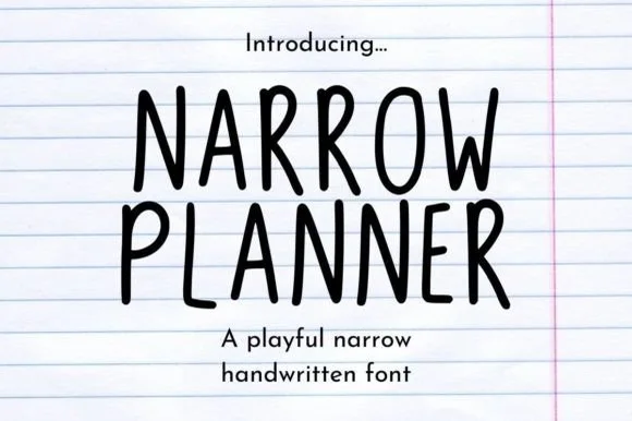
Narrow Planner is a narrow handwritten face in black on ruled paper: tall condensed capitals drawn with a wobbly monoline stroke, uneven letter heights, and a lowercase that reads as the same hand at a normal width.
Ideas for this font
Same independent foundry
Allow optional Google Analytics to measure visits and catalogue actions. Your search words and notes are not included. Privacy & storage