Editorial Serif Anchor

Back to School Handwritten + Majestic Letters
Anchors Back to School Handwritten's fluid strokes with crisp Roman proportions on wedding suites, headers and packaging.
Inspect Majestic Letters specimenDisclosure: MakerFileHub may earn a commission from qualifying purchases via paid links on this page. How our links work.
Rounded informal school handwriting with soft curved terminals
Back to School Handwritten is a rounded informal hand in which the letters stay unjoined, the terminals curve softly and the weight sits between a pen and a marker, so a note reads as written on lined paper rather than as a script.
Paid link
Get this fontProject & layout blueprintsAt-a-glance maker compatibility
Weld or Unite overlapping script joins into one continuous vector path before sending to the blade.
Visual anatomy & craft review
The b lifts a loose loop, the a closes an open bowl, the c turns a wide crescent and the l rises straight before it curls out, all at a medium weight with rounded ends and a light, slightly irregular baseline. The unjoined setting is the character: it keeps a long line readable at small sizes, which is why the sample sets two mixed-case words above a narrower caps descriptor. Because the strokes are soft, the face holds from 16 pt in print and welds cleanly for cutting from 1.1 inches of x-height. The school-supply drawings, the pale ground and the narrow caps line are presentation; the rounded hand lettering is the face.
Informal · Rounded · School
Two-font hierarchy recipes
Tested contrast partners — pairing Back to School Handwritten with grounded secondary typography.
Back to School Handwritten + Majestic Letters
Anchors Back to School Handwritten's fluid strokes with crisp Roman proportions on wedding suites, headers and packaging.
Inspect Majestic Letters specimen
Back to School Handwritten + Borsen
Keeps small-scale dates, URLs, nutrition facts and care instructions crisp and legible below script titles.
Inspect Borsen specimenPractical applications
Concrete hierarchy, scale and production guidance tailored to Back to School Handwritten’s stroke geometry.
The informal hand reads as a teacher's note, and the unjoined letters keep a long line legible at 14 pt on an A5 letter sheet.
Hierarchy & layout recipe
Print an A5 letter: set the heading at 24 pt in the hand, set the body at 14 pt with 1.5 leading, and keep the permission line in a 10 pt sans so signatures have a clear place.
Pre-production check
A handwritten face set as body text at 10 pt turns mushy; check the proof and keep the smallest line at 12 pt or above.
The rounded hand suits a classroom door, and the even strokes stay visible at 50 mm on a laminated sign printed in one ink against a pale panel.
Hierarchy & layout recipe
Print an A4 sign: set the room name at 50 mm, keep 18 mm of border, and laminate with a matte pouch so the rounded terminals do not catch the corridor lights.
Pre-production check
A glossy laminate over soft terminals throws highlights; check the mounted sign from three metres and switch to matte film.
The warm hand suits a small paper tag, and the unjoined letters keep two short words readable at 20 pt on a 40 mm tag with a punched hole.
Hierarchy & layout recipe
Print a 40 by 80 mm tag: set the words at 20 pt, punch a 4 mm hole 10 mm from the top, and keep 8 mm between the hole and the first letter so the tag holds.
Pre-production check
A hole punched close to a rounded terminal tears on a ribbon; check the die and move the hole 4 mm further from the word.
Technical & licence verification
Confirm included OTF/TTF/WOFF formats, full glyph tables and licence coverage on the live store page before batch production.
Closest visual alternatives
Matched across letterform anatomy, stroke behaviour and craft applications.
Mixed handwritten display
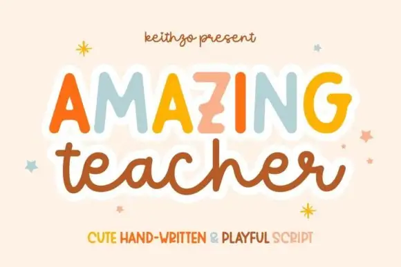
Amazing Teacher places broad separate capitals in mixed warm colours above a connected lowercase sample in brown, where the top line has blunt rounded ends and the lower t and h rise above the joined rhythm on a cream field with small star marks around the words.
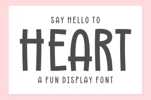
Tall hand-drawn capitals with rough edges and thin raised crossbars
Heart is a tall hand-drawn capital alphabet in which the strokes are narrow and rough-edged, the crossbars sit high and thin, and every letter leans a little, so a word reads as something brushed on a wall.
Ideas for this font
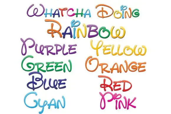
Loose rounded handwriting with loops and shaded rainbow colours
Whatcha Doing is a playful curled script in which each letter carries a decorative loop or tail, and the sample sets the set's name plus a colour word in each of eight colour variants.
Ideas for this font
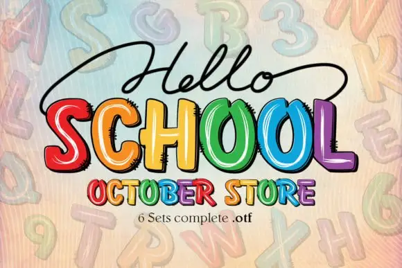
Bright irregular capitals with pale curved highlights and rough dark offsets
Hello School shows chunky irregular capitals in red, orange, yellow, green, blue and violet, where pale curved strokes sit inside the faces, dark rough-edged offsets create a drawn shadow and the large SCHOOL row has tall open counters with uneven widths.
Ideas for this font
Same independent foundry
Allow optional Google Analytics to measure visits and catalogue actions. Your search words and notes are not included. Privacy & storage