Editorial Serif Anchor

Letter Cute + The Lumina Awesome
Anchors Letter Cute's fluid strokes with crisp Roman proportions on wedding suites, headers and packaging.
Inspect The Lumina Awesome specimenDisclosure: MakerFileHub may earn a commission from qualifying purchases via paid links on this page. How our links work.
Narrow upright looped brush forms
Letter Cute is a narrow upright brush script in orange on cream: tall tight loops, a bouncy baseline and a heavy monoline stroke, presented on a citrus ground with a teal banner beneath.
Paid link
Get this fontProject & layout blueprintsAt-a-glance maker compatibility
Weld or Unite overlapping script joins into one continuous vector path before sending to the blade.
Visual anatomy & craft review
The two words run as one line, and the face is a brush script with narrow proportions: the L opens with a tall loop, the e and the t are small, the r is a hook, the C of Cute throws a big oval and the final e curls up into a loop, while the letters lean almost upright and their heights vary, so a line reads as written with a brush held at an angle. The stroke is heavy and even, the joins are loose and the counters are narrow and tall, which is what gives the face a quirky rather than elegant voice. The ground is a cream sheet covered with drawn lemons and leaves, and a teal ribbon beneath carries the caption in the same face at a smaller size. Letter Cute is a script for children's products, cards, labels and packaging, and it needs a short phrase at a generous size.
A quirky brush script with tight loops
Two-font hierarchy recipes
Tested contrast partners — pairing Letter Cute with grounded secondary typography.
Letter Cute + The Lumina Awesome
Anchors Letter Cute's fluid strokes with crisp Roman proportions on wedding suites, headers and packaging.
Inspect The Lumina Awesome specimen
Letter Cute + Taught
Keeps small-scale dates, URLs, nutrition facts and care instructions crisp and legible below script titles.
Inspect Taught specimenPractical applications
Concrete hierarchy, scale and production guidance tailored to Letter Cute’s stroke geometry.
A quirky brush script reads as a sign made by a teacher, and the heavy stroke holds up at a distance in a bright classroom.
Hierarchy & layout recipe
Print a 300 by 200 mm sign: set the word at 64 pt on one line, keep 18 mm of clear ground beneath before the note at 20 pt, and hold 16 mm of border on all four sides.
Pre-production check
The bouncy baseline can look uneven on a rigid board; print one at the final size and check the level before the set.
A warm brush script sets a friendly tone on a small card, and the narrow tight loops keep a longer greeting inside a small format.
Hierarchy & layout recipe
Print a 105 by 148 mm card: set the greeting at 28 pt on one line, keep 14 mm of clear ground beneath before the details at 9.5 pt, and hold 13 mm of margin on all four sides.
Pre-production check
Tight loops fill at small sizes; print one card at the finished size and check the L before the batch.
Small stickers reward children, and the heavy rounded stroke survives a die cut at forty millimetres where a fine script would tear.
Hierarchy & layout recipe
Print a 100 by 150 mm sheet of 40 mm stickers: set the word at 18 pt inside each die, keep 7 mm of clear ground to the die line, and repeat the block across the sheet.
Pre-production check
A narrow loop can cross a small die and get sliced; print one sheet and cut it before running the rest of the order.
Technical & licence verification
Confirm included OTF/TTF/WOFF formats, full glyph tables and licence coverage on the live store page before batch production.
Closest visual alternatives
Matched across letterform anatomy, stroke behaviour and craft applications.
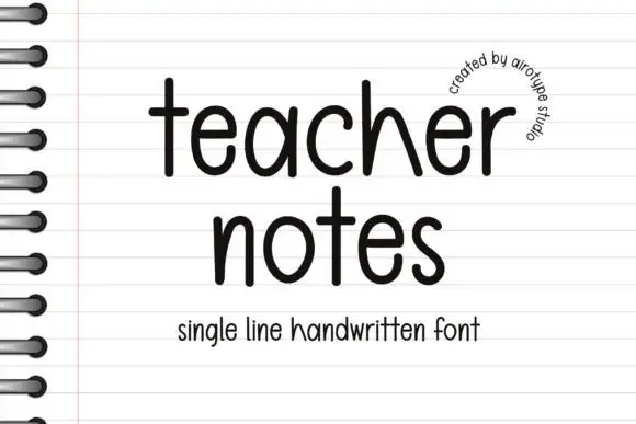
Single-line handwritten sans with a loose baseline
Teacher Notes is a single-line handwritten sans in black on lined notebook paper: an even monoline with rounded terminals, a tall x-height, slightly varying letter heights and a loose baseline, with a small arc of text at the upper right.
Ideas for this font
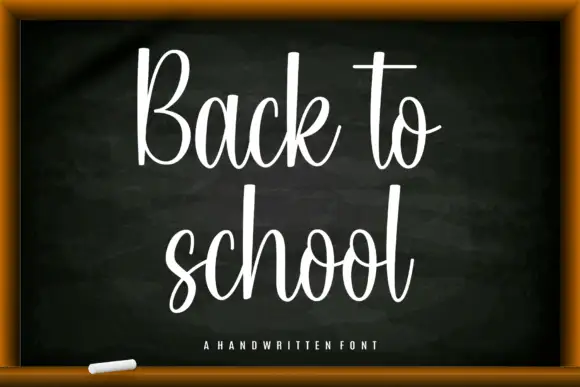
Tall narrow classroom script with high loops and even connected joins
Back to School is a tall narrow script in which the ascenders run high above the letters, the joins stay even and the whole word leans slightly, so a heading reads as something written on a board with a good pen.
Ideas for this font
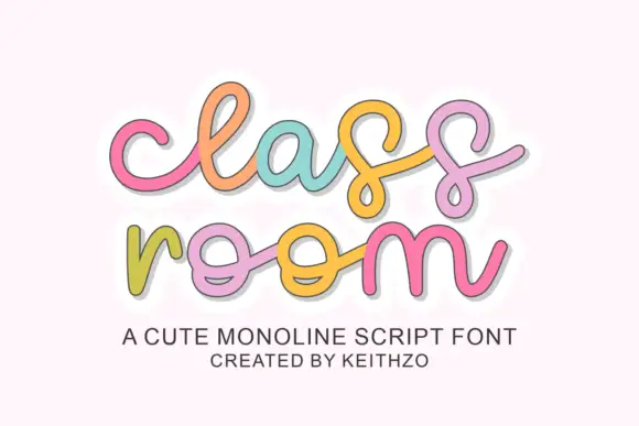
Rounded linked script with loose spacing and a light monoline stroke
Classroom is a rounded linked script in which the letters join through soft loops, the stroke stays monoline and even, and the spacing runs loose enough that each letter keeps its own shape.
Ideas for this font
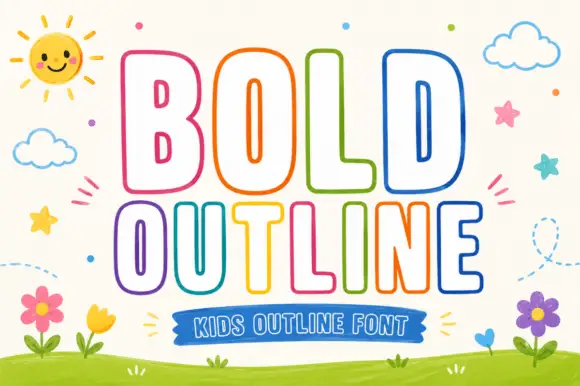
Rounded outline capitals
Bold Outline shows tall rounded capitals traced by a thin coloured contour on a pale field, where the B keeps small narrow counters while the L and D leave broad white interiors, and the letter widths change across the two rows so the second word runs wider than the first.
Ideas for this font
Same independent foundry
Allow optional Google Analytics to measure visits and catalogue actions. Your search words and notes are not included. Privacy & storage