Editorial Serif Anchor

Back to School + Stanza
Anchors Back to School's fluid strokes with crisp Roman proportions on wedding suites, headers and packaging.
Inspect Stanza specimenDisclosure: MakerFileHub may earn a commission from qualifying purchases via paid links on this page. How our links work.
Tall narrow classroom script with high loops and even connected joins
Back to School is a tall narrow script in which the ascenders run high above the letters, the joins stay even and the whole word leans slightly, so a heading reads as something written on a board with a good pen.
Paid link
Get this fontProject & layout blueprintsAt-a-glance maker compatibility
Fine grain and micro-texture excel in 300 DPI print, sublimation, and screen print rather than small vinyl weeding.
Visual anatomy & craft review
The capital B opens with a narrow looped stem and the rest of the word keeps the same slim proportion: the a closes a small bowl, the c opens a narrow crescent, the k splays with a thin arm and the double o closes two tall ovals, all at an even medium weight with rounded joins. Nothing thins at the joins, which keeps the line reading as handwriting rather than as calligraphy, and the narrow width lets two long words stack in a portrait format at 40 pt. The high ascenders set the leading: a line set too close will touch the loops above. The chalkboard ground, the wooden frame, the white ink, the chalk stick and the small caption are presentation; the script is the two words.
Tall · Narrow · Connected
Two-font hierarchy recipes
Tested contrast partners — pairing Back to School with grounded secondary typography.
Back to School + Stanza
Anchors Back to School's fluid strokes with crisp Roman proportions on wedding suites, headers and packaging.
Inspect Stanza specimen
Back to School + Bielchon
Keeps small-scale dates, URLs, nutrition facts and care instructions crisp and legible below script titles.
Inspect Bielchon specimenPractical applications
Concrete hierarchy, scale and production guidance tailored to Back to School’s stroke geometry.
The tall narrow script reads as written on a board, and the even joins keep a two-word heading legible at 40 pt from across a room.
Hierarchy & layout recipe
Print a 700 by 400 mm board: set the heading at 40 pt across the upper half in two lines with 12 mm leading, set the class list in a 12 mm sans beneath, and keep 25 mm of border so the high loops stay inside the frame.
Pre-production check
Two tall script lines set close merge their loops; check the board at final size and open the leading rather than reducing the point size.
The narrow script fits a slim notebook cover at 20 pt, and the even weight keeps a subject name readable at the height of a pencil case.
Hierarchy & layout recipe
Print a 60 by 90 mm cover label: set the subject at 20 pt, set the pupil's name in a 7 pt sans beneath, and keep 5 mm of margin so the loops are not cut by the rounded corner of the label.
Pre-production check
A label on a soft cover flexes and cracks; check a labelled notebook after a week and keep the script off the crease line.
The script gives a printed sign a hand-written voice, and the tall forms read at 10 cm from a corridor where a flat sans would look institutional.
Hierarchy & layout recipe
Print a 600 by 400 mm board: set the event name at 10 cm in the upper third, run the date in the script at 4 cm beneath, and keep 8 cm of border so the descenders stay clear of the frame edge.
Pre-production check
Two script lines at different sizes lose their rhythm; check the sign and keep both lines at the same weight rather than mixing sizes.
Technical & licence verification
Confirm included OTF/TTF/WOFF formats, full glyph tables and licence coverage on the live store page before batch production.
Closest visual alternatives
Matched across letterform anatomy, stroke behaviour and craft applications.
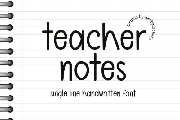
Single-line handwritten sans with a loose baseline
Teacher Notes is a single-line handwritten sans in black on lined notebook paper: an even monoline with rounded terminals, a tall x-height, slightly varying letter heights and a loose baseline, with a small arc of text at the upper right.
Ideas for this font
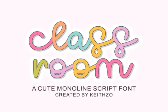
Rounded linked script with loose spacing and a light monoline stroke
Classroom is a rounded linked script in which the letters join through soft loops, the stroke stays monoline and even, and the spacing runs loose enough that each letter keeps its own shape.
Ideas for this font
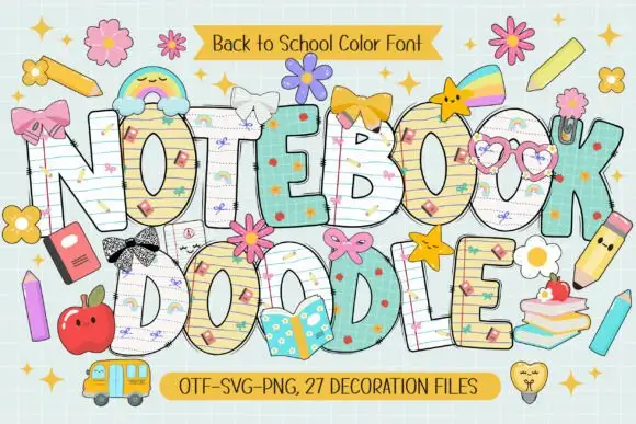
School-paper doodle colour display
Notebook Doodle is a colour display on a pale study scene: fat capitals filled with ruled paper, graph paper and star patterns, outlined in dark ink, decorated with bows, flower clips, pencils and stickers, with two ribbons that name the format list and the count of decoration files.
Ideas for this font
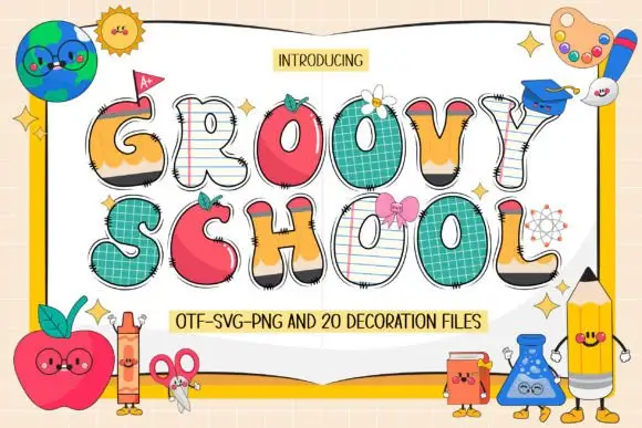
Swelling school-themed capitals mixing pencil, apple, paper and grid surfaces
Groovy School draws every capital as a piece of classroom stationery — a notebook page, an apple, a ruler, a pencil — then adds a face, a bow or a patch to most of them, plus a set of matching decoration files.
Ideas for this font
Same independent foundry
Allow optional Google Analytics to measure visits and catalogue actions. Your search words and notes are not included. Privacy & storage