Editorial Serif Anchor

Teacher Notes + Kernova
Anchors Teacher Notes's fluid strokes with crisp Roman proportions on wedding suites, headers and packaging.
Inspect Kernova specimenDisclosure: MakerFileHub may earn a commission from qualifying purchases via paid links on this page. How our links work.
Single-line handwritten sans with a loose baseline
Teacher Notes is a single-line handwritten sans in black on lined notebook paper: an even monoline with rounded terminals, a tall x-height, slightly varying letter heights and a loose baseline, with a small arc of text at the upper right.
Paid link
Get this fontProject & layout blueprintsAt-a-glance maker compatibility
Set Cricut or Silhouette operation to Pen, Foil Quill, or Laser Score — not Basic Blade Cut.
Visual anatomy & craft review
Two words are stacked on a sheet of lined paper and the face is a single-line handwriting: every letter is drawn with one even stroke, the terminals are rounded, the t carries a short crossbar, the a is single-storey, the h and the k rise to a consistent height, and the baseline drifts slightly from word to word so the line looks written by hand rather than ruled. The x-height is tall, which keeps a handwritten face readable at small sizes, and there are no joins, so the letters stand apart. A small arc of text runs along the upper right, naming the studio, and a tracked line beneath names the style. The ground is a ruled spiral notebook page with a red margin line, printed in soft white and grey. Teacher Notes is a handwritten sans for notes, worksheets, planners and any design that wants to look written but stay perfectly legible, and it works at text sizes as well as in headings.
Single-line, handwritten, even
Two-font hierarchy recipes
Tested contrast partners — pairing Teacher Notes with grounded secondary typography.
Teacher Notes + Kernova
Anchors Teacher Notes's fluid strokes with crisp Roman proportions on wedding suites, headers and packaging.
Inspect Kernova specimen
Teacher Notes + Kohilo
Keeps small-scale dates, URLs, nutrition facts and care instructions crisp and legible below script titles.
Inspect Kohilo specimenPractical applications
Concrete hierarchy, scale and production guidance tailored to Teacher Notes’s stroke geometry.
A single-line hand reads as a teacher's writing, and the even stroke stays legible at the small size of a worksheet instruction.
Hierarchy & layout recipe
Print an A4 sheet at 210 by 297 mm: set the instructions at 12 pt over four lines, keep 10 mm of clear ground above the answer lines, and hold 20 mm of margin on all four sides.
Pre-production check
A handwritten body at twelve points can look casual; check one photocopy on the school machine before a class set.
A handwritten heading signals a piece about classrooms, and the even stroke keeps it from looking like a novelty face on a serious page.
Hierarchy & layout recipe
Print a 210 by 280 mm page: set the heading at 34 pt on one line, keep 14 mm of clear ground beneath before the standfirst at 11 pt, and hold 20 mm of margin on all four sides.
Pre-production check
A loose baseline at heading size can look like a mistake; proof one page and check the alignment against the column.
A handwritten label suits notebooks and planners, and the monoline reproduces cleanly on a cheap printed sticker at small sizes.
Hierarchy & layout recipe
Print a 50 by 30 mm label: set the product at 10 pt on one line, keep 3.5 mm of clear ground on all four sides, and hold the label 8 mm from the top edge of the notebook.
Pre-production check
A small label with a light hand can look empty; print one on the real stock and check the balance before the order.
Technical & licence verification
Confirm included OTF/TTF/WOFF formats, full glyph tables and licence coverage on the live store page before batch production.
Closest visual alternatives
Matched across letterform anatomy, stroke behaviour and craft applications.
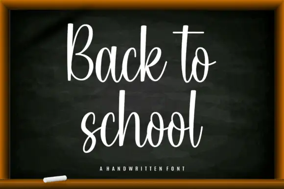
Tall narrow classroom script with high loops and even connected joins
Back to School is a tall narrow script in which the ascenders run high above the letters, the joins stay even and the whole word leans slightly, so a heading reads as something written on a board with a good pen.
Ideas for this font
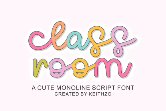
Rounded linked script with loose spacing and a light monoline stroke
Classroom is a rounded linked script in which the letters join through soft loops, the stroke stays monoline and even, and the spacing runs loose enough that each letter keeps its own shape.
Ideas for this font
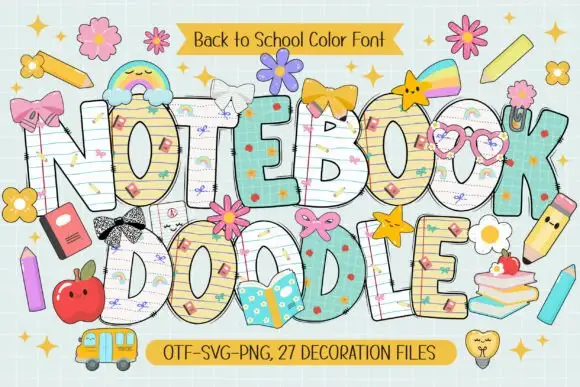
School-paper doodle colour display
Notebook Doodle is a colour display on a pale study scene: fat capitals filled with ruled paper, graph paper and star patterns, outlined in dark ink, decorated with bows, flower clips, pencils and stickers, with two ribbons that name the format list and the count of decoration files.
Ideas for this font
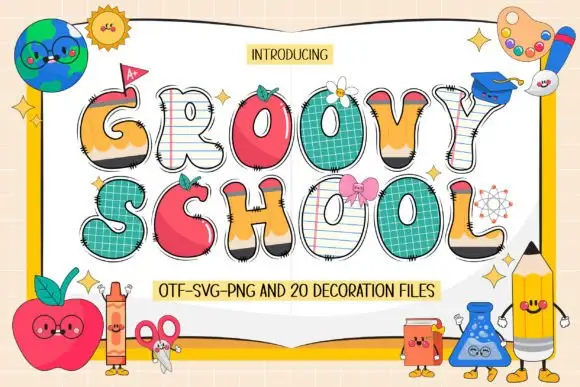
Swelling school-themed capitals mixing pencil, apple, paper and grid surfaces
Groovy School draws every capital as a piece of classroom stationery — a notebook page, an apple, a ruler, a pencil — then adds a face, a bow or a patch to most of them, plus a set of matching decoration files.
Ideas for this font
Same independent foundry
Allow optional Google Analytics to measure visits and catalogue actions. Your search words and notes are not included. Privacy & storage