Modern Grotesque Body

Kroned + Modern Heritage
Creates crisp high-hierarchy contrast beneath Kroned headlines across menus, websites and labels.
Inspect Modern Heritage specimenDisclosure: MakerFileHub may earn a commission from qualifying purchases via paid links on this page. How our links work.
Heavy athletic capitals with rounded bowls and inward-cut slab joins
Kroned is a heavy athletic slab in which the O stays broad and round, the K and N meet their limbs in firm diagonals, short inward cuts sit beneath the slab caps and the fill is clean, so a team word reads as a pressed varsity patch.
Paid link
Get this fontProject & layout blueprintsAt-a-glance maker compatibility
Sturdy stroke walls and open counters weed cleanly on adhesive vinyl, HTV apparel film, and cut cardstock.
Visual anatomy & craft review
The O closes a round bowl with no distortion, the K runs a straight diagonal to the stem, the N carries a steep arm and every slab cap holds a small notch beneath it rather than a distressed edge. The clean fill is the character: there is no wear in the lettering, which is why the sample sets one word on a solid ground with sport captions below. Because the letterforms are simple and heavy, the face wants 30 pt and holds from three quarters of an inch of cap height in vinyl or felt. The shuttlecock photograph and the category captions are cover composition; the mint capitals are the face.
Athletic · Clean · Slab
Two-font hierarchy recipes
Tested contrast partners — pairing Kroned with grounded secondary typography.
Kroned + Modern Heritage
Creates crisp high-hierarchy contrast beneath Kroned headlines across menus, websites and labels.
Inspect Modern Heritage specimen
Kroned + Coastal Honey
Adds a warm human signature touch for 1-to-3-word callouts without competing against structured serif capitals.
Inspect Coastal Honey specimenPractical applications
Concrete hierarchy, scale and production guidance tailored to Kroned’s stroke geometry.
The clean slabs translate into felt, and the round bowls stay even at 45 mm on a sew-on patch with a merrowed border stitch.
Hierarchy & layout recipe
Cut a 75 mm patch: set the team name at 45 mm, keep the inward notches as straight cut lines, and leave 6 mm of border so the merrow does not eat the outline.
Pre-production check
A merrowed border stitch consumes about 3 mm of the patch edge; check the artwork and hold every letter 6 mm inside the cut line.
The heavy athletic forms read from a touchline, and the clean fill stays solid at 100 mm on a printed banner in one ink.
Hierarchy & layout recipe
Print a two-metre banner: set the name at 100 mm, set the fixture details in a 30 mm caps beneath, and keep 45 mm of border so the eyelets clear the letters.
Pre-production check
A clean heavy face printed to the hem loses its outer edge; check the finished banner and keep 40 mm of margin.
The varsity tone suits a bottle label, and the round bowls stay legible at 20 pt on a 50 mm printed panel in one flat ink.
Hierarchy & layout recipe
Print a 50 by 70 mm label: set the name at 20 pt, set the flavour in a 7 pt caps beneath it, and keep 6 mm of clear label from the die so the slab caps stay whole.
Pre-production check
Small inward notches printed at 14 pt disappear; check the label proof and keep the name at 18 pt or above.
Technical & licence verification
Confirm included OTF/TTF/WOFF formats, full glyph tables and licence coverage on the live store page before batch production.
Closest visual alternatives
Matched across letterform anatomy, stroke behaviour and craft applications.
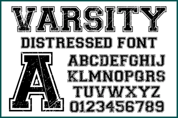
Varsity slab with double outline and wear
Varsity Distressed is a varsity slab in black on white: heavy capitals with flat serifs, a double outline that follows the silhouette, and a worn texture across the fill, shown with a full alphabet and a digit set.
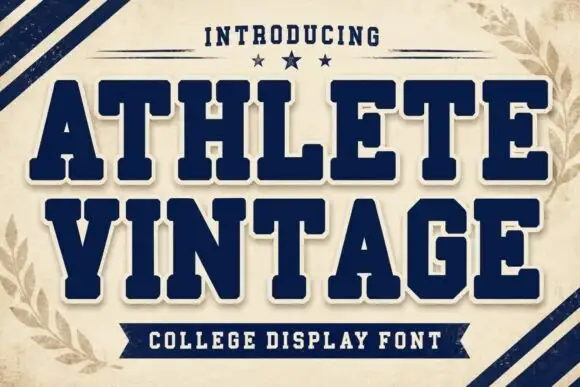
Heavy varsity slabs with soft corners and a wide rectangular top line
Athlete Vintage is a heavy varsity slab in which the caps keep a soft corner radius, the slab tops run wide and flat, and the deep triangular openings in the V and A stay open, so a team name reads as stitched athletic lettering.
Ideas for this font
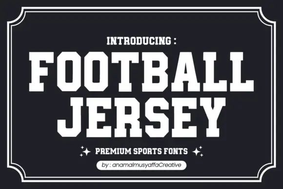
Solid athletic capitals with clipped corners and square slab ends
Football Jersey presents solid white athletic capitals on charcoal inside a double frame, where the O bowls have cut-off corners, the T and J carry broad rectangular terminals and the two rows keep an even dense rhythm with almost no space between the letters.
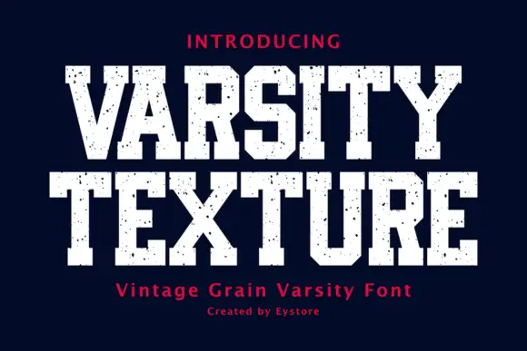
Display
Varsity Texture is a collegiate block face: heavy slab-serifed capitals with a flat top and foot, tight spacing and a grain texture that leaves the letters looking stamped on fabric.
Ideas for this font
Same independent foundry
Allow optional Google Analytics to measure visits and catalogue actions. Your search words and notes are not included. Privacy & storage