Modern Grotesque Body

Luxtya Mewoth + Noar
Creates crisp high-hierarchy contrast beneath Luxtya Mewoth headlines across menus, websites and labels.
Inspect Noar specimenDisclosure: MakerFileHub may earn a commission from qualifying purchases via paid links on this page. How our links work.
Luxury serif with ornamental flourishes
Luxtya Mewoth is a luxury serif in gold on deep red silk: high contrast, sharp thin serifs, and tall ribbon flourishes that rise from the L and the M and curl back over the following letters, with a small registered mark beside the first line.
Paid link
Get this fontProject & layout blueprintsAt-a-glance maker compatibility
Sturdy stroke walls and open counters weed cleanly on adhesive vinyl, HTV apparel film, and cut cardstock.
Visual anatomy & craft review
The two lines are set one above the other and the drawing is a display serif with an ornamental layer: the stems are heavy, the hairlines are fine, the serifs are sharp wedges, and the capitals carry flourishes that leave the letterform entirely and float above the x-height like calligraphic ribbons. The lower case stays comparatively plain, which is what keeps the word readable under the ornament, and the spacing is wide enough that each flourish has air. The mockup is a deep red fabric photographed in folds, and the gold type sits on the brighter folds so the hairlines stay visible without a plate. Four corner labels and a small ® give the specimen the look of a fashion house's type sample, and the two caption lines are set in a light face that contrasts with the display without competing.
Luxury, ornate, contrasted, ceremonial
Two-font hierarchy recipes
Tested contrast partners — pairing Luxtya Mewoth with grounded secondary typography.
Luxtya Mewoth + Noar
Creates crisp high-hierarchy contrast beneath Luxtya Mewoth headlines across menus, websites and labels.
Inspect Noar specimen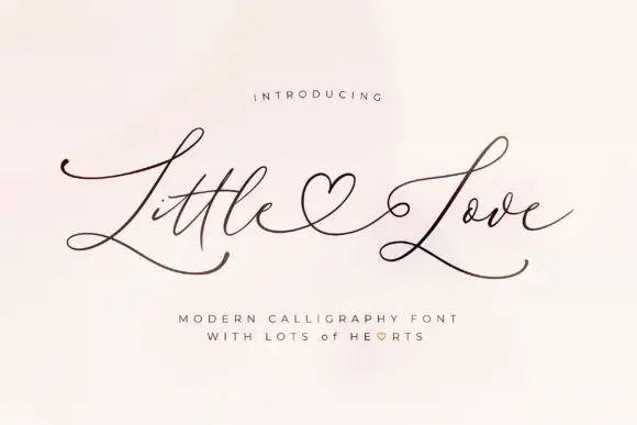
Luxtya Mewoth + Little Love
Adds a warm human signature touch for 1-to-3-word callouts without competing against structured serif capitals.
Inspect Little Love specimenPractical applications
Concrete hierarchy, scale and production guidance tailored to Luxtya Mewoth’s stroke geometry.
Ornamental flourishes give a couture mark the look of an engraved monogram, and the flourish can be scaled down to a single letter for a woven label or a button.
Hierarchy & layout recipe
Set the name at 36 pt in gold on a dark ground, keep the flourish of the capital inside a 12 mm margin, and build a single-letter version for the garment label at 10 mm. Keep the whole system one colour plus foil.
Pre-production check
Check the flourish at 12 mm on the woven label, where the hairline ribbon disappears; thicken it for the woven version or drop the ornament. Confirm the 36 pt mark holds its contrast on the dark silk and that the foil edge stays clean at 0.8 mm.
A luxury serif with flourishes reads as an embossed album cover, and a single ornamental capital gives the cover a mark without a separate crest.
Hierarchy & layout recipe
Set the couple's names at 44 pt on a 300 mm square cover, allow the capital's flourish to rise 15 mm above the cap line, and place the date in a 9 pt roman at the foot. Emboss the type blind or in a single gold foil on a deep board.
Pre-production check
Check the blind emboss, where a hairline under 0.4 mm will not register; use foil for the finest parts and blind emboss only for the stems. Confirm the flourish clears the trim by 12 mm and the 9 pt date reads at arm's length.
A flourish serif gives a supplement cover the register of a fashion title without a script, and the ornament stays graphic rather than decorative when it is one capital only.
Hierarchy & layout recipe
Set the title at 100 pt across 200 mm with the flourish on the first capital rising into the top margin, the standfirst in a 10 pt serif beneath, and the issue details in 8 pt caps at the foot. Keep the page to two inks.
Pre-production check
Check the flourish against the top margin at 100 pt, where it can be trimmed if the cover's head margin is under 15 mm. Confirm the hairlines survive the press on coated stock and that the 8 pt details stay legible on the newsstand.
Technical & licence verification
Confirm included OTF/TTF/WOFF formats, full glyph tables and licence coverage on the live store page before batch production.
Closest visual alternatives
Matched across letterform anatomy, stroke behaviour and craft applications.
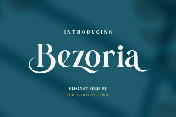
Elegant serif with calligraphic tails and a flowing lowercase
Bezoria is an elegant serif in which the lowercase carries calligraphic tails, the bowls flow into their stems and the serifs stay fine, so a single name reads as a piece of modern lettering rather than as a text face.
Ideas for this font
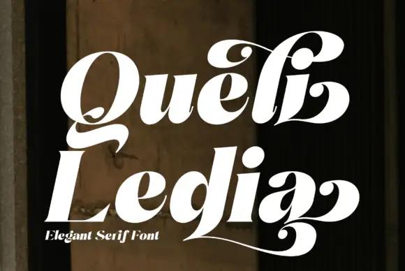
Heavy slanted swash serif
Queli Ledia is a heavy slanted serif in white on a dark weathered wall: fat stems with curled terminals, ball ends on the tails, a long low sweep that runs under the second word, and a small line beneath naming the style.
Ideas for this font
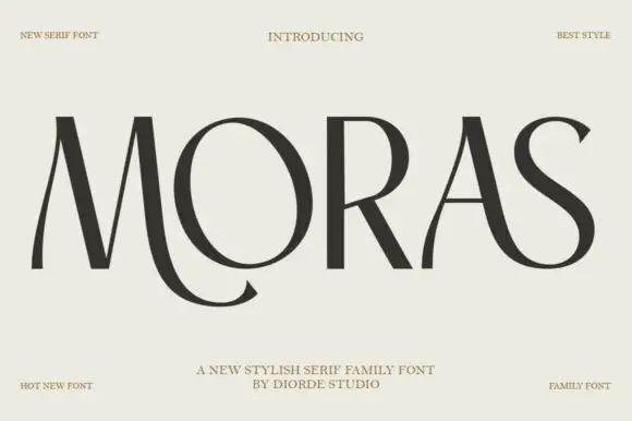
Stylish display serif family
Moras is a stylish serif family in near-black on pale stone: very high contrast, hairline stems and thin flat serifs, with a curling tail on the R, a swooping S and a ligature between the O and the R, set as one wide word with tracked corner notes.
Ideas for this font
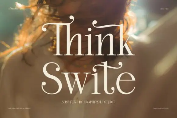
Display serif with calligraphic curled terminals
Think Swite is a display serif in cream over a warm portrait: tall letters with a strong contrast, thin stems and curled calligraphic terminals that lift off the tops of the T and the h, set as two stacked words with a small caption beneath.
Ideas for this font
Same independent foundry
Allow optional Google Analytics to measure visits and catalogue actions. Your search words and notes are not included. Privacy & storage