High-Contrast Display Serif

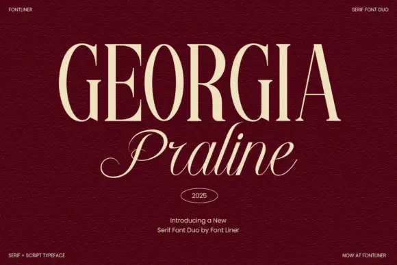
Sencor + Medvilea Editorial
Pairs sculptural editorial warmth with Sencor's clean modern geometry.
Inspect Medvilea Editorial specimenDisclosure: MakerFileHub may earn a commission from qualifying purchases via paid links on this page. How our links work.
Condensed heavy rounded sans
Sencor is a condensed sans on a deep green ground: tall heavy rounded capitals in cream, with long slot counters, a short soft E arm and a narrow R leg, set as one word across the base beneath a header row naming the foundry, the style, the glyph count and the rights line.
Paid link
Get this fontProject & layout blueprintsAt-a-glance maker compatibility
Sturdy stroke walls and open counters weed cleanly on adhesive vinyl, HTV apparel film, and cut cardstock.
Visual anatomy & craft review
The plate is a specification sheet, and the header row is the practical part: it names the style as a display condensed sans serif, gives a glyph count, states multilingual support and carries the rights line, all before the word is read. The letters are tall and heavy with long slot counters, so the face sets a long word in a narrow measure and still reads at a distance, and the short E arm keeps the counters open at small sizes. That construction sets a moderate size floor, because the slots close first. The header is product copy. It suits a poster, a package and a sign, and its main talent is fitting a long name into a tight column without losing weight.
Sans serif, condensed, heavy, editorial
Two-font hierarchy recipes
Tested contrast partners — pairing Sencor with grounded secondary typography.
Sencor + Medvilea Editorial
Pairs sculptural editorial warmth with Sencor's clean modern geometry.
Inspect Medvilea Editorial specimen
Sencor + Honey
Introduces organic movement on pull-quotes, signatures and gift tags.
Inspect Honey specimenPractical applications
Concrete hierarchy, scale and production guidance tailored to Sencor’s stroke geometry.
A condensed heavy sans fits a long product name on a narrow pack, and the slot counters hold at a distance on a shelf. The weight reads on a shelf.
Hierarchy & layout recipe
Print a 65 by 160 mm can wrap: the brand at 14 pt condensed, the variant at 8 pt, and the volume at 7 pt. Keep 6 mm inside the die and keep the slots above 0.4 mm.
Pre-production check
Check the 14 pt brand on the curve, where a slot can fill; keep it above 0.4 mm. Confirm the 7 pt volume reads on the shelf and that the wrap registers round the seam.
A condensed poster holds a long line-up, and the heavy weight reads across a room where a normal width would run out of space.
Hierarchy & layout recipe
A2 poster: the headliner at 120 mm cap height, the support acts in a 20 mm condensed, and the venue at 11 mm. Keep 30 mm margins, print two colours and keep the slots above 3 mm.
Pre-production check
Check the A2 at five metres, where a slot can vanish; keep it above 3 mm. Confirm the 11 mm venue reads at two metres and that the longest act fits the measure.
A condensed sans fits a long store name on a narrow fascia, and the heavy strokes hold in vinyl at a height read from a car park.
Hierarchy & layout recipe
Cut a 1400 by 320 mm fascia: the store at 120 mm cap height, the line in a 24 mm sans, and a 4 mm contour. Keep 30 mm margins and keep the strokes above 9 mm.
Pre-production check
Check the cut at 120 mm, where a 4 mm stroke can tear on weeding; keep it above 9 mm. Confirm the 24 mm line reads at twelve metres and that the contour clears the frame.
Technical & licence verification
Confirm included OTF/TTF/WOFF formats, full glyph tables and licence coverage on the live store page before batch production.
Closest visual alternatives
Matched across letterform anatomy, stroke behaviour and craft applications.
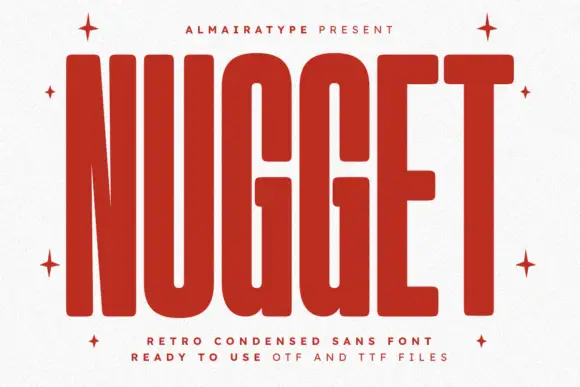
Very tall heavy capitals with rounded corners and narrow internal channels
Nugget shows red capitals filling most of a white cover, where thick near-even strokes leave thin vertical openings in the U and G, the N draws a sharply narrowing diagonal and every outer corner softens.
Ideas for this font
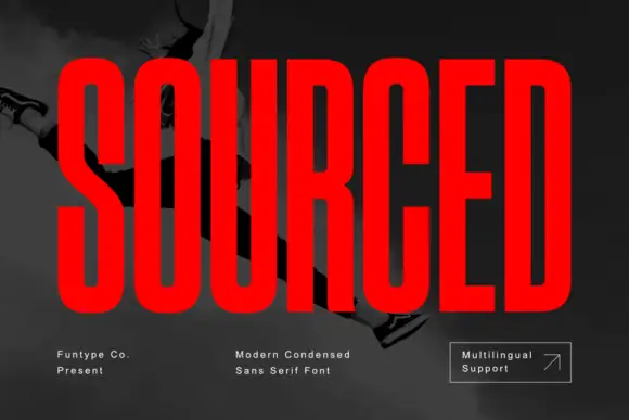
Very condensed heavy capitals with narrow rounded rectangular counters
Sourced shows vivid red capitals across a dark monochrome photograph, where tall heavy uprights and flat-ended arms leave thin rounded rectangular counters inside the O and D, the R carries a straight angled leg and the C opens only a small gap on its right side.
Ideas for this font
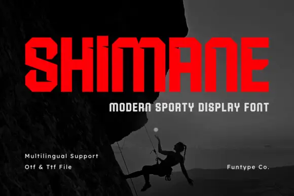
Chamfered condensed display sans
Shimane is an angular condensed sans in red on a dark photograph of a climber: wide capitals with chamfered corners, small horizontal notches on the stems and flat terminals, set as one large word with a tracked line beneath and three plain notes at the foot.
Ideas for this font
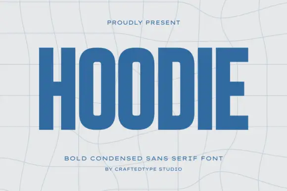
Condensed block capitals with rounded rectangular O counters
Hoodie shows a large blue uppercase word on a pale warped-grid field, where heavy straight uprights and flat horizontal endings form a dense block, the O and D hold rounded rectangular counters, the H crossbar sits near the middle and the E keeps three squared arms.
Ideas for this font
Same independent foundry
Allow optional Google Analytics to measure visits and catalogue actions. Your search words and notes are not included. Privacy & storage