Editorial Serif Anchor

Best Friend + Vanielst Elegant Serif Display Stylistic
Anchors Best Friend's fluid strokes with crisp Roman proportions on wedding suites, headers and packaging.
Inspect Vanielst Elegant Serif Display Stylistic specimenDisclosure: MakerFileHub may earn a commission from qualifying purchases via paid links on this page. How our links work.
Thin rounded mixed case with high ascenders and a broad plain uppercase row
Best Friend is a tall hand-drawn sans with narrow round letters, uneven strokes and a heavy white outline that makes every word look cut out and stuck down.
Paid link
Get this fontProject & layout blueprintsAt-a-glance maker compatibility
Weld or Unite overlapping script joins into one continuous vector path before sending to the blade.
Visual anatomy & craft review
best over FRIEND fills the card in black ink on a warm tan ground, the lowercase first word short and bouncy, the second word in capitals nearly four times its height, and both enclosed in one white sticker shape with a soft hand-cut edge. The letters are drawn with a single even pressure, so the strokes wobble slightly and the counters sit off centre, which is what makes the face read as handwriting rather than as a geometric sans. Behind the sticker a faint repeating line of the same words fills the background like a wrapping paper pattern. Under it all, a small caps line names the style and a credit names the studio in a smaller hand. The outline is part of the file, so the face behaves like a sticker font: it needs air around it, and it will crowd anything set close beside it. There is no italic and there are no fine details to lose, which is why it holds up on a mug, a tote or a phone-sized graphic.
Thin rounded mixed case with high ascenders and a broad plain uppercase row
Two-font hierarchy recipes
Tested contrast partners — pairing Best Friend with grounded secondary typography.
Best Friend + Vanielst Elegant Serif Display Stylistic
Anchors Best Friend's fluid strokes with crisp Roman proportions on wedding suites, headers and packaging.
Inspect Vanielst Elegant Serif Display Stylistic specimen
Best Friend + Limited Coffee
Keeps small-scale dates, URLs, nutrition facts and care instructions crisp and legible below script titles.
Inspect Limited Coffee specimenPractical applications
Concrete hierarchy, scale and production guidance tailored to Best Friend’s stroke geometry.
The sticker outline lets the word sit on a busy bag without a panel behind it, and the tall narrow letters fit a long thank-you in a short space.
Hierarchy & layout recipe
Print a 70 mm wide sticker: set the word at 26 pt on one row, keep 5 mm of clear white edge around the sticker before the bag surface, and hold 8 mm of ground beneath for the name at 6 pt.
Pre-production check
White edges of a hand-cut outline print with visible steps; print one sticker at the real size and trim it before the batch.
The uneven strokes make a plain card feel written by hand, and the two-tier layout gives the short name and the loud greeting a natural order.
Hierarchy & layout recipe
Print a 120 by 170 mm card: set the greeting at 40 pt across two rows, keep 14 mm of clear ground beneath before the message line at 8 pt, and hold 12 mm from the white outline to the card edge.
Pre-production check
The outline closes the counters below 20 pt; print one card at the true size and read it at arm's length before ordering the box.
The narrow letters fit a full name into a small label, and the heavy ink survives the wash cycle that a book bag label always meets.
Hierarchy & layout recipe
Print a 40 by 90 mm iron-on label: set the name at 18 pt on one row, keep 4 mm of clear ground beneath before the class at 5 pt, and hold 3 mm from the outline to the label edge.
Pre-production check
Iron-on transfers spread the outline; print one label and heat it on a scrap of the same fabric before the set.
Technical & licence verification
Confirm included OTF/TTF/WOFF formats, full glyph tables and licence coverage on the live store page before batch production.
Closest visual alternatives
Matched across letterform anatomy, stroke behaviour and craft applications.
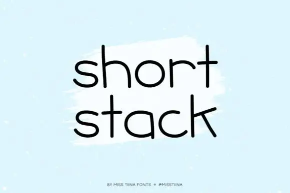
Wide rounded monoline letters
Short Stack is a wide rounded monoline hand in black on pale blue: broad open letters with round terminals, a low x-height and a generous spacing that makes two short words fill a square.
Ideas for this font
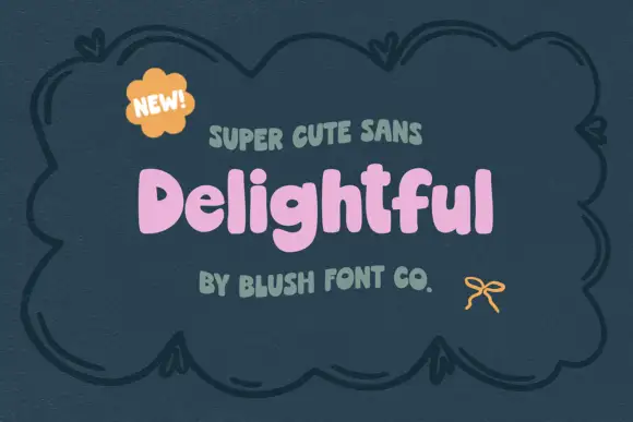
Chunky soft mixed case with uneven shoulders and a rounded g descender
Delightful shows a small pink mixed-case title inside a dark drawn frame, where broad irregular strokes form soft rounded bowls, the e opens compactly and a curved g drops below a lowercase row whose h and l rise above it.
Ideas for this font
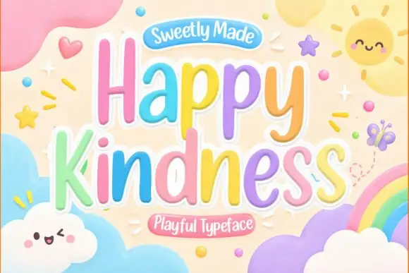
Playful rounded lettering with a bouncy baseline and soft glow
Happy Kindness is a playful rounded alphabet in which the letters bounce along an uneven baseline, the strokes stay soft and each word carries a pale glow, so a greeting reads as a sticker set made for a classroom wall.
Ideas for this font
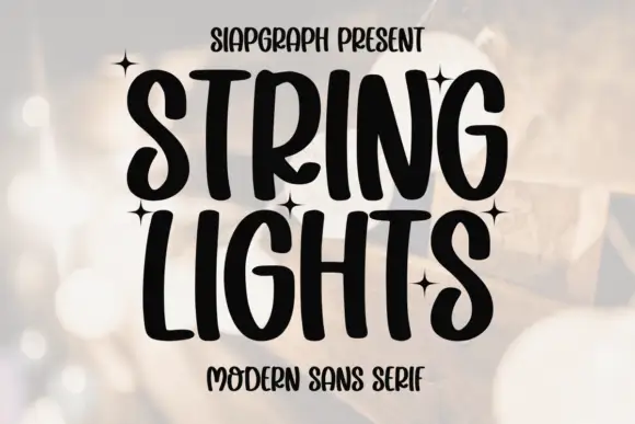
Heavy irregular handwritten caps
String Lights is a heavy irregular handwritten face in black over a blurred warm background: tall caps with soft hooked ends, narrow bowls and uneven heights, set on two lines with small four-point stars scattered between the words and a tracked line beneath.
Same independent foundry
Allow optional Google Analytics to measure visits and catalogue actions. Your search words and notes are not included. Privacy & storage