Neutral Sans Workhorse

Horror Season + Corven
Lets Horror Season own the focal silhouette while handling secondary copy, sizing and subheads cleanly.
Inspect Corven specimenDisclosure: MakerFileHub may earn a commission from qualifying purchases via paid links on this page. How our links work.
Bubble horror letters with faces and webs
Horror Season mixes puffy capitals with melting lower edges and face-shaped counters, where webs, cracks and small creature details appear inside selected letter bodies and the title is multicoloured with a heavy outline.
Paid link
Get this fontProject & layout blueprintsAt-a-glance maker compatibility
Sturdy stroke walls and open counters weed cleanly on adhesive vinyl, HTV apparel film, and cut cardstock.
Visual anatomy & craft review
The bodies stay puffy, the bottoms melt away, several counters turn into faces and the outlines stack in bright colours. That face-shaped counter is the character: the word becomes a picture without a separate illustration, which is why the cover adds webs and cracks around a two-row title. The bonus graphics are advertised rather than inspected, so confirm which details actually sit inside the glyphs, test a plain single-colour version first and keep 40 pt before the faces blur. The melting bottoms are the first thing to go: they pool into the outline at small sizes and the face-shaped counters plug, so a single-colour flat version is the only reliable cut for a shirt or a bag. Set the faces at 40 pt and above, and proof one print.
Bubble · Faces · Melting
Two-font hierarchy recipes
Tested contrast partners — pairing Horror Season with grounded secondary typography.
Horror Season + Corven
Lets Horror Season own the focal silhouette while handling secondary copy, sizing and subheads cleanly.
Inspect Corven specimen
Horror Season + Lumera Editorial
Grounds bold display lettering with classic typographic authority on posters, badges and apparel.
Inspect Lumera Editorial specimenPractical applications
Concrete hierarchy, scale and production guidance tailored to Horror Season’s stroke geometry.
The bubble horror letters set a playful party poster, and the face counters read at 48 pt on an A3 sheet, where the melting edges stay visible.
Hierarchy & layout recipe
Print an A3 poster: set the title at 48 pt over two rows, keep 20 mm of clear ground between them, and keep 22 mm of margin so the melting edges stay inside.
Pre-production check
Faces inside the counters vanish under 30 pt; check the proof and hold the title at 42 pt or above.
The puffy letters suit a small bag, and the web details stay visible at 24 pt on a 45 mm label, where the outline keeps the shape readable.
Hierarchy & layout recipe
Print a 45 by 35 mm label: set the word at 24 pt on one row, keep 8 mm of clear ground beneath for the melting edge, and keep 5 mm of border on all four sides.
Pre-production check
Two colours plus an outline muddy at label size; check the plate proof and drop to one ink.
The bubbly horror face keeps a birthday playful, and the melting edges hold a short greeting at 30 pt on an A6 sheet, where the faces stay legible.
Hierarchy & layout recipe
Print an A6 card: set the greeting at 30 pt on one row, keep 16 mm of clear ground beneath for the melt, and set the details at 11 pt in a rounded sans.
Pre-production check
Stacked outlines printed small close the counters; check the card and keep the greeting at 28 pt or above.
Technical & licence verification
Confirm included OTF/TTF/WOFF formats, full glyph tables and licence coverage on the live store page before batch production.
Closest visual alternatives
Matched across letterform anatomy, stroke behaviour and craft applications.
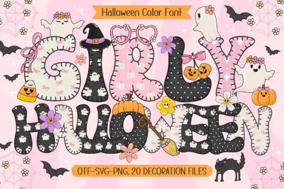
Rounded patchwork letters with pink motifs and small Halloween figures
Girly Halloween sets fat colour capitals in two treatments — cream with tiny black ghosts, and black with white dots — and dresses every letter with a bow, a flower, a pumpkin or a friendly ghost.
Ideas for this font
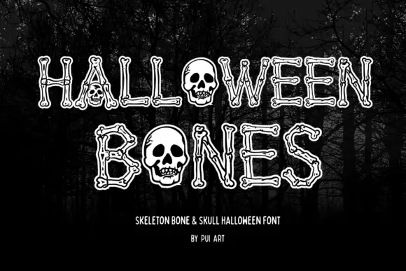
Narrow outlined capitals constructed from bone shapes with skulls replacing O forms
Halloween Bones sets pale outlined capitals against a dark forest, where long bone-like strokes end in small rounded joints and carry thin inner contours, and large skulls replace the O forms while the trees supply the scene behind the word.
Ideas for this font
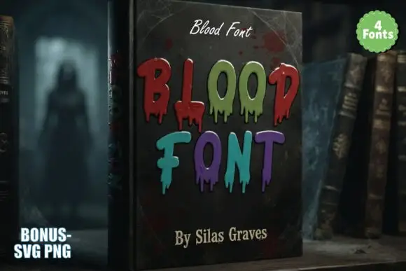
Tall irregular horror capitals with thin hanging drips and mixed colours
Blood is a decorative horror set in which narrow upright letters keep soft corners, thin drips hang unevenly from the lower edges and the words are drawn in mixed dark reds, greens and violets, so a heading reads as lettering running down a page.
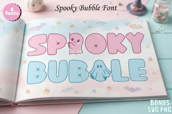
Pastel bubble display with cross counters
Spooky Bubble is a pastel colour display on a photograph of a book: fat rounded capitals in pink and pale blue with cross-shaped counters, a small ghost standing in for one letter and another ghost drawn inside a bowl, set in two lines with bats, candy and stars scattered around and a badge in the corner that names four fonts.
Ideas for this font
Same independent foundry
Allow optional Google Analytics to measure visits and catalogue actions. Your search words and notes are not included. Privacy & storage