Neutral Sans Workhorse

Blood + Saltriver Grotesk
Lets Blood own the focal silhouette while handling secondary copy, sizing and subheads cleanly.
Inspect Saltriver Grotesk specimenDisclosure: MakerFileHub may earn a commission from qualifying purchases via paid links on this page. How our links work.
Tall irregular horror capitals with thin hanging drips and mixed colours
Blood is a decorative horror set in which narrow upright letters keep soft corners, thin drips hang unevenly from the lower edges and the words are drawn in mixed dark reds, greens and violets, so a heading reads as lettering running down a page.
Paid link
Get this fontProject & layout blueprintsAt-a-glance maker compatibility
Sturdy stroke walls and open counters weed cleanly on adhesive vinyl, HTV apparel film, and cut cardstock.
Visual anatomy & craft review
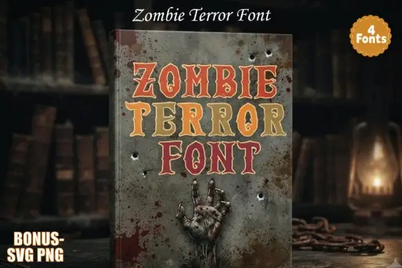
The B closes two narrow bowls inside a tall silhouette, the O keeps a tall narrow counter against a broad outer bowl, the D and F carry thin hanging drips at different lengths and the colours shift between words rather than within them. The drips are the defining detail, which is why the sample leaves a clear band beneath the heading instead of crowding another line against it. Because the drips are thin, the face wants 34 pt before they read and tips under 3 mm fill in on a screen; the multi-colour look is a palette choice, not automatic layers. The book mockup is artwork; the dripping letters are the face.
Horror · Dripping · Irregular
Two-font hierarchy recipes
Tested contrast partners — pairing Blood with grounded secondary typography.
Blood + Saltriver Grotesk
Lets Blood own the focal silhouette while handling secondary copy, sizing and subheads cleanly.
Inspect Saltriver Grotesk specimen
Blood + The Simple Editorial
Grounds bold display lettering with classic typographic authority on posters, badges and apparel.
Inspect The Simple Editorial specimenPractical applications
Concrete hierarchy, scale and production guidance tailored to Blood’s stroke geometry.
The drips set the genre, and the tall narrow letters keep a two-word title readable at 80 pt with a clear band left beneath them.
Hierarchy & layout recipe
Print an A5 cover: set the title at 80 pt across the upper third, keep 24 mm of clear cover beneath the longest drip, and set the author at 10 pt in a caps at the foot.
Pre-production check
A subtitle set under the drips reads as part of the title; check the cover and keep 22 mm of clear ground below the block.
The tall forms hold on fabric, and the heavy silhouettes stay solid at 70 mm across a printed chest in two flat inks on cotton.
Hierarchy & layout recipe
Print a 280 mm chest print: set the title at 70 mm, keep every drip at 4 mm wide minimum, and keep 45 mm of clear shirt beneath the drips for the address line.
Pre-production check
Thin drips break in a screen print; check the film at full size and thicken the drip rather than the letter.
The narrow shapes cut into a simple sticker, and the drips stay whole at 28 mm on a shaped die laid over a pale backing sheet.
Hierarchy & layout recipe
Print a 50 mm shaped sticker: set the word at 28 mm, keep 4 mm of clear vinyl beyond the longest drip, and keep 6 mm between the drips so the die cuts stay separate.
Pre-production check
Two drips closer than 5 mm share a cut line; check the sheet and open the spacing by 2 mm before cutting.
Technical & licence verification
Confirm included OTF/TTF/WOFF formats, full glyph tables and licence coverage on the live store page before batch production.
Closest visual alternatives
Matched across letterform anatomy, stroke behaviour and craft applications.
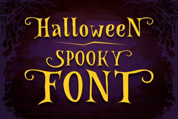
Narrow spooky serifs with curled ends
Halloween Spooky shows tall high-contrast letters with pointed serif tips and long curling terminals, and the enlarged F and T extend horizontally across the lowest word of the composition.
Ideas for this font
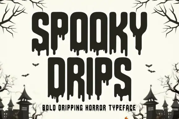
Bold dripping horror display
Spooky Drips is a bold dripping display in near-black on a bone ground: very heavy condensed letters with long viscous drips running from the baseline and the counters, flat terminals and a squared top, framed by bare branches and a row of haunted houses along the foot.
Ideas for this font
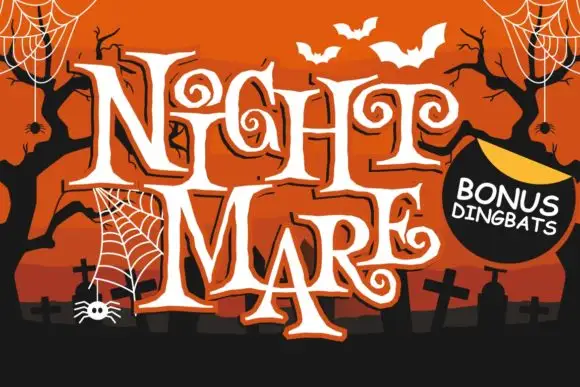
Angular spiral-terminal horror serif
Night Mare is an angular decorative serif in which the letters stay uneven, the feet come to points and the terminals coil inward in tight spirals, so a stacked title reads as gothic horror lettering rather than a clean historical blackletter.
Ideas for this font
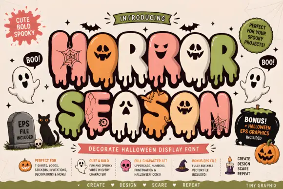
Bubble horror letters with faces and webs
Horror Season mixes puffy capitals with melting lower edges and face-shaped counters, where webs, cracks and small creature details appear inside selected letter bodies and the title is multicoloured with a heavy outline.
Ideas for this font
Same independent foundry
Allow optional Google Analytics to measure visits and catalogue actions. Your search words and notes are not included. Privacy & storage