Editorial Serif Anchor

Angela Flower + The Simple Editorial
Anchors Angela Flower's fluid strokes with crisp Roman proportions on wedding suites, headers and packaging.
Inspect The Simple Editorial specimenDisclosure: MakerFileHub may earn a commission from qualifying purchases via paid links on this page. How our links work.
Rounded connected handwriting with small looped r
Angela Flower shows thick smooth strokes with softly rounded terminals, where the g drops low, the f makes a small loop and the r turns through a tight upper loop.
Paid link
Get this fontProject & layout blueprintsAt-a-glance maker compatibility
Weld or Unite overlapping script joins into one continuous vector path before sending to the blade.
Visual anatomy & craft review
The strokes stay thick and even, the joins stay closed, the terminals round off and two small letters carry loops that keep the word lively. That tight r loop is the character: a friendly script gains a small distinction that survives at a modest size, which is why the sample keeps the phrase short. Because the g drops low, keep 18 mm beneath from 26 pt, and check that the looped forms appear in the letters your phrase actually uses.
Rounded · Connected · Looped r
Two-font hierarchy recipes
Tested contrast partners — pairing Angela Flower with grounded secondary typography.
Angela Flower + The Simple Editorial
Anchors Angela Flower's fluid strokes with crisp Roman proportions on wedding suites, headers and packaging.
Inspect The Simple Editorial specimen
Angela Flower + Montreal
Keeps small-scale dates, URLs, nutrition facts and care instructions crisp and legible below script titles.
Inspect Montreal specimenPractical applications
Concrete hierarchy, scale and production guidance tailored to Angela Flower’s stroke geometry.
The rounded script suits a florist's label, and the thick joins hold a two-word name at 24 pt on a 55 mm panel, where the loops stay open.
Hierarchy & layout recipe
Print a 55 by 40 mm label: set the shop name at 24 pt on one row, keep 8 mm of clear ground beneath for the g, and set the street at 6 pt in a plain sans at the foot.
Pre-production check
Fine joins printed at 16 pt close into a line; check the plate proof and hold the name at 22 pt or above.
The connected hand keeps a note warm, and the smooth strokes stay legible at 26 pt on an A6 card, where the small loops add life without clutter.
Hierarchy & layout recipe
Print an A6 card: set the line at 26 pt across the upper third, keep 16 mm of clear ground beneath for the descender, and leave the lower half free for a written message.
Pre-production check
A thick script used for a whole paragraph tires the eye; check the card and keep the face for the heading.
The rounded script suits an informal invitation, and the closed joins hold a pair of names at 28 pt on heavy card, where the looped r finishes the row.
Hierarchy & layout recipe
Print a 105 by 148 mm card: set the couple's names at 28 pt on one row, keep 18 mm of clear ground beneath, and set the date at 9 pt in a plain serif below.
Pre-production check
Two script names sharing one row need space around the ampersand; check the card and open 4 mm on both sides.
Technical & licence verification
Confirm included OTF/TTF/WOFF formats, full glyph tables and licence coverage on the live store page before batch production.
Closest visual alternatives
Matched across letterform anatomy, stroke behaviour and craft applications.

Smooth thick monoline cursive with a long entry and a lifted exit
Honey is a smooth thick monoline cursive in which every stroke is the same weight, the entry comes in from the left and the exit lifts at the tip to the right.
Ideas for this font
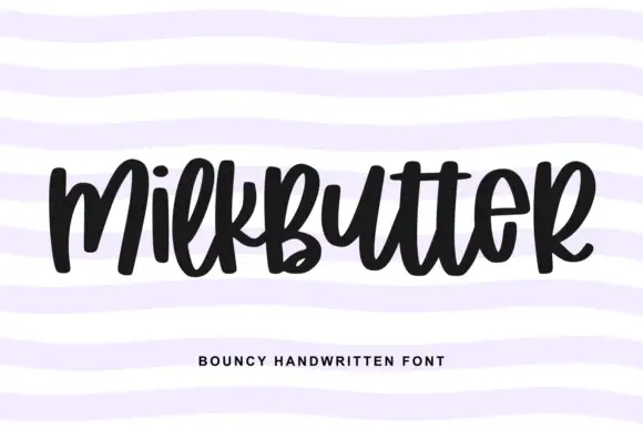
Bouncy fat handwriting with a tall waist
Milkbutter is a bouncy handwritten face in black on white: fat rounded letters with a tall waist, stems that lean and lift, and a baseline that rises and falls across the word, shown over soft lilac wavy bands.
Ideas for this font
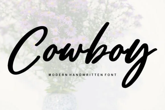
Smooth slanted brush-marker script with heavy joins and blunt ends
Cowboy is a smooth slanted brush-marker script in which every stroke is heavy and even, the joins are as thick as the letters and the ends are blunt rather than tapered.
Ideas for this font
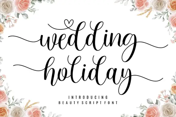
Brush script with a heart flourish
Wedding Holiday is a brush script in black on white: thick connected letters with high contrast at the joins, tall loops on the ascenders and a small heart drawn into the flourish above the first word, framed by peach roses.
Ideas for this font
Same independent foundry
Allow optional Google Analytics to measure visits and catalogue actions. Your search words and notes are not included. Privacy & storage



