Neutral Sans Workhorse

Dreadmoor + Prime Nordic
Lets Dreadmoor own the focal silhouette while handling secondary copy, sizing and subheads cleanly.
Inspect Prime Nordic specimenDisclosure: MakerFileHub may earn a commission from qualifying purchases via paid links on this page. How our links work.
Soft heavy blackletter with curled capitals and uneven rounded bowls
Dreadmoor is a bold medieval display face with rounded blackletter bones, a small set of capitals that behave like initials, and a heavy base line under the word that reads as a shelf.
Paid link
Get this fontProject & layout blueprintsAt-a-glance maker compatibility
Sturdy stroke walls and open counters weed cleanly on adhesive vinyl, HTV apparel film, and cut cardstock.
Visual anatomy & craft review
DREADMOOR fills the middle of the card in cream on a dark wooden ground, the letters fat and rounded where blackletter usually turns sharp, with the stems carrying short hooks at the foot and a few small spurs at the shoulder. Below the capitals a lowercase sample repeats the word at half the size, and beneath that a script line names the style. The whole block sits on a heavy cream rule with arrow terminals, which gives the composition a base and stops the word from floating. A line of small text at the foot explains the face, and a banner at the top marks the year and the studio. Beside the type, a tabby cat in armour sits on a crate, which is the only colour in an otherwise cream and brown palette. It is a display face for fantasy, brewing, tattoo and book covers, and it holds best above 30 pt.
Soft heavy blackletter with curled capitals and uneven rounded bowls
Two-font hierarchy recipes
Tested contrast partners — pairing Dreadmoor with grounded secondary typography.
Dreadmoor + Prime Nordic
Lets Dreadmoor own the focal silhouette while handling secondary copy, sizing and subheads cleanly.
Inspect Prime Nordic specimen
Dreadmoor + Glofi
Grounds bold display lettering with classic typographic authority on posters, badges and apparel.
Inspect Glofi specimenPractical applications
Concrete hierarchy, scale and production guidance tailored to Dreadmoor’s stroke geometry.
The medieval weight names the theme in one word, and the rounded blackletter stays readable at a distance where a sharp gothic cut would turn into spikes.
Hierarchy & layout recipe
Print a 500 by 700 mm board: set the greeting at 92 pt across two rows, keep 28 mm of clear ground beneath before the time at 16 pt, and hold 26 mm of border on all four sides of the board.
Pre-production check
Cream on a dark ground needs a second coat when painted; check one painted sample at arm's length before the board is produced.
The face gives a bottle an old-tavern feel, and the wide rounded caps keep a short brewery name heavy enough to read on a dark shelf.
Hierarchy & layout recipe
Print a 70 by 100 mm label: set the brewery name at 24 pt on one row, keep 9 mm of clear ground beneath before the style at 5.5 pt, and hold 7 mm from the lowest hook to the die line.
Pre-production check
The base rule crowds the descender line; print one label and check the gap before the label order is placed.
The weight holds a long title at thumbnail size where a lighter blackletter disappears, and the medieval tone sits well over photographic covers.
Hierarchy & layout recipe
Print a 130 by 200 mm paperback cover: set the title at 54 pt across two rows, keep 24 mm of clear ground beneath before the author at 12 pt, and hold 16 mm from the widest letter to the trim.
Pre-production check
Cream type over a photograph loses edge; print one cover on the actual board and check the contrast before the run.
Technical & licence verification
Confirm included OTF/TTF/WOFF formats, full glyph tables and licence coverage on the live store page before batch production.
Closest visual alternatives
Matched across letterform anatomy, stroke behaviour and craft applications.
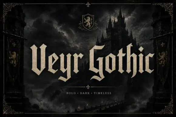
Angular blackletter with paired tips
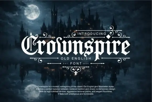
Veyr Gothic is an angular blackletter in bone on a dark castle scene: capitals with paired V tips, low curled tails, sharp joins and a heavy even stroke, set in two words across the middle of the frame with a small line above and a tracked line beneath a divider.
Ideas for this font
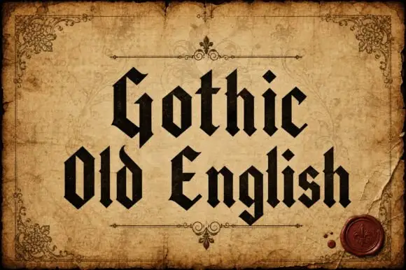
Upright broken-stroke blackletter with diamond dots
Gothic Old English is a classic textura blackletter in mixed case, with dense vertical strokes, diamond feet and a rhythm that reads as print rather than as lettering.
Ideas for this font
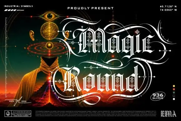
Outlined ornamental blackletter
Magic Round is an outlined ornamental blackletter in white on a dark illustrated scene: letters traced with a double line and filled with a diamond lattice, with huge swashes that sweep beneath and between the words, set in two lines above a landscape of a hooded figure, an eye and a volcano, with small technical marks at the corners.
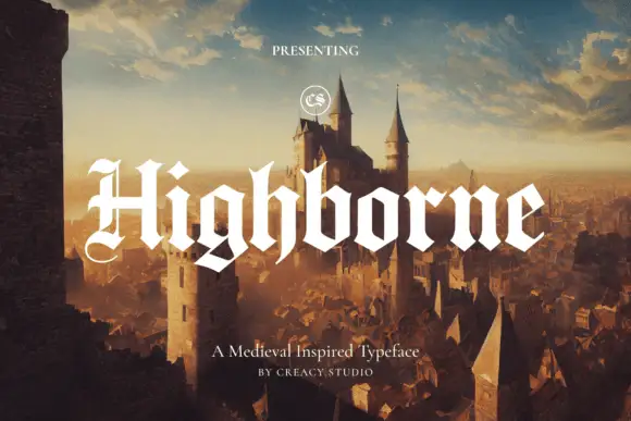
Solid blackletter with divided H and pointed angular shoulders
Highborne sets a solid blackletter across a painted castle town, its strokes rising into sharp peaks, the shoulders angled into points and the first capital divided down the middle.
Same independent foundry
Allow optional Google Analytics to measure visits and catalogue actions. Your search words and notes are not included. Privacy & storage