Modern Grotesque Body

Thimes Christmas + Borsen
Creates crisp high-hierarchy contrast beneath Thimes Christmas headlines across menus, websites and labels.
Inspect Borsen specimenDisclosure: MakerFileHub may earn a commission from qualifying purchases via paid links on this page. How our links work.
High-contrast display serif
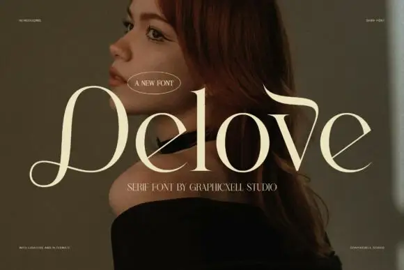
Thimes Christmas is a high-contrast display serif in cream over a warm portrait photograph: very fine hairlines, tall stems, sharp bracketed serifs and small ball terminals, set in two lines with tracked labels at the corners naming the studio and the language support.
Paid link
Get this fontProject & layout blueprintsAt-a-glance maker compatibility
Crisp hairline serifs shine on stationery, foil stamping, and packaging; add slight offset for small decals.
Visual anatomy & craft review
The two words are stacked and the drawing is a contrasted serif: the stems are tall, the hairlines are fine, and the serifs are sharp with a small bracket, which gives the block its elegance at a large size. The plate sets the type over a portrait in warm light, which is a realistic test: the cream has to hold against a mid-tone image, and the specimen keeps the type over the calmest area. The tracked labels at the corners are set in a light sans at a fraction of the size, which keeps the plate from becoming a single-family exercise. Because the hairlines are fine, the face works at display sizes and on a dark or mid-tone ground, which the plate shows honestly.
Serif, contrasted, elegant, editorial
Two-font hierarchy recipes
Tested contrast partners — pairing Thimes Christmas with grounded secondary typography.
Thimes Christmas + Borsen
Creates crisp high-hierarchy contrast beneath Thimes Christmas headlines across menus, websites and labels.
Inspect Borsen specimen
Thimes Christmas + Stylish
Adds a warm human signature touch for 1-to-3-word callouts without competing against structured serif capitals.
Inspect Stylish specimenPractical applications
Concrete hierarchy, scale and production guidance tailored to Thimes Christmas’s stroke geometry.
A high-contrast serif gives a seasonal card formality, and the fine hairlines read against a warm ground where a heavier face would look plain.
Hierarchy & layout recipe
A6 card: the greeting at 28 pt, the details in a 9 pt serif, and a 3 mm border. Keep 12 mm margins and print cream on a warm dark card so the hairlines stay visible.
Pre-production check
Check the 28 pt greeting, where a hairline can break at home-print resolution; keep it above 0.4 mm. Confirm the 9 pt details keep a 4.5:1 contrast and that the border clears the descenders.
A contrasted serif gives a gift-book cover its weight, and the fine letterforms let a photograph show through the title rather than hiding it.
Hierarchy & layout recipe
Set the title at 95 mm cap height across 210 mm, the subtitle in a 12 pt serif, and the editor at 9 pt. Print cream over a photograph and keep the title in the upper half.
Pre-production check
Check the title at thumbnail size, where the hairlines can disappear; keep the ground behind it dark. Confirm the 9 pt editor survives lamination and that the title clears the trim by 10 mm.
A contrasted serif keeps a menu elegant, and the fine construction holds on a heavy card where a script would look out of season.
Hierarchy & layout recipe
A5 menu: the heading at 24 pt, the courses at 9.5 pt with 15 pt leading, and the date at 8 pt. Keep 22 mm margins and letterpress one ink on a cream card.
Pre-production check
Check the 9.5 pt courses in letterpress, where hairlines can sink; proof on the stock. Confirm the heading reads across the table and that the date clears the trim by 10 mm.
Technical & licence verification
Confirm included OTF/TTF/WOFF formats, full glyph tables and licence coverage on the live store page before batch production.
Closest visual alternatives
Matched across letterform anatomy, stroke behaviour and craft applications.
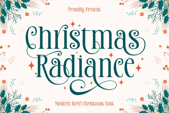
Tall Christmas serif with spiral terminals and fine bracketed serifs
Christmas Radiance is a tall festive serif in which the capitals finish in spiral terminals, the serifs are fine and bracketed and the proportions run narrow, so a greeting reads as an engraved seasonal plate.
Ideas for this font
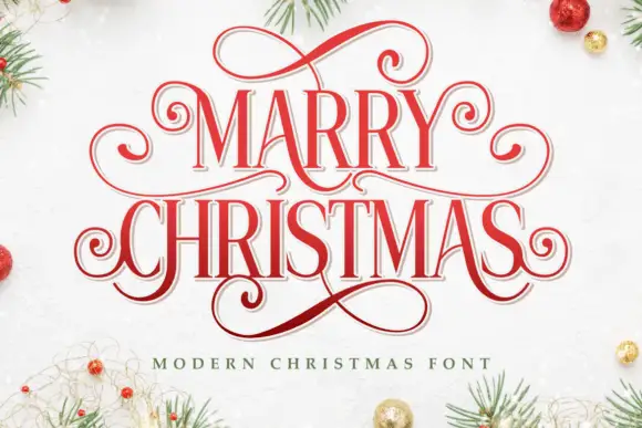
Narrow festive serifs with tall proportions and extended curled loops
Marry Christmas is a narrow festive serif in which the letters run tall and lean, the capitals carry extended loops and the descenders curl into long tails, so a greeting reads as an engraved seasonal plate.
Ideas for this font
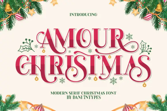
Festive high-contrast serifs with curling extensions
Amour Christmas shows tall serif capitals with curled entry strokes and long sweeping tails in a shaded red with a pale offset edge, where the R, C and S forms extend well beyond their main letter bodies and small hanging ornaments sit around the title on a cream field framed by fir.
Ideas for this font
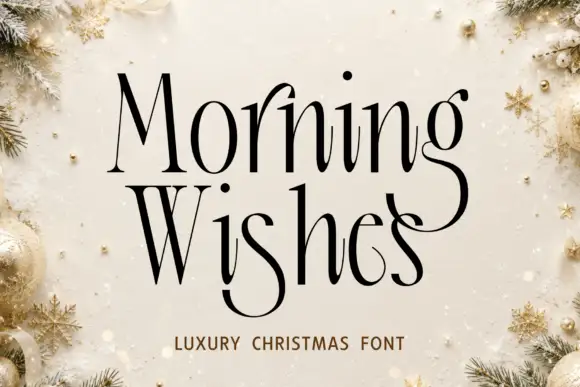
Tall narrow mixed case with deep curled descenders and hairline serifs
Christmas Morning Wishes is a tall narrow serif in which the letters run high and thin, the serifs are hairlines and the descenders curl into deep open loops that sit below the line.
Ideas for this font
Same independent foundry
Allow optional Google Analytics to measure visits and catalogue actions. Your search words and notes are not included. Privacy & storage