Modern Grotesque Body

Welcome Christmas + Bargain Condensed
Creates crisp high-hierarchy contrast beneath Welcome Christmas headlines across menus, websites and labels.
Inspect Bargain Condensed specimenDisclosure: MakerFileHub may earn a commission from qualifying purchases via paid links on this page. How our links work.
Compact festive serif with curled capitals
Welcome Christmas is a compact festive serif in red and green on cream: tall capitals with curled terminals, a spur on the W, a swashed C and small drawn holly between the two lines.
Paid link
Get this fontProject & layout blueprintsAt-a-glance maker compatibility
Sturdy stroke walls and open counters weed cleanly on adhesive vinyl, HTV apparel film, and cut cardstock.
Visual anatomy & craft review
The greeting is set on two staggered lines, the red word above and the green word below, and both are the same capital face: the W carries a curl at the top of each stroke, the E has a curled middle bar, the C closes with a small swash and the S finishes with a spur, so a plain serif becomes a seasonal one through ornament rather than through colour. The letters are narrow and tightly spaced, which lets nine letters fit a greeting width, and the block is framed by a drawn border of holly, berries and small stars in the corners. Two tracked captions fill the upper and lower edges. The face is a display serif for holiday cards, labels and shop signage, and it is best set in one rich ink at a size where the curls still read; the greeting itself carries the season, so the face does not need a second decorative font.
A warm serif with curled terminals for the season
Two-font hierarchy recipes
Tested contrast partners — pairing Welcome Christmas with grounded secondary typography.
Welcome Christmas + Bargain Condensed
Creates crisp high-hierarchy contrast beneath Welcome Christmas headlines across menus, websites and labels.
Inspect Bargain Condensed specimen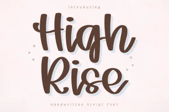
Welcome Christmas + High Rise
Adds a warm human signature touch for 1-to-3-word callouts without competing against structured serif capitals.
Inspect High Rise specimenPractical applications
Concrete hierarchy, scale and production guidance tailored to Welcome Christmas’s stroke geometry.
A curled serif in one ink gives a card its seasonal tone without a second decorative face, and the compact width fits a long greeting on a small card.
Hierarchy & layout recipe
Print a 120 by 120 mm square card: set the greeting at 30 pt over two lines, keep 14 mm of clear ground beneath before the message at 9.5 pt, and hold 13 mm of margin on all sides.
Pre-production check
Curled terminals can collide across lines; print one card at the finished size and check the two lines before the batch.
A small box label needs a face that reads at fifteen points, and the narrow capitals keep a long greeting inside a short die.
Hierarchy & layout recipe
Print a 60 by 40 mm label: set the greeting at 13 pt on one line, keep 5 mm of clear ground beneath before the name at 6 pt, and hold 4 mm of margin on all sides.
Pre-production check
Small curls fill in on kraft stock; print one label on the real material and check the ornaments before the order.
A shop window needs one line that reads from the pavement, and a curled serif in a warm ink says the season without tinsel.
Hierarchy & layout recipe
Print an A2 window poster: set the greeting at 90 pt over two lines, keep 26 mm of clear ground beneath before the opening hours at 14 pt, and hold 20 mm of margin on all sides.
Pre-production check
A dark ink on glass can look thin under daylight; print one sheet at the final size and check the weight from outside before the run.
Technical & licence verification
Confirm included OTF/TTF/WOFF formats, full glyph tables and licence coverage on the live store page before batch production.
Closest visual alternatives
Matched across letterform anatomy, stroke behaviour and craft applications.
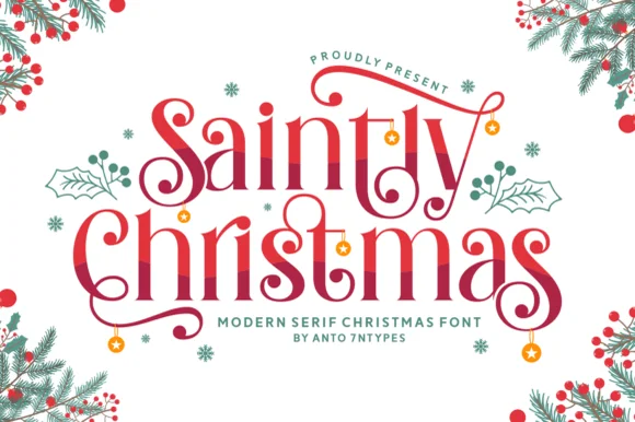
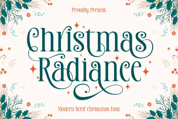
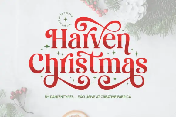
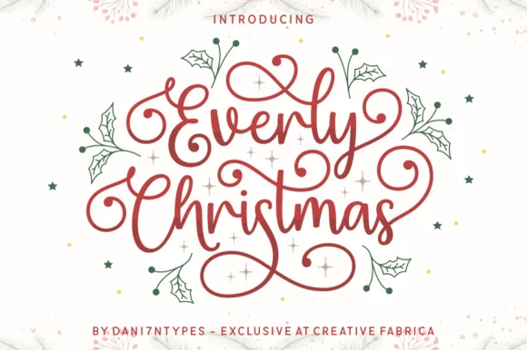
Swashed romantic holiday display serif with dangling ornaments
Saintly Christmas is a festive display serif in which the capitals throw long swashes, the serifs are fine and small ornaments hang from the ends, so a greeting reads as a decorated holiday plate.
Ideas for this font
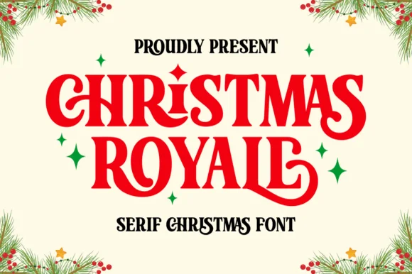
Ornate Christmas serif with curled stems and sparkle ornaments
Christmas Royale is an ornate serif display in which the stems curl at the foot, a few letters carry a dropped swash and the bars hold drawn diamonds, so a two-word greeting reads as engraved seasonal stationery.
Ideas for this font

Narrow festive serifs with tall proportions and extended curled loops
Marry Christmas is a narrow festive serif in which the letters run tall and lean, the capitals carry extended loops and the descenders curl into long tails, so a greeting reads as an engraved seasonal plate.
Ideas for this font
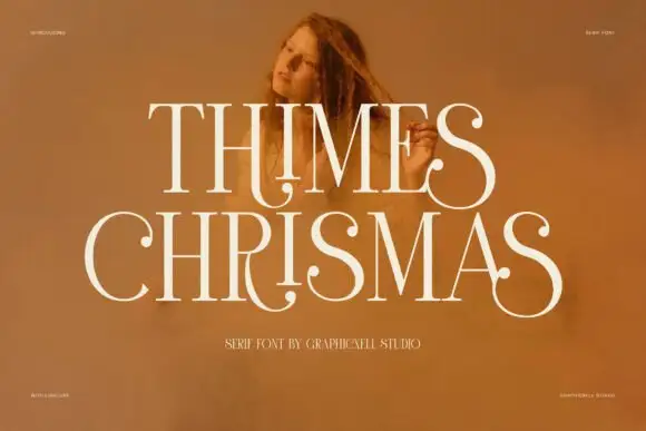
High-contrast display serif
Thimes Christmas is a high-contrast display serif in cream over a warm portrait photograph: very fine hairlines, tall stems, sharp bracketed serifs and small ball terminals, set in two lines with tracked labels at the corners naming the studio and the language support.
Ideas for this font
Same independent foundry
Allow optional Google Analytics to measure visits and catalogue actions. Your search words and notes are not included. Privacy & storage