Modern Grotesque Body

Handmade + Bareum
Creates crisp high-hierarchy contrast beneath Handmade headlines across menus, websites and labels.
Inspect Bareum specimenDisclosure: MakerFileHub may earn a commission from qualifying purchases via paid links on this page. How our links work.
Bold slab serif with a cracked fill and a matching outline style
Handmade Blackcraft is a bold slab serif that ships solid and outlined, in which the solid cut carries a cracked fill and the outline keeps the same square serifs, so a word can be dense or drawn as a contour.
Paid link
Get this fontProject & layout blueprintsAt-a-glance maker compatibility
Sturdy stroke walls and open counters weed cleanly on adhesive vinyl, HTV apparel film, and cut cardstock.
Visual anatomy & craft review
The H sets two wide stems with a heavy bar, the A carries a low crossbar, the N keeps two stems and a thick diagonal, the D fills its counter and the E stacks three arms, all at a bold slab weight with square serifs; the outline cut follows the same contour at a constant width. The two cuts are the character: the sample stacks solid above outline in one card, which lets a short word carry weight without a second colour. Both cuts hold from 28 pt upward, and the textured fill needs a smooth sheet to stay readable. The rounded frame, the three sample lines and the small caption are presentation; the black and outlined words are the face.
Slab · Textured · Outline
Two-font hierarchy recipes
Tested contrast partners — pairing Handmade with grounded secondary typography.
Handmade + Bareum
Creates crisp high-hierarchy contrast beneath Handmade headlines across menus, websites and labels.
Inspect Bareum specimen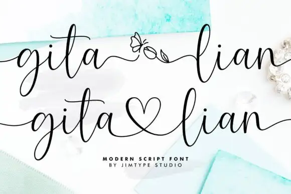
Handmade + Gita Lian
Adds a warm human signature touch for 1-to-3-word callouts without competing against structured serif capitals.
Inspect Gita Lian specimenPractical applications
Concrete hierarchy, scale and production guidance tailored to Handmade’s stroke geometry.
The solid and outline cuts give a label a hierarchy in one ink, and the bold slabs hold a maker's name at 20 pt on kraft.
Hierarchy & layout recipe
Print a 70 by 45 mm label: set the shop name at 20 pt in the solid cut, set the product line at 12 pt in the outline cut beneath, and keep 5 mm from the die so the square serifs stay whole.
Pre-production check
An outline at 12 pt on a kraft label closes up; check the printed label and keep the outline line at 1 mm or wider.
The slab weight reads across an aisle, and the paired cuts let one board carry a title and a subtitle at 90 mm and 40 mm.
Hierarchy & layout recipe
Print an A2 board: set the title at 90 mm in the solid cut, set the subtitle at 40 mm in the outline cut beneath, and keep 30 mm of clear ground between the two blocks.
Pre-production check
A textured fill printed beside an outline looks inconsistent at distance; check the board and keep the texture off the subtitle.
The bold slab holds a section head, and the outline cut gives the running theme a lighter second line at 64 pt and 40 pt.
Hierarchy & layout recipe
Print an A4 spread: set the section head at 64 pt in the solid cut, set the question line at 40 pt in the outline cut beneath, and keep 16 mm of clearance above the body copy.
Pre-production check
An outlined line printed over body text looks crowded; check the proof and keep 16 mm of clear space under it.
Technical & licence verification
Confirm included OTF/TTF/WOFF formats, full glyph tables and licence coverage on the live store page before batch production.
Closest visual alternatives
Matched across letterform anatomy, stroke behaviour and craft applications.

Layered varsity capitals with an inline stroke and outlined numbers
Varsity Spirit is a layered varsity capital alphabet in which each letter carries an inline stroke, a keyline and a set of matching numerals, so a team name reads as the appliqué on a college jacket.
Ideas for this font
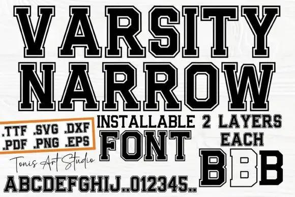
Narrow outlined varsity slabs with clipped corners and an inner border
Varsity Narrow is a narrow athletic slab in which the capitals compress, the corners clip, the O turns an octagonal counter and a fine inner border runs inside the letter, so a long team name fits a narrow board.
Ideas for this font
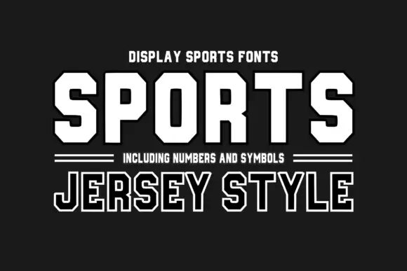
Octagonal sports display with number set
Sports Jersey Style is an octagonal sports display in white on charcoal: heavy caps with cut corners, a flat apex and closed counters, offered solid and outlined, with a double hairline rule, a subtitle in small caps and a note about the numbers and symbols in the family.
Ideas for this font
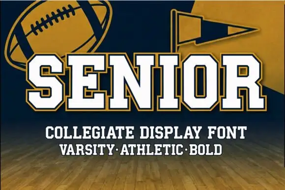
Two-layer varsity block with a gold border
Senior is a varsity block built as two layers: white letterforms inside a gold border on navy, with a football and a pennant beside the word and a slab subtitle beneath.
Ideas for this font
Same independent foundry
Allow optional Google Analytics to measure visits and catalogue actions. Your search words and notes are not included. Privacy & storage