High-Contrast Display Serif

Embrace Mother's + Aureline
Pairs sculptural editorial warmth with Embrace Mother's's clean modern geometry.
Inspect Aureline specimenDisclosure: MakerFileHub may earn a commission from qualifying purchases via paid links on this page. How our links work.
Fine slanted script with long flowing joins
Embrace Mothers is a fine slanted script in which the joins are as long as the letters they connect, so a phrase reads as one continuous flowing line with a light, even pressure throughout.
Paid link
Get this fontProject & layout blueprintsAt-a-glance maker compatibility
Weld or Unite overlapping script joins into one continuous vector path before sending to the blade.
Visual anatomy & craft review
The capital E opens with a loop above the cap line that curls back toward the left before the stem drops, and that loop is the tallest element in the line. The m and the b keep narrow bowls with high shoulders, and the joins between words are drawn long and low, passing under the x-height so the letters appear to float above a continuous thread. Weight is thin but never hairline: each downstroke holds a consistent width while the turns ease off slightly, which keeps the face printable at small sizes. The final s closes with a long flat exit, and the descenders on the p and the g are short straight strokes with a shallow hook. Ends taper only at the very tip. The soft photographic background and the tracked caps labels are presentation; the script is the phrase.
Fine · Slanted · Flowing
Two-font hierarchy recipes
Tested contrast partners — pairing Embrace Mother's with grounded secondary typography.
Embrace Mother's + Aureline
Pairs sculptural editorial warmth with Embrace Mother's's clean modern geometry.
Inspect Aureline specimen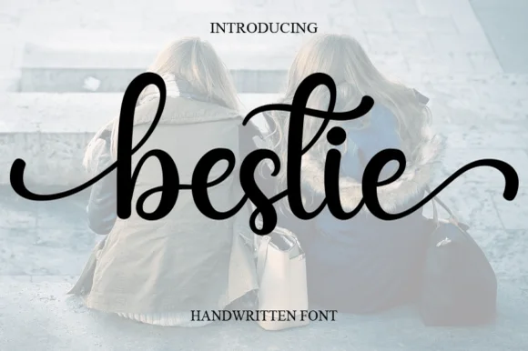
Embrace Mother's + Bestie
Introduces organic movement on pull-quotes, signatures and gift tags.
Inspect Bestie specimenPractical applications
Concrete hierarchy, scale and production guidance tailored to Embrace Mother's’s stroke geometry.
A fine flowing script carries a short personal phrase with warmth and without the heaviness of a display face, and the long joins keep three words on one line without a break.
Hierarchy & layout recipe
Set the phrase at 18 pt on a 120 mm square card, keep the sender's name in the same face at 11 pt below, and leave 15 mm of white above so the capital's entry loop sits clear of the printed edge.
Pre-production check
A fine script on a card that will be handled needs some ink weight; check the proof in daylight and increase the size to 20 pt rather than thickening the joins.
The flowing joins let a short thanks line sit above a handwritten message without taking up the space the message needs, and the light pressure keeps the printed card from competing with the writing.
Hierarchy & layout recipe
Set the greeting at 16 pt on a 105 by 148 mm card, reserve 70 mm for handwriting, and keep the couple's names in the same face at 10 pt at the foot of the card.
Pre-production check
A printed card that is written on with a ballpoint needs a lighter printed line; print one card, write on it, then decide whether the greeting goes lighter or the size comes up.
A fine slanted script on a small label reads as a person's handwriting rather than a brand system, which is what a soap maker selling at a market is trying to signal, and the long joins keep a longer name on one line.
Hierarchy & layout recipe
Set the maker's name at 10 pt on a 35 by 65 mm label, keep the scent and weight in a narrow sans at 5 pt, and leave the lower third of the label blank so the script is not crowded by regulations text.
Pre-production check
Small labels are usually printed on a roll where registration drifts; check the second impression in the run and hold the fine joins at least 0.3 mm wide before approving it.
Technical & licence verification
Confirm included OTF/TTF/WOFF formats, full glyph tables and licence coverage on the live store page before batch production.
Closest visual alternatives
Matched across letterform anatomy, stroke behaviour and craft applications.
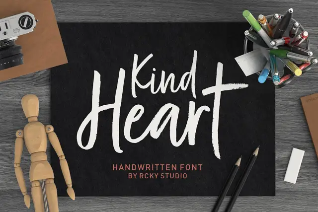
Rough brush title with a handwritten pair
Kind Heart Font Duo pairs a rough-edged brush title with a smaller, calmer handwritten companion, both of them cut with the same angled flat tool.
Ideas for this font
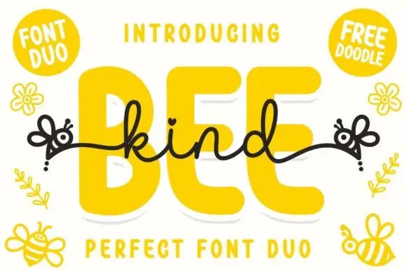
Font duo pairing a fat rounded sans with a monoline connected script
Bee Kind is a two-part family in which a very fat rounded capital sans carries the weight and a monoline script answers it, so a design gets a headline voice and a written line from one purchase.
Ideas for this font
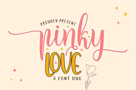
Tall sweeping script with a narrow display companion
Pinky Love is a duo in pink and orange: a tall sweeping script with a white keyline for the first word and a narrow upright display capital for the second, presented on a warm cream ground with drawn sparkles.
Ideas for this font
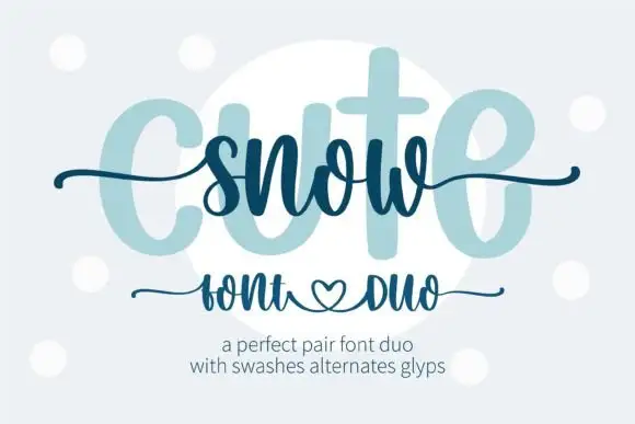
Heavy print and thin swash script
Snow Cute Duo is a pairing in icy blue: a very heavy rounded capital face drawn as a pale ghost, and a thin swash script written across it, with curls and a heart under the caption line.
Ideas for this font
Same independent foundry
Allow optional Google Analytics to measure visits and catalogue actions. Your search words and notes are not included. Privacy & storage



