High-Contrast Display Serif

Snow Cute Duo + Papillon Serif – Elegant Modern Luxury
Pairs sculptural editorial warmth with Snow Cute Duo's clean modern geometry.
Inspect Papillon Serif – Elegant Modern Luxury specimenDisclosure: MakerFileHub may earn a commission from qualifying purchases via paid links on this page. How our links work.
Heavy print and thin swash script
Snow Cute Duo is a pairing in icy blue: a very heavy rounded capital face drawn as a pale ghost, and a thin swash script written across it, with curls and a heart under the caption line.
Paid link
Get this fontProject & layout blueprintsAt-a-glance maker compatibility
Weld or Unite overlapping script joins into one continuous vector path before sending to the blade.
Visual anatomy & craft review
CUTE fills the card in heavy rounded capitals, but it is printed in a pale blue at low contrast so it reads as a backdrop rather than a headline, and Snow is written across its middle in a thin dark script with a long entry curl and an exit that runs out to the right. Beneath them the phrase font duo is written in the same thin script with a heart drawn between the two words and small curls at both ends. The design idea is layering: the heavy capitals supply a shape, the thin script supplies the readable words, and the contrast between the two weights is what makes the card work. The ground is a pale blue with soft white bokeh circles, and two lines of a plain sans at the foot explain the swashes. The duo is for winter cards and packaging: the ghost layer needs to stay pale, and the script needs to remain dark enough to read over it.
A heavy capital over a thin swash script
Two-font hierarchy recipes
Tested contrast partners — pairing Snow Cute Duo with grounded secondary typography.
Snow Cute Duo + Papillon Serif – Elegant Modern Luxury
Pairs sculptural editorial warmth with Snow Cute Duo's clean modern geometry.
Inspect Papillon Serif – Elegant Modern Luxury specimen
Snow Cute Duo + Hello Honey
Introduces organic movement on pull-quotes, signatures and gift tags.
Inspect Hello Honey specimenPractical applications
Concrete hierarchy, scale and production guidance tailored to Snow Cute Duo’s stroke geometry.
A pale ghost layer behind a thin script gives a board depth without a second colour, which is what a winter palette needs.
Hierarchy & layout recipe
Print a 500 by 350 mm board: set the ghost word at 140 pt, set the script across it at 70 pt, keep 22 mm of clear ground beneath before the names at 20 pt, and hold 22 mm of border.
Pre-production check
The pale layer can vanish under venue lighting; print one board at the final size and check the contrast before the set.
Layering a heavy ghost word under a thin script is a cover idea in one purchase, and the pale palette suits a seasonal feature.
Hierarchy & layout recipe
Print a 230 by 300 mm cover: set the ghost word at 110 pt, set the script at 54 pt across it, keep 26 mm of clear ground beneath before the cover lines at 12 pt, and hold 20 mm of margin.
Pre-production check
Low-contrast layering can disappear on newsprint; print one cover on the actual stock and check both layers read before the run.
The pair gives a card a soft layered look without an illustration, and the thin script keeps a seasonal card from becoming heavy.
Hierarchy & layout recipe
Print a 120 by 120 mm square card: set the ghost word at 60 pt, set the script at 32 pt, keep 15 mm of clear ground beneath before the details at 9 pt, and hold 13 mm of margin.
Pre-production check
A thin script over a pale layer needs a dark ink; print one card on the actual machine and check the contrast before the batch.
Technical & licence verification
Confirm included OTF/TTF/WOFF formats, full glyph tables and licence coverage on the live store page before batch production.
Closest visual alternatives
Matched across letterform anatomy, stroke behaviour and craft applications.
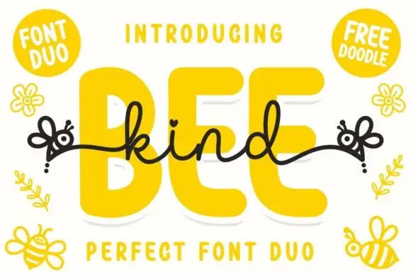
Font duo pairing a fat rounded sans with a monoline connected script
Bee Kind is a two-part family in which a very fat rounded capital sans carries the weight and a monoline script answers it, so a design gets a headline voice and a written line from one purchase.
Ideas for this font
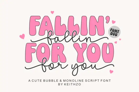
Heavy irregular rounded capitals with a thin linked lowercase script
Fallin for You pairs heavy irregular rounded capitals with a thin linked lowercase script: the script f and l loop high, the y drops low, long side tails curl outward and hearts surround the title.
Ideas for this font
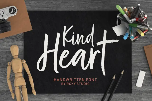
Rough brush title with a handwritten pair
Kind Heart Font Duo pairs a rough-edged brush title with a smaller, calmer handwritten companion, both of them cut with the same angled flat tool.
Ideas for this font
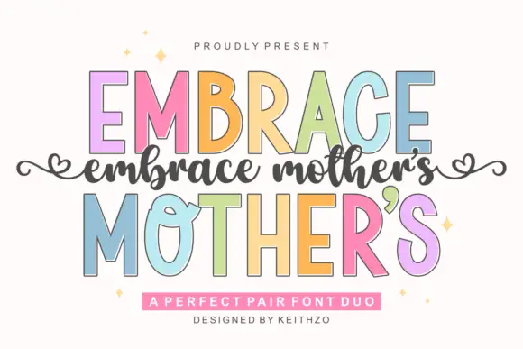
Fine slanted script with long flowing joins
Embrace Mothers is a fine slanted script in which the joins are as long as the letters they connect, so a phrase reads as one continuous flowing line with a light, even pressure throughout.
Ideas for this font
Same independent foundry
Allow optional Google Analytics to measure visits and catalogue actions. Your search words and notes are not included. Privacy & storage