Neutral Sans Workhorse

Monogram Font Family + Homies
Lets Monogram Font Family own the focal silhouette while handling secondary copy, sizing and subheads cleanly.
Inspect Homies specimenDisclosure: MakerFileHub may earn a commission from qualifying purchases via paid links on this page. How our links work.
Floral-packed monogram initial
Monogram Font Family is a single ornate initial in pale blue on black: a broad serif M whose every stroke is packed with curling floral and paisley-like linework, lit with a blue flare at two corners and labelled above with the family name.
Paid link
Get this fontProject & layout blueprintsAt-a-glance maker compatibility
Sturdy stroke walls and open counters weed cleanly on adhesive vinyl, HTV apparel film, and cut cardstock.
Visual anatomy & craft review
This is a monogram system rather than a text face, and the plate shows one letter at a size where the ornament can be read, which is the right choice for a design whose detail is the product. The drawing is a broad serif M filled with dense floral linework, so the letter reads as a decorated panel rather than as a letterform, and the outline stays clean enough to cut or foil. That construction sets a large size floor, because the linework closes when the glyph shrinks, and a buyer should test the smallest intended size. The black ground and the blue flare are staging that gives the pale ornament a glow. It suits a crest, a bookplate and a package mark rather than a heading.
Decorative, monogram, floral, ornate
Two-font hierarchy recipes
Tested contrast partners — pairing Monogram Font Family with grounded secondary typography.
Monogram Font Family + Homies
Lets Monogram Font Family own the focal silhouette while handling secondary copy, sizing and subheads cleanly.
Inspect Homies specimen
Monogram Font Family + The Lumina Awesome
Grounds bold display lettering with classic typographic authority on posters, badges and apparel.
Inspect The Lumina Awesome specimenPractical applications
Concrete hierarchy, scale and production guidance tailored to Monogram Font Family’s stroke geometry.
A packed floral initial gives a couple a crest with real detail, and the clean outline converts to foil or letterpress without redrawing the ornament.
Hierarchy & layout recipe
Set the initial at 55 mm on the invitation, 30 mm on the menu and 18 mm on a favour tag, in one ink. Keep the finest floral line above 0.35 mm and hold 8 mm clear space around the letter.
Pre-production check
Check the 18 mm tag, where the floral linework can close; simplify at that size. Confirm the 55 mm invitation holds in letterpress and that the outline stays clean in foil.
A floral monogram reads as a perfume house, and the dense ornament gives a single initial the weight of a crest on a small box.
Hierarchy & layout recipe
Set the mark at 22 pt on a box, 90 mm on a window and 15 pt on a card, keeping the florals only above 26 pt. Keep one colour and reserve clear space equal to half the mark height on all sides.
Pre-production check
Check the 15 pt card mark, where the ornament closes into a tone; use the solid variant at that size. Confirm the window mark reads at six metres and that the outline cuts cleanly.
A floral initial makes a bookplate feel engraved, and the single letter carries a personal mark without a second ornament.
Hierarchy & layout recipe
Print a 90 by 60 mm plate: the initial at 34 mm, the name in a 9 pt serif, and one ink on a cream stock. Keep 8 mm margins and keep the finest line above 0.3 mm.
Pre-production check
Check the 34 mm initial on a small plate, where the linework can fill; keep the line above 0.3 mm. Confirm the 9 pt name reads at arm's length and that the plate pastes flat.
Technical & licence verification
Confirm included OTF/TTF/WOFF formats, full glyph tables and licence coverage on the live store page before batch production.
Closest visual alternatives
Matched across letterform anatomy, stroke behaviour and craft applications.
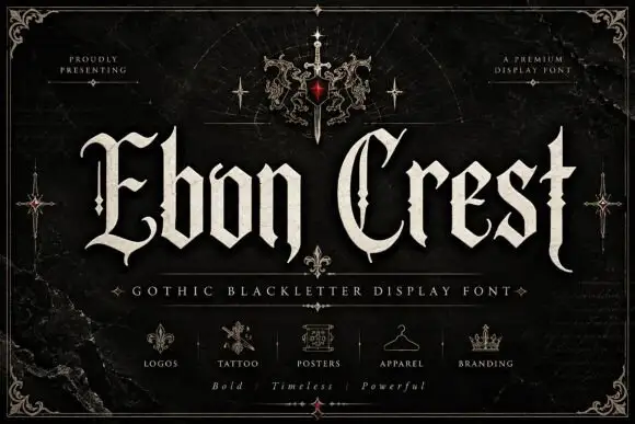
Split Gothic capitals beside narrow angular lowercase
Ebon Crest sets a tall gothic blackletter in bone white on a dark ground and frames it with a crest, a sword and fleur ornaments, then lists the uses along the foot of the cover.
Ideas for this font
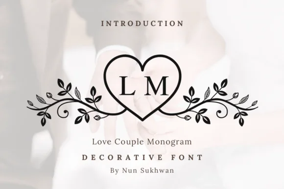
Line-art heart monogram with vine flourishes
Love Couple Monogram is a line-art monogram in black on a blurred wedding photograph: a heart drawn as a single outline, two serif initials set inside it, and vines with leaves and berries curling out to both sides.
Ideas for this font
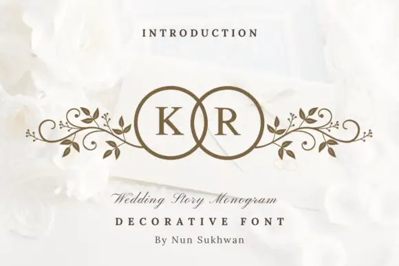
Circle-pair monogram with scrolls
Wedding Story Monogram is a two-initial monogram in bronze on a white still life: two serif capitals set inside two overlapping circles, with mirrored leafy scrolls extending sideways from the rings, staged on an envelope among white roses with a small line above and two lines beneath.
Ideas for this font
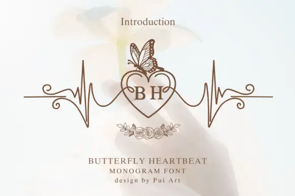
Serif B and H inside a heart topped by a butterfly and flanked by pulse-like lines
Butterfly Heartbeat draws two serif initials inside a heart, runs a drawn pulse line through the heart and out to both sides, and sets a line-drawn butterfly on the upper edge.
Ideas for this font
Same independent foundry
Allow optional Google Analytics to measure visits and catalogue actions. Your search words and notes are not included. Privacy & storage