Editorial Serif Anchor

Gerbox + Vanielst Elegant Serif Display Stylistic
Anchors Gerbox's fluid strokes with crisp Roman proportions on wedding suites, headers and packaging.
Inspect Vanielst Elegant Serif Display Stylistic specimenDisclosure: MakerFileHub may earn a commission from qualifying purchases via paid links on this page. How our links work.
Heavy rough brush print with dry edges and uneven stroke ends
Gerbox is a heavy brush print in which letters stand separately, strokes end in dry ragged tips and the weight varies with the speed of the brush, so a word reads as painted rather than typeset.
Paid link
Get this fontProject & layout blueprintsAt-a-glance maker compatibility
Weld or Unite overlapping script joins into one continuous vector path before sending to the blade.
Visual anatomy & craft review
The capital G is drawn as a heavy hook with a ragged top, and the letters after it keep that roughness: the e closes a small bowl against the join, the r keeps a blunt arm, the b and the o hold heavy verticals with dry ends and the x finishes with a broad crossing stroke. Nothing connects, and the letter fit is tight enough that the word reads as one painted block rather than separate signs. The weight varies between letters, the ends are cut by the dryness of the brush and the counters stay small and open at the centre of each letter. That combination is what gives a word its hand-painted presence at a distance. The oatmeal paper ground, the small red arc and the two tracked captions are presentation; the lettering is the word.
Rough · Heavy · Brushed
Two-font hierarchy recipes
Tested contrast partners — pairing Gerbox with grounded secondary typography.
Gerbox + Vanielst Elegant Serif Display Stylistic
Anchors Gerbox's fluid strokes with crisp Roman proportions on wedding suites, headers and packaging.
Inspect Vanielst Elegant Serif Display Stylistic specimen
Gerbox + Mango Dream
Keeps small-scale dates, URLs, nutrition facts and care instructions crisp and legible below script titles.
Inspect Mango Dream specimenPractical applications
Concrete hierarchy, scale and production guidance tailored to Gerbox’s stroke geometry.
The rough brush reads as hand-painted on a window or a wall and stays legible at a distance where a delicate script would disappear, which suits a small shopfront.
Hierarchy & layout recipe
Set the shop name at 25 cm on the window, keep the menu items in a clean sans at 4 cm, and hold 15 cm of clearance so the dry ends of the letters are not cut by the frame.
Pre-production check
Window paint and vinyl both blunt dry tips; check a vinyl cut at full size and thicken any tip under 3 mm before the plotter runs.
The painted weight gives a handmade product its voice on a small label, and the separate letters stay readable at 14 pt where a connected script would clot.
Hierarchy & layout recipe
Set the product name at 14 pt on a 55 by 75 mm label, keep the weight and scent in a 6 pt sans, and leave 6 mm of margin so the ragged ends stay inside the trim.
Pre-production check
A rough edge under 0.2 mm fills in on a small label; check the printed label at final size and smooth the driest tips rather than shrinking the type.
The heavy brush suits a relaxed venue and reads across a field, while the hand-painted feel keeps a painted board from looking manufactured.
Hierarchy & layout recipe
Set the greeting at 14 cm on a 700 by 500 mm board, set the names in the same face at 7 cm beneath, and leave 12 cm of margin so the broad ends stay on the board.
Pre-production check
Painted boards weather; check the sealed sign in daylight and add a second coat on the heaviest strokes rather than enlarging the lettering.
Technical & licence verification
Confirm included OTF/TTF/WOFF formats, full glyph tables and licence coverage on the live store page before batch production.
Closest visual alternatives
Matched across letterform anatomy, stroke behaviour and craft applications.
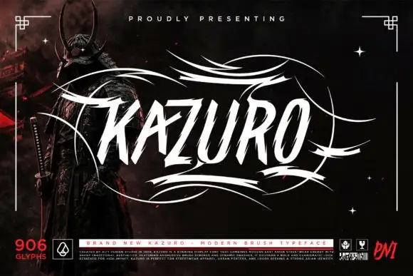
Sharp slanted brush capitals with cut terminals and a wide flourish frame
Kazuro is a sharp slanted brush alphabet in capitals, with strokes that end in hard cut angles and a flourish frame of thin sweeping lines drawn around the word.
Ideas for this font
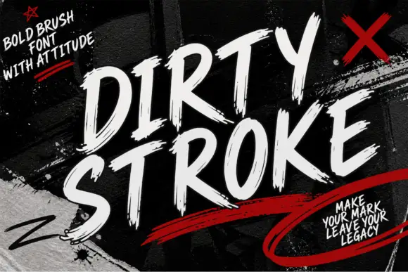
Ragged slanted brush capitals with dry ends and a strong forward lean
Dirty Stroke is ragged brush capitals in which every stroke ends in a dry split tip, the lean is strong and the fit is tight so two words read as one painted block.
Ideas for this font
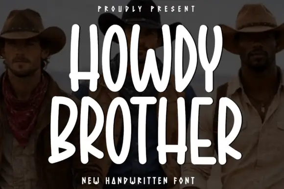
Tall condensed rounded capitals, all caps
Howdy Brother is an all-caps handwriting drawn tall and narrow with thick even strokes and rounded corners, so two stacked words fill a square frame without losing the space between them.
Ideas for this font
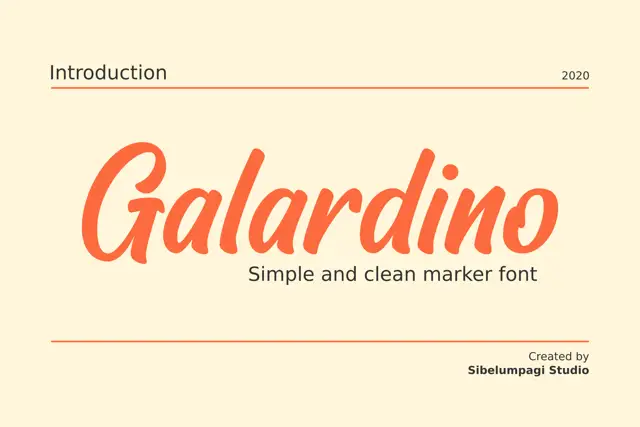
Broad slanted marker with a clean geometry
Galardino is a broad slanted marker alphabet with even strokes, short rounded terminals and a clean, unfussy rhythm that sits close to a slanted grotesque.
Same independent foundry
Allow optional Google Analytics to measure visits and catalogue actions. Your search words and notes are not included. Privacy & storage