Neutral Sans Workhorse

Bit Font + Swaraga
Lets Bit Font own the focal silhouette while handling secondary copy, sizing and subheads cleanly.
Inspect Swaraga specimenDisclosure: MakerFileHub may earn a commission from qualifying purchases via paid links on this page. How our links work.
Bright rectangular pixel-style capitals with hard black offset shadows
Bit Font draws heavy capitals on a coarse pixel grid, gives each letter a solid colour, and steps a black shadow one block to the right so every word looks extruded by two rows of pixels.
Paid link
Get this fontProject & layout blueprintsAt-a-glance maker compatibility
Sturdy stroke walls and open counters weed cleanly on adhesive vinyl, HTV apparel film, and cut cardstock.
Visual anatomy & craft review
ABCD fills the card in red, green, yellow and magenta on a plain off-white ground, each letter built from visible square blocks with a one-block black shadow behind and below it. The grid is coarse, so the A is a triangle of blocks, the B has square notches for counters, and the C is a rectangle with two blocks bitten out of the right side. There is no antialiasing in the drawing at all, which is what gives the shapes their hard edge. Two small lines under the letters list the style name and the file formats, set in a quiet sans so they do not compete. The face is a colour font: the fills are part of the file, so the alphabet prints in four colours straight out of the box, and the solid black shadow is what keeps two adjacent letters from merging into one block on a busy ground.
Bright rectangular pixel-style capitals with hard black offset shadows
Two-font hierarchy recipes
Tested contrast partners — pairing Bit Font with grounded secondary typography.
Bit Font + Swaraga
Lets Bit Font own the focal silhouette while handling secondary copy, sizing and subheads cleanly.
Inspect Swaraga specimen
Bit Font + Worldstar
Grounds bold display lettering with classic typographic authority on posters, badges and apparel.
Inspect Worldstar specimenPractical applications
Concrete hierarchy, scale and production guidance tailored to Bit Font’s stroke geometry.
The pixel grid says screens and logic before the heading is read, and the heavy blocks stay legible from the back of a classroom at poster size.
Hierarchy & layout recipe
Print an A4 notice: set the club name at 54 pt on one row, keep 16 mm of clear ground beneath before the meeting time at 11 pt, and hold 15 mm of margin at both sides of the sheet.
Pre-production check
The black shadow doubles the ink area; print one sheet on the office machine and check that the smallest blocks stay separate.
The four-colour fills give a newsstand cover a bright block of colour, and the stepped shadow holds the word together over a dark photograph.
Hierarchy & layout recipe
Print a 210 by 297 mm cover: set the masthead at 96 pt across one row, keep 24 mm of clear ground beneath before the issue line at 10 pt, and hold 18 mm from the shadow side to the right trim.
Pre-production check
Colour blocks with a hard edge show every plate misregistration; print one cover from the real separations and check the shadow before the run.
The pixel forms name the event in one word, and the bright fills read across a dim hall where a single-colour face would sink into the dark.
Hierarchy & layout recipe
Print a 500 by 350 mm sign: set the event name at 100 pt across two rows, keep 22 mm of clear ground beneath before the time at 14 pt, and hold 24 mm of border so the outer shadow block is not cut.
Pre-production check
Neon or blacklight changes colour inks; print one sign and view it under the room lighting before the batch is produced.
Technical & licence verification
Confirm included OTF/TTF/WOFF formats, full glyph tables and licence coverage on the live store page before batch production.
Closest visual alternatives
Matched across letterform anatomy, stroke behaviour and craft applications.
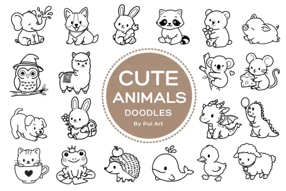
Rounded black outline animal dingbats with simple expressions and props
Cute Animals Doodles is a typable collection of about two dozen animals — elephant, corgi, bunny, raccoon, bear, owl, alpaca, koala, mouse, hedgehog, whale, duck, sheep, a small dragon — each drawn in one even black line.
Ideas for this font
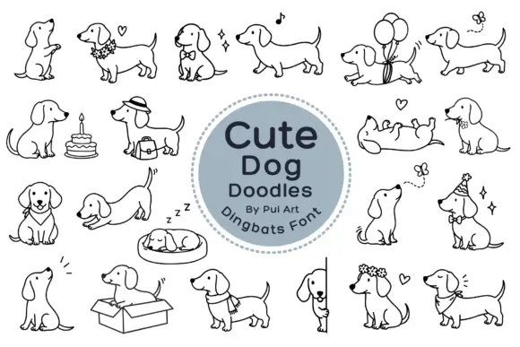
Long-bodied dog outlines with balloons, flowers and playful poses
Cute Dog Doodles is a dingbat set of about two dozen line-drawn dachshunds: sitting, sleeping in a bed, standing in a box, wearing a party hat, carrying a cake, holding a balloon, and one draped over a fence.
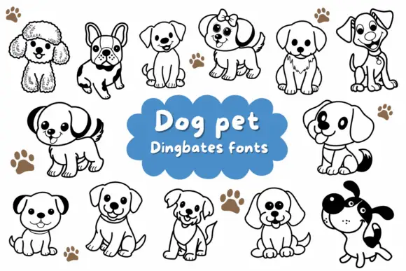
Rounded puppy outlines with dark ears, collars and varied facial expressions
Dog Pet is a typable set of about fifteen puppies — a poodle, a French bulldog, a spaniel, a terrier, a labrador, a dalmatian — drawn in a bold outline with a few patches solid black.
Ideas for this font
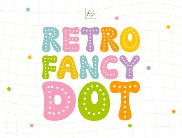
Dotted puffy display
Retro Fancy Dot is a puffy display in coral, teal, orange, pink and violet on a pale ruled ground: irregular fat capitals with small pale dots following the strokes inside each letter, set in three staggered lines with a small studio mark above and dots scattered around.
Ideas for this font
Same independent foundry
Allow optional Google Analytics to measure visits and catalogue actions. Your search words and notes are not included. Privacy & storage