High-Contrast Display Serif

Designer + Grandeur – Elegant Classic Serif
Pairs sculptural editorial warmth with Designer's clean modern geometry.
Inspect Grandeur – Elegant Classic Serif specimenDisclosure: MakerFileHub may earn a commission from qualifying purchases via paid links on this page. How our links work.
Tall narrow capitals with curved E arms and a high rounded G bowl
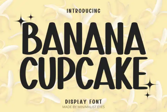
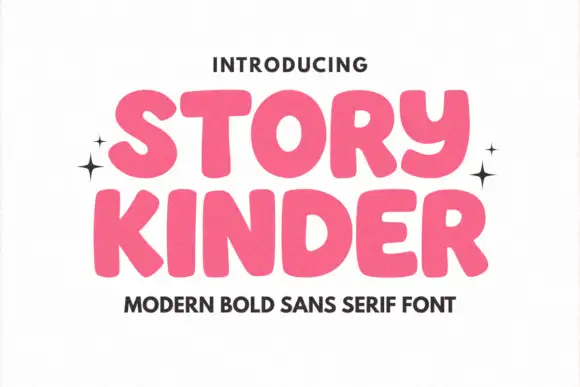
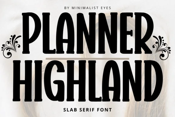
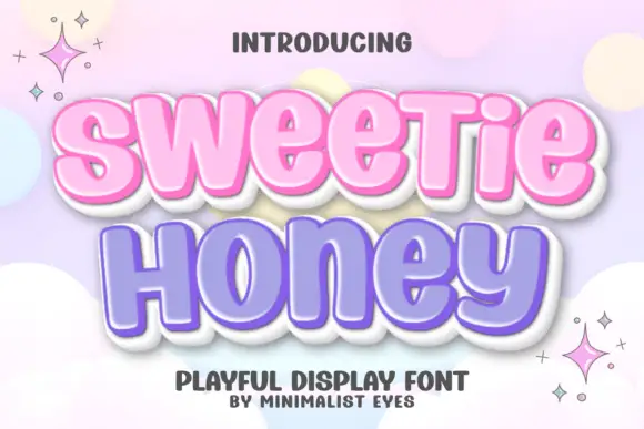
Designer sets a tall playful sans in heavy black, its bowls rounded, its strokes even and its ascenders long enough to make a single word fill the width of a page.
Paid link
Get this fontProject & layout blueprintsAt-a-glance maker compatibility
Sturdy stroke walls and open counters weed cleanly on adhesive vinyl, HTV apparel film, and cut cardstock.
Visual anatomy & craft review
The name stands in capitals across a pale blue ground covered in sketch marks, the D and the R keeping wide curves and the G closing with a short bar, and the whole line reads as a friendly sign-painter face rather than a geometric one. Two tracked captions name the style above and below. Nothing is decorative beyond the proportions: the character comes from the tall narrow shapes and the heavy even weight, which holds at poster size and at label size. It suits children's brands, workshops and covers, and it is too heavy for a long line of text.
Tall narrow capitals with curved E arms and a high rounded G bowl
Two-font hierarchy recipes
Tested contrast partners — pairing Designer with grounded secondary typography.
Designer + Grandeur – Elegant Classic Serif
Pairs sculptural editorial warmth with Designer's clean modern geometry.
Inspect Grandeur – Elegant Classic Serif specimen
Designer + Silken Luxe
Introduces organic movement on pull-quotes, signatures and gift tags.
Inspect Silken Luxe specimenPractical applications
Concrete hierarchy, scale and production guidance tailored to Designer’s stroke geometry.
The friendly heavy letters read as approachable rather than childish, and the tall forms fit a long workshop name on one sign.
Hierarchy & layout recipe
Print a 600 by 300 mm sign: set the workshop name at 60 mm on one row, keep 20 mm of clear ground beneath before the times at 12 mm, and keep 26 mm of border so the rounded forms stay inside the panel.
Pre-production check
Thin joins thin further in vinyl; check a cut test before the sign is produced. Have the printer send a physical sample first.
The bold shapes stay clear on a folder that gets carried around all term, and the playful tone suits a creative subject.
Hierarchy & layout recipe
Print an A4 cover: set the subject at 44 pt across one row, keep 16 mm of clear ground beneath before the pupil name at 12 pt, and keep 18 mm of margin from the trim edge on all sides.
Pre-production check
Heavy fills bleed on cheap card; check a copy on the school printer before the class set. Request a proof on the actual stock before signing off.
The tall word fills an opener without a photograph, and the heavy weight holds attention next to a full page of body text.
Hierarchy & layout recipe
Print a 210 by 280 mm page: set the opener at 72 pt across one row, keep 20 mm of clear ground beneath before the standfirst at 10 pt, and keep 16 mm of margin from the text block on both sides.
Pre-production check
Long ascenders need extra leading; check the pairing with the text at final size before the issue.
Technical & licence verification
Confirm included OTF/TTF/WOFF formats, full glyph tables and licence coverage on the live store page before batch production.
Closest visual alternatives
Matched across letterform anatomy, stroke behaviour and craft applications.
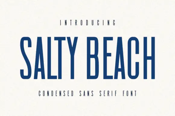
Tall narrow sans
Salty Beach is a tall narrow sans in navy on an off-white sheet: capitals with flat endings, compressed rounded bowls, a low middle bar and an even stroke, with tracked caps above and beneath that name the style.
Ideas for this font

Tall distressed vintage capitals with speckled edges and tight fit
Modern Vintage is a tall capital alphabet with a distressed print texture, tight letterfit and vertical proportions, so a word reads as letterpress that has been used a hundred times.
Ideas for this font
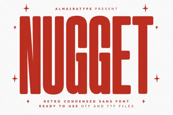
Very tall heavy capitals with rounded corners and narrow internal channels
Nugget shows red capitals filling most of a white cover, where thick near-even strokes leave thin vertical openings in the U and G, the N draws a sharply narrowing diagonal and every outer corner softens.
Ideas for this font
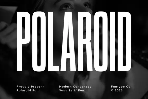
Tall condensed grotesque
Polaroid is a tall condensed grotesque in white over a monochrome portrait: very narrow capitals with flat terminals, a closed counter in the O, a short bar on the R, and a height that runs almost the full frame, so the word reads as a stretched sign rather than a standard alphabet.
Ideas for this font
Same independent foundry
Allow optional Google Analytics to measure visits and catalogue actions. Your search words and notes are not included. Privacy & storage