Editorial Serif Anchor

Cute Simple + Resquel
Anchors Cute Simple's fluid strokes with crisp Roman proportions on wedding suites, headers and packaging.
Inspect Resquel specimenDisclosure: MakerFileHub may earn a commission from qualifying purchases via paid links on this page. How our links work.
Simple rounded separate letters
Cute Simple sets rounded, separated letters with a mixed outline treatment and a soft pill badge, reading as a friendly printed label rather than a script.
Paid link
Get this fontProject & layout blueprintsAt-a-glance maker compatibility
Weld or Unite overlapping script joins into one continuous vector path before sending to the blade.
Visual anatomy & craft review
The first capital is drawn as an outline while the following letters are solid, which gives the word a two-tone effect without a second colour. Letters are separate rather than connected, terminals are fully rounded, and the x-height is generous, so the shape stays legible at small sizes and cuts cleanly as separate vector pieces. Spacing is open and even, which keeps the word from looking crowded despite the soft edges. The line-art flowers around the card and the pill-shaped badge are artwork and a listing label respectively, and the small tracked line at the base belongs to a separate sans.
Simple · Rounded · Printable
Two-font hierarchy recipes
Tested contrast partners — pairing Cute Simple with grounded secondary typography.
Cute Simple + Resquel
Anchors Cute Simple's fluid strokes with crisp Roman proportions on wedding suites, headers and packaging.
Inspect Resquel specimen
Cute Simple + Furion
Keeps small-scale dates, URLs, nutrition facts and care instructions crisp and legible below script titles.
Inspect Furion specimenPractical applications
Concrete hierarchy, scale and production guidance tailored to Cute Simple’s stroke geometry.
Separated rounded letters cut as individual pieces, which is exactly what a sticker or classroom label workflow actually needs.
Hierarchy & layout recipe
Set each name at 24 pt, keep the outline capital at the same size as the solid letters beside it, and leave 6 mm between the name and the label edge on all four sides.
Pre-production check
The outline treatment needs a closed shape; check that the outline capital is not lighter than 0.5 mm at label size.
Rounded separate letters stay readable on a small 30 mm sticker, where a connected script would smear into an illegible blur at that size.
Hierarchy & layout recipe
Print the word at 12 pt on a 35 mm round sticker, keep it to a single word, and centre it on the optical middle of the circle rather than on the geometric bounding box.
Pre-production check
At sticker size the outline capital can vanish; use the solid weight for anything under 15 mm wide.
The friendly proportion sets the tone for a children's workshop class while still staying legible in a cheap photocopied flyer.
Hierarchy & layout recipe
Set the heading at 28 pt across two lines, keep the schedule in a plain sans at 10 pt, and leave 8 mm between the heading and the first line of detail.
Pre-production check
Photocopiers thicken light strokes, so the outline capital may close up on a cheap copy; check one copy before committing the whole run.
Technical & licence verification
Confirm included OTF/TTF/WOFF formats, full glyph tables and licence coverage on the live store page before batch production.
Closest visual alternatives
Matched across letterform anatomy, stroke behaviour and craft applications.
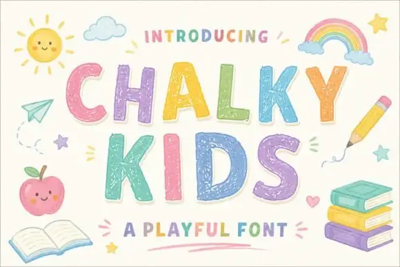
Textured chalk capitals with rounded frames and a broken inner fill
Chalky Kids is a rounded capital alphabet with a chalk texture inside the strokes, drawn so a word looks written on a blackboard rather than printed on paper.
Ideas for this font
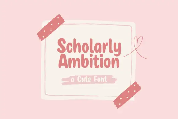
Compact heavy rounded separate letters
Scholarly Ambition is a compact heavy hand-drawn print in dusty rose on a cream card taped to a pink wall: fat rounded letters with blunt ends, a light bounce, and a brush-stroke caption beneath.
Ideas for this font
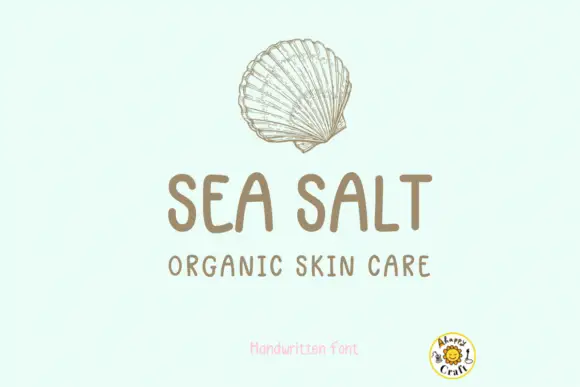
Rounded handwritten capitals with tracked lower line
Stand by Me is a handwritten face in warm brown on pale mint: rounded capital letters with a nearly even stroke, a flat-topped A and an S with a square shoulder, shown as a two-line product label under a fine drawn shell.
Ideas for this font
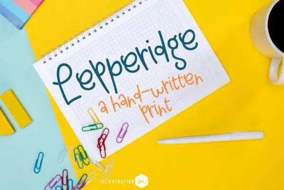
Slender looped print lettering
Lepperidge is a slender looped print hand in teal on graph paper: narrow letters with large open loops on the L, the p and the d, a light monoline stroke and a warm slant that keeps a ten-letter word moving.
Ideas for this font
Allow optional Google Analytics to measure visits and catalogue actions. Your search words and notes are not included. Privacy & storage