Editorial Serif Anchor

Lepperidge + Alerigue
Anchors Lepperidge's fluid strokes with crisp Roman proportions on wedding suites, headers and packaging.
Inspect Alerigue specimenDisclosure: MakerFileHub may earn a commission from qualifying purchases via paid links on this page. How our links work.
Slender looped print lettering
Lepperidge is a slender looped print hand in teal on graph paper: narrow letters with large open loops on the L, the p and the d, a light monoline stroke and a warm slant that keeps a ten-letter word moving.
Paid link
Get this fontProject & layout blueprintsAt-a-glance maker compatibility
Weld or Unite overlapping script joins into one continuous vector path before sending to the blade.
Visual anatomy & craft review
The word is set across a notebook page, and the face is a hand rather than a script: the L opens with a big loop, the e and the r are small, the p and the d carry large loops above and below the line, the i is a stem with a round dot and the double g closes with a tail, while the letters stand apart with a light slant and the baseline drifts a little down the page. The stroke is a monoline of medium weight, and the loops are much larger than the bodies, which is what gives the face its friendly proportions at small sizes. A second line in the same face, at half the size and in a different colour, names the style, which shows how the hand behaves as a note rather than a title. Lepperidge is a hand for labels, cards, packaging and school material.
A friendly hand with big open loops
Two-font hierarchy recipes
Tested contrast partners — pairing Lepperidge with grounded secondary typography.
Lepperidge + Alerigue
Anchors Lepperidge's fluid strokes with crisp Roman proportions on wedding suites, headers and packaging.
Inspect Alerigue specimen
Lepperidge + Lemon Milk Pro FTR
Keeps small-scale dates, URLs, nutrition facts and care instructions crisp and legible below script titles.
Inspect Lemon Milk Pro FTR specimenPractical applications
Concrete hierarchy, scale and production guidance tailored to Lepperidge’s stroke geometry.
A looped hand reads at a child's eye level and looks written by the teacher, and the light monoline prints cleanly on a shelf label.
Hierarchy & layout recipe
Print 90 by 40 mm labels: set the word at 18 pt on one line, keep 6 mm of clear ground beneath before the note at 6 pt, and hold 5 mm of margin on all four sides.
Pre-production check
Large loops use more vertical space than expected; print one label at the finished size and check the fitting before the set.
A hand with big loops suits a product sold on notebooks, and the teal-on-graph mock-up shows exactly where a buyer would use it.
Hierarchy & layout recipe
Print a 60 by 45 mm label: set the brand at 14 pt on one line, keep 5 mm of clear ground beneath before the address at 5.5 pt, and hold 4 mm of margin on all four sides.
Pre-production check
A loop can hit a label edge; print one on the real stock and check the ends before the order.
A friendly hand gives a journal a cover a child will not mind carrying, and the loops read at a cover size in one colour.
Hierarchy & layout recipe
Print a 148 by 210 mm cover: set the title at 44 pt on one line, keep 18 mm of clear ground beneath before the name line at 14 pt, and hold 16 mm of margin on all four sides.
Pre-production check
Loops on a busy cover can blur; print one at the finished size and check the contrast before the run.
Technical & licence verification
Confirm included OTF/TTF/WOFF formats, full glyph tables and licence coverage on the live store page before batch production.
Closest visual alternatives
Matched across letterform anatomy, stroke behaviour and craft applications.

Rounded handwritten capitals with tracked lower line
Stand by Me is a handwritten face in warm brown on pale mint: rounded capital letters with a nearly even stroke, a flat-topped A and an S with a square shoulder, shown as a two-line product label under a fine drawn shell.
Ideas for this font
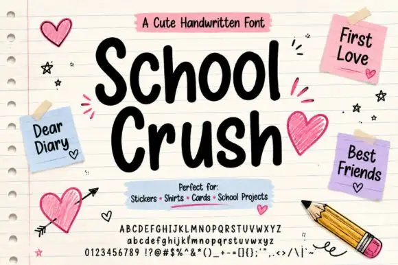
Heavy rounded marker print on a notebook page
School Crush is a heavy rounded marker print in black on a lined notebook page, with drawn hearts, sticky notes and a pencil turning the specimen into a school desk.
Ideas for this font
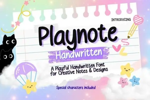
Rounded upright handwriting with a bouncy baseline
Playnote is a rounded upright handwriting face in black on a pink lined notepad: fat rounded letters with a bouncy baseline, shown over a spiral-bound sheet with a purple highlighter block, star stickers and drawn cats.
Ideas for this font
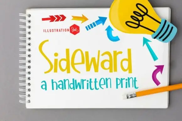
Tall irregular print hand
Sideward is a tall irregular print hand in yellow and teal on a notebook page: narrow letters of different heights, big open loops on the S and the d, and a light monoline stroke with a hand-drawn bounce.
Ideas for this font
Same independent foundry
Allow optional Google Analytics to measure visits and catalogue actions. Your search words and notes are not included. Privacy & storage