Neutral Sans Workhorse

Bloopsy + Homies
Lets Bloopsy own the focal silhouette while handling secondary copy, sizing and subheads cleanly.
Inspect Homies specimenDisclosure: MakerFileHub may earn a commission from qualifying purchases via paid links on this page. How our links work.
Soft chunky mixed-case letters with looping tails and a rounded skeleton
Bloopsy is soft chunky mixed-case lettering in which the letters keep a rounded skeleton, the descenders loop back up and the weight stays heavy and even across a phrase.
Paid link
Get this fontProject & layout blueprintsAt-a-glance maker compatibility
Weld or Unite overlapping script joins into one continuous vector path before sending to the blade.
Visual anatomy & craft review
The capital B closes two soft bowls against a thick stem, the l and the p carry looped descenders that curl back toward the baseline and the y finishes with a broad curl rather than a straight tail. Lowercase and uppercase are drawn at nearly the same weight, which is what lets a mixed-case phrase read as one soft mass rather than as a hierarchy. Weight is heavy and constant, corners are fully rounded and the counters stay open enough to read at 14 pt on a label. The looping tails are the defining gesture: they give the lettering its friendly, almost sweet-shop quality without any extra ornament. The cream ground, the terracotta ink, the cat photograph and the two small blocks of text are presentation; the lettering is the words.
Soft · Chunky · Looping
Two-font hierarchy recipes
Tested contrast partners — pairing Bloopsy with grounded secondary typography.
Bloopsy + Homies
Lets Bloopsy own the focal silhouette while handling secondary copy, sizing and subheads cleanly.
Inspect Homies specimen
Bloopsy + Cervelique
Grounds bold display lettering with classic typographic authority on posters, badges and apparel.
Inspect Cervelique specimenPractical applications
Concrete hierarchy, scale and production guidance tailored to Bloopsy’s stroke geometry.
The soft chunky weight suits a sweet product and reads at 13 pt on a small bag label where a lighter display face would disappear against the pack.
Hierarchy & layout recipe
Set the brand at 13 pt on a 70 by 45 mm bag label, set the product in a 6 pt sans beneath, and leave 5 mm of margin so the looping tail stays on the label.
Pre-production check
A looping descender can run into the label edge; check the printed label at final size and lift the baseline rather than shortening the loop.
The rounded heavy letters read across a room and the loops give a printed banner a hand-drawn charm without an illustration.
Hierarchy & layout recipe
Set the greeting at 80 mm on a 1.2 m paper banner, set the name at 50 mm beneath it, and leave 30 mm at each end so the curls stay inside the banner edge.
Pre-production check
Paper banners crease where they are taped; add a second fixing point and check the hanging the day before the party.
The soft shapes die-cut cleanly and the heavy weight stays legible at 11 pt, which keeps a small sticker readable on a laptop or a bag.
Hierarchy & layout recipe
Set the business name at 11 pt on a 50 mm round sticker, keep the city in a 5 pt sans beneath, and leave 5 mm inside the die so the loops are not clipped.
Pre-production check
A curl crossing the cut line weakens the sticker edge; check the artwork against the die and rotate the word if a loop meets it.
Technical & licence verification
Confirm included OTF/TTF/WOFF formats, full glyph tables and licence coverage on the live store page before batch production.
Closest visual alternatives
Matched across letterform anatomy, stroke behaviour and craft applications.
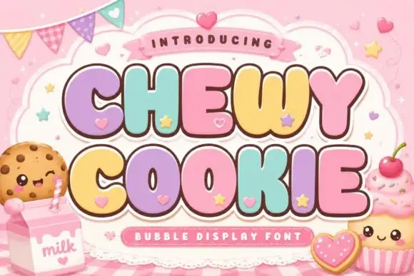
Squat bubble capitals packed tightly with heart accents between letters
Chewy Cookie is a squat bubble capital alphabet packed so tightly that the letters touch, with small hearts scattered into the gaps and a soft outline around the whole phrase.
Ideas for this font
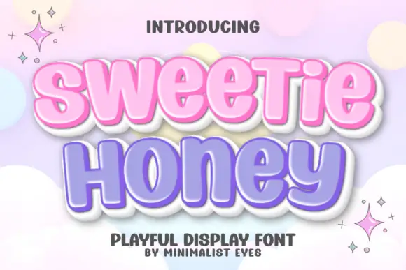
Rounded heavy display with a glossy edge
Sweetie Honey is a fat rounded display face with soft inward curves, drawn as a bubbly sticker: pastel pink and lavender fills inside a thick white outline with a soft grey shadow.
Ideas for this font
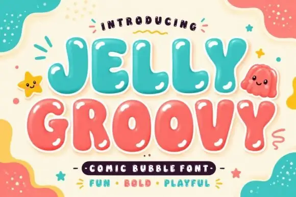
Soft irregular bubble capitals with heavy rounded interiors and small counters
Jelly Groovy is a soft irregular bubble capital alphabet in which the strokes swell unevenly, the counters stay small and the letters lean slightly, so a phrase reads as a comic-book bubble rather than a geometric display face.
Ideas for this font
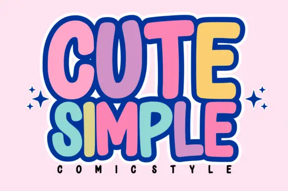
Tall rounded comic blocks with bubble outlines and per-letter colour
Cute Simple is a tall rounded comic alphabet in which the blocks stack tightly, the outlines bubble outward and each letter can take its own colour without breaking the composition.
Ideas for this font
Same independent foundry
Allow optional Google Analytics to measure visits and catalogue actions. Your search words and notes are not included. Privacy & storage