Editorial Serif Anchor

Housing + Augler
Anchors Housing's fluid strokes with crisp Roman proportions on wedding suites, headers and packaging.
Inspect Augler specimenDisclosure: MakerFileHub may earn a commission from qualifying purchases via paid links on this page. How our links work.
Formal script with broad initial loops and a wide descending flourish
Housing is a formal script with an oversized initial loop, broad shaded stems and a wide flourish that drops below the baseline at the end of the word.
Paid link
Get this fontProject & layout blueprintsAt-a-glance maker compatibility
Weld or Unite overlapping script joins into one continuous vector path before sending to the blade.
Visual anatomy & craft review
The capital H is drawn as a large open loop that begins below the baseline and rises above the cap line before the stems close, and the letters after it stay broad and formal: the o and the u close round bowls, the s reverses through a shaded stem and the final g drops a descender that sweeps out into a wide flourish. Contrast is strong, with heavy downstrokes and thin joins, and the letterfit is generous, so a single word fills a wide measure at 40 pt and above. The loop count is moderate: one large initial and one final flourish carry the ornament, which keeps the face usable for signage rather than only for certificates. Ends taper. The dark landscape behind, the cream ink and the small credits are presentation; the script is the word.
Formal · Looped · Broad
Two-font hierarchy recipes
Tested contrast partners — pairing Housing with grounded secondary typography.
Housing + Augler
Anchors Housing's fluid strokes with crisp Roman proportions on wedding suites, headers and packaging.
Inspect Augler specimen
Housing + Memoir Slang
Keeps small-scale dates, URLs, nutrition facts and care instructions crisp and legible below script titles.
Inspect Memoir Slang specimenPractical applications
Concrete hierarchy, scale and production guidance tailored to Housing’s stroke geometry.
The formal loop and the wide flourish give a studio sign the presence of an engraved plate, and the single word fills a fascia without extra elements.
Hierarchy & layout recipe
Set the studio name at 22 cm across the fascia, keep the services in a clean sans at 5 cm, and hold 15 cm of clearance so the descending flourish stays on the panel.
Pre-production check
A wide flourish painted on a fascia can read as a stray mark; check the sign at street distance and keep the flourish shorter than a third of the word.
The broad contrasted script carries a surname of any length on one line, and the wide flourish gives the name a composed finish on a tall card.
Hierarchy & layout recipe
Set both names at 30 pt on a 120 by 190 mm card, set the details in a small caps serif at 8 pt, and hold 20 mm below the flourish so the details have clear air.
Pre-production check
A descending flourish near the details block collides; check the proof at final size and shorten the flourish rather than moving the details.
The formal weight suits a homeware label and the single flourish gives a small tag a designed edge without a second element.
Hierarchy & layout recipe
Set the brand at 13 pt on a 45 by 70 mm tag, keep the product line in a 6 pt caps serif, and leave 7 mm at the base so the flourish finishes inside the tag.
Pre-production check
Foil on a heavy script closes the tightest counters; check a foil dummy at final size and open the o and u slightly before the die is cut.
Technical & licence verification
Confirm included OTF/TTF/WOFF formats, full glyph tables and licence coverage on the live store page before batch production.
Closest visual alternatives
Matched across letterform anatomy, stroke behaviour and craft applications.

Ornate flourished calligraphy with oversized loops
Handmade Calligraphy is an ornate script whose flourishes leave the letters entirely, curling above and below the line so the two words read as a drawn flourish with letters inside it.
Ideas for this font

Bold slanted script with a curled capital and heavy connected stems
Esmeralda is a bold slanted script in which the capital curls back over itself and the body runs in connected heavy stems with a steady forward lean.
Ideas for this font
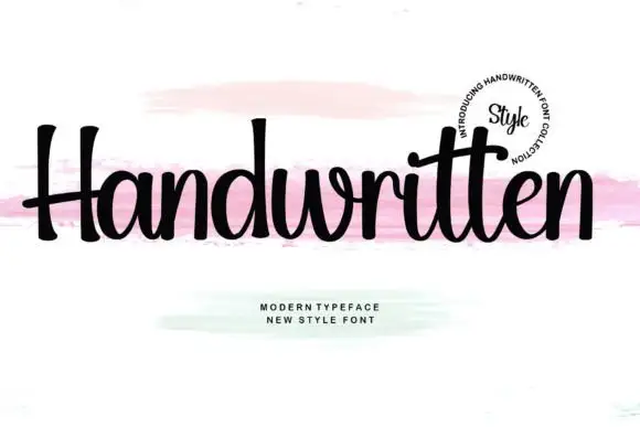
Upright compact script with flared terminals and closed tight fit
Handwritten is a compact upright script in which the letters stay close together, the strokes run heavy and even, and the terminals flare slightly where the pen lifts.
Ideas for this font

Very slanted calligraphy with broad lower sweeps and fine hairlines
Silken Luxe is a formal calligraphy script with a steep slant, broad lower sweeps and hairlines that thin almost to nothing, drawn so two words build an ornamental diagonal across the plate.
Ideas for this font
Same independent foundry
Allow optional Google Analytics to measure visits and catalogue actions. Your search words and notes are not included. Privacy & storage