Neutral Sans Workhorse

Scramble + Prime Nordic
Lets Scramble own the focal silhouette while handling secondary copy, sizing and subheads cleanly.
Inspect Prime Nordic specimenDisclosure: MakerFileHub may earn a commission from qualifying purchases via paid links on this page. How our links work.
Broad experimental sans with looping forms
Scramble is a broad experimental display shown in lime on a deep green field: lowercase with a looping S that carries a long tail beneath the baseline, a b whose bowl folds into the stem, and a two-level composition in which the final letters drop below the line, with small tracked notes in the lower left and a plain header.
Paid link
Get this fontProject & layout blueprintsAt-a-glance maker compatibility
Sturdy stroke walls and open counters weed cleanly on adhesive vinyl, HTV apparel film, and cut cardstock.
Visual anatomy & craft review
The plate is an art-directed split: the word runs across two levels, the first half sitting high and the second dropping below the baseline, and that arrangement is itself the demonstration of the expressive alternates named in the note. The drawing is a broad experimental sans with looping S and b forms, so the face reads as a variable display for a poster rather than as a text face, and the loops set a size floor because they close when the letters shrink. The notes in the lower left are genuine product copy that name the axes and the count of styles. Because the composition depends on the alternates, a layout should be set in the type rather than approximated.
Display, experimental, looping, variable
Two-font hierarchy recipes
Tested contrast partners — pairing Scramble with grounded secondary typography.
Scramble + Prime Nordic
Lets Scramble own the focal silhouette while handling secondary copy, sizing and subheads cleanly.
Inspect Prime Nordic specimen
Scramble + Rosemode
Grounds bold display lettering with classic typographic authority on posters, badges and apparel.
Inspect Rosemode specimenPractical applications
Concrete hierarchy, scale and production guidance tailored to Scramble’s stroke geometry.
An experimental display gives a festival a poster that reads as designed rather than typed, and the loops hold at large size.
Hierarchy & layout recipe
A1 poster: the name at 200 mm cap height on two levels, the dates in a 24 mm sans, and the venue at 12 mm. Keep 30 mm margins and print two colours on a light stock.
Pre-production check
Check the A1 at five metres, where a loop can close; keep it above 4 mm. Confirm the 12 mm venue reads at two metres and that the dropped level clears the trim.
An experimental display fills a cover with one word, and the split composition gives the sheet movement without an image.
Hierarchy & layout recipe
Set the title at 110 mm cap height across 195 mm on two levels, the subtitle in an 8.5 pt sans, and the issue at 7 pt. Print one ink on a matte stock and keep 22 mm margins.
Pre-production check
Check the title at 110 mm, where a loop can cross the line beneath; allow 10 mm. Confirm the 7 pt issue survives lamination and that the title clears the trim at both ends.
An experimental mark gives a centre a graphic identity, and the looping tail makes a short name recognisable on a poster wall.
Hierarchy & layout recipe
Set the mark at 22 pt on a card, 110 mm on a wall and 15 pt in a programme, keeping the alternates above 18 pt. Keep one colour and clear space equal to the cap height.
Pre-production check
Check the 15 pt programme mark, where a loop can close; keep the size above 18 pt. Confirm the wall mark reads at ten metres and that the tail clears the frame.
Technical & licence verification
Confirm included OTF/TTF/WOFF formats, full glyph tables and licence coverage on the live store page before batch production.
Closest visual alternatives
Matched across letterform anatomy, stroke behaviour and craft applications.
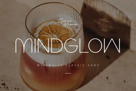
Hairline capitals with rounded m arches and an inverted angular final form
Mindglow sets wide light capitals with hairline strokes and generous tracking, and lays them over a warm photograph of a drink so the word reads as a line of light rather than a block.
Ideas for this font
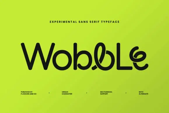
Rounded experimental mixed case with looped central strokes and a curled final e
Wobble is an experimental sans in which a few glyphs break into loops: the b carries a curl through its bowl, the l doubles back on itself and the e ends in a spiral, while the rest of the word stays straight.
Ideas for this font
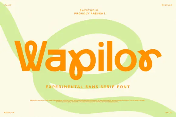
Experimental looping mixed case
Wapilor is an experimental mixed-case display in orange on cream: rounded geometric letters with a pointed W, a p whose bowl extends into a long loop and an r drawn as a hook, set as one word over a pale green swirl, with tracked corner notes naming the regular and italic cuts and a small line of description at the foot.
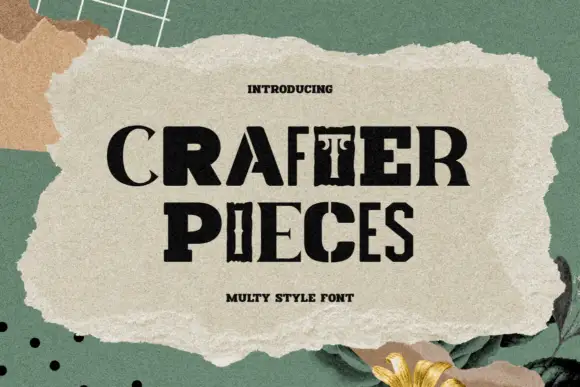
A mixed-style capital title combining slabs, narrow serifs and stencil-like interruptions
Crafter Pieces combines visibly different capital constructions in one black title, where a broad slab-like R sits beside a thin serif C, a sharply split A and narrow ornamental verticals, and the lower line adds another heavy P and a divided C.
Ideas for this font
Same independent foundry
Allow optional Google Analytics to measure visits and catalogue actions. Your search words and notes are not included. Privacy & storage