Modern Grotesque Body

Cowboy Junior + Borsen
Creates crisp high-hierarchy contrast beneath Cowboy Junior headlines across menus, websites and labels.
Inspect Borsen specimenDisclosure: MakerFileHub may earn a commission from qualifying purchases via paid links on this page. How our links work.
Chamfered collegiate blocks with deep irregular erosion
Cowboy Junior stacks a pale upper row over an orange lower one on green: clipped O and C corners, broad feet and thick straight strokes build a collegiate skeleton, while large ragged holes and small flecks erode the fill.
Paid link
Get this fontProject & layout blueprintsAt-a-glance maker compatibility
Fine grain and micro-texture excel in 300 DPI print, sublimation, and screen print rather than small vinyl weeding.
Visual anatomy & craft review
The O and C clip their corners, the feet widen into broad slabs, the stems stay straight and heavy and the fill loses large ragged pieces alongside finer flecks. The deep erosion is the character: the wear cuts into the letter rather than sitting on top of it, which is why the sample sets two rows on a dark green ground. Because the holes are large, keep 32 pt so a letter does not lose a stroke, and check the number set separately since a personalised figure may not carry the same treatment. The rider silhouette and landscape circle are cover art.
Collegiate · Chamfered · Eroded
Two-font hierarchy recipes
Tested contrast partners — pairing Cowboy Junior with grounded secondary typography.
Cowboy Junior + Borsen
Creates crisp high-hierarchy contrast beneath Cowboy Junior headlines across menus, websites and labels.
Inspect Borsen specimen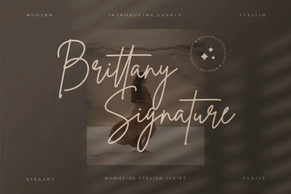
Cowboy Junior + Brittany Signature Script
Adds a warm human signature touch for 1-to-3-word callouts without competing against structured serif capitals.
Inspect Brittany Signature Script specimenPractical applications
Concrete hierarchy, scale and production guidance tailored to Cowboy Junior’s stroke geometry.
The collegiate blocks read on fabric, and the eroded fill gives a team name a worn feel at 80 mm across a printed chest. Two inks keep the pale upper row from competing with the lower one.
Hierarchy & layout recipe
Print a 300 mm chest print: set the upper row at 80 mm and the lower at 66 mm, keep 18 mm between the rows, and keep 45 mm beneath for the player number on a separate line. Keep the player number off the eroding rows.
Pre-production check
Large erosion holes can isolate a stroke at small sizes; check the film at full size and keep the letters at 60 mm or more.
The chamfered slabs suit a Western sign, and the pale fill on a dark ground holds a two-word name at 60 mm on a painted board. One colour also keeps the clipped corners readable at a distance.
Hierarchy & layout recipe
Paint a 600 by 300 mm board: set the upper row at 60 mm and the lower at 50 mm, keep 20 mm between the rows, and keep 28 mm of border so the clipped corners stay whole. Use one coat for each colour.
Pre-production check
Erosion painted too fine fills in under a second coat; check the mask and keep the flecks at 3 mm minimum. Paint a sample board before the sign.
The worn blocks suit a seasonal label, and the thick slabs keep a short name clear at 22 pt on a 60 mm panel in two inks. The lower row stays short so two eroded lines do not compete.
Hierarchy & layout recipe
Print a 60 by 40 mm label: set the name at 22 pt, keep 8 mm of clear ground beneath for the lower row, and set the price in a 6 pt sans at the foot with 5 mm of clear space. Keep the price line deliberately small.
Pre-production check
Two eroding rows on one small label become noise; check the proof and keep the second row out of labels under 50 mm.
Technical & licence verification
Confirm included OTF/TTF/WOFF formats, full glyph tables and licence coverage on the live store page before batch production.
Closest visual alternatives
Matched across letterform anatomy, stroke behaviour and craft applications.
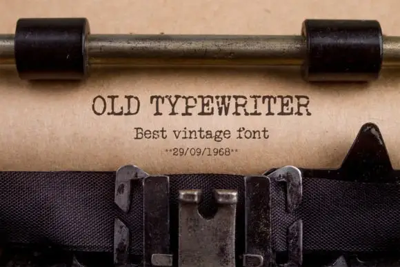
Typewriter slab
Old Typewriter is a typewriter slab in dark ink on a kraft sheet: light uniform strokes, blunt slab serifs, a fixed advance and slightly uneven impressions, set as one line with a smaller line beneath and a dated note under that, with the carriage and the ribbon visible above and below.
Ideas for this font
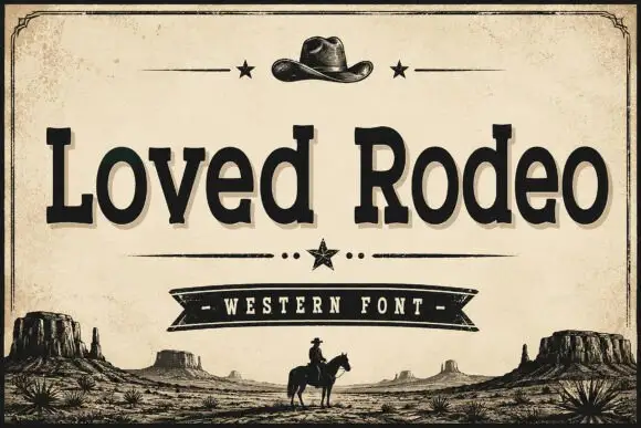
Vintage western slab with ornaments
Loved Rodeo is a vintage western slab in black on aged paper: bracketed slab serifs, a slightly flared stem, an R with a spurred leg, and a composition framed by a hat, stars, a ribbon banner and a desert silhouette, so the pair reads as a saloon sign rather than as a modern serif.
Ideas for this font
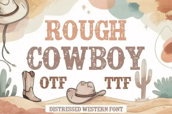
Distressed western slab in two tones
Rough Cowboy is a distressed western slab in brown and beige on cream: heavy capitals with thick flat serifs and a worn texture, printed in two tones so each letter reads as a stencil, with boots, hats, cacti and watercolour clouds around them.
Ideas for this font
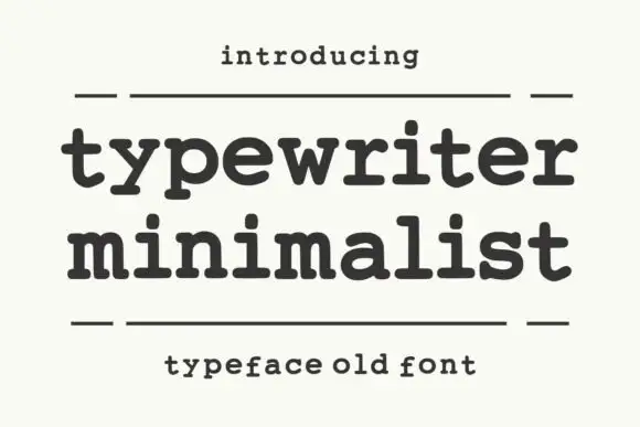
Heavy rounded typewriter slab
Typewriter Minimalist is a heavy rounded typewriter slab in charcoal on cream: thick lowercase with blunt typewriter feet, a large x-height and short ascenders, set over two lines between two rules with a tracked line above and a caption beneath.
Same independent foundry
Allow optional Google Analytics to measure visits and catalogue actions. Your search words and notes are not included. Privacy & storage