Modern Grotesque Body

Cowboy Gothic + Miniplate
Creates crisp high-hierarchy contrast beneath Cowboy Gothic headlines across menus, websites and labels.
Inspect Miniplate specimenDisclosure: MakerFileHub may earn a commission from qualifying purchases via paid links on this page. How our links work.
Tall soft Western forms with small mid-stroke points and rounded bowls
Cowboy Gothic sets white title-case lettering over a dark interior, where large C and G initials lead smaller tall capitals with rounded bowls and subtle pointed waist details, and the narrow upright rhythm is lighter and softer than a dense blackletter reading of the name Gothic.
Paid link
Get this fontProject & layout blueprintsAt-a-glance maker compatibility
Fine grain and micro-texture excel in 300 DPI print, sublimation, and screen print rather than small vinyl weeding.
Visual anatomy & craft review
The forms stand tall and narrow, the bowls round, the waist points stay small and the capitals lead lowercase letters. That softness is the character: the face reads as a gentle Western rather than a haunted blackletter, which is why the sample keeps a title-case word in a warm interior. The dark room is background imagery rather than part of the letters, so confirm the actual case mapping, check how the waist points behave at 22 pt and set a longer title yourself before judging the rhythm.
Tall soft Western forms with small mid-stroke points and rounded bowls
Two-font hierarchy recipes
Tested contrast partners — pairing Cowboy Gothic with grounded secondary typography.
Cowboy Gothic + Miniplate
Creates crisp high-hierarchy contrast beneath Cowboy Gothic headlines across menus, websites and labels.
Inspect Miniplate specimen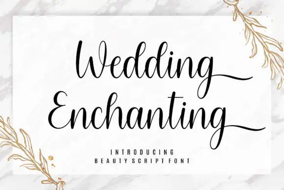
Cowboy Gothic + Wedding Enchanting
Adds a warm human signature touch for 1-to-3-word callouts without competing against structured serif capitals.
Inspect Wedding Enchanting specimenPractical applications
Concrete hierarchy, scale and production guidance tailored to Cowboy Gothic’s stroke geometry.
The soft Western forms suit a storefront, and the tall caps hold a two-word name at 54 mm on a painted board, where the rounded bowls stay friendly at distance.
Hierarchy & layout recipe
Paint a 600 by 300 mm board: set the store name at 54 mm on one row, keep 22 mm of clear ground beneath before the hours at 14 pt, and keep 22 mm of border so the waist points are not crowded.
Pre-production check
Waist points painted at 2 mm close; check the mask artwork and hold the sign at 46 mm or above.
The Western softness gives a bottle warmth, and the title-case forms hold a two-word name at 22 pt on a 55 by 70 mm label, where the small waist points stay visible on paper.
Hierarchy & layout recipe
Print a 55 by 70 mm label: set the name at 22 pt on one row, keep 10 mm of clear ground beneath before the age at 6 pt, and keep the label a light ground so the rounded bowls read.
Pre-production check
The name says Gothic, but this file may not carry blackletter at all; check the font before using it for a gothic theme.
The tall forms read on a banner, and the mixed case holds a two-word title at 56 pt on a printed sheet, where the leading capitals set the rhythm for the row.
Hierarchy & layout recipe
Print a 900 by 400 mm banner: set the title at 56 pt on one row, keep 24 mm of clear ground beneath before the dates at 15 pt, and keep 28 mm from the hem so the points stay whole.
Pre-production check
A title-case row needs a subject; check the file's uppercase before setting an all-caps banner.
Technical & licence verification
Confirm included OTF/TTF/WOFF formats, full glyph tables and licence coverage on the live store page before batch production.
Closest visual alternatives
Matched across letterform anatomy, stroke behaviour and craft applications.
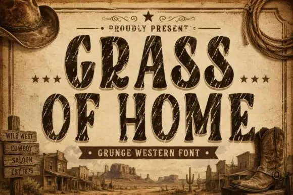
Condensed rounded Western capitals crossed by long diagonal scratches
Grass of Home is a condensed rounded slab in which tall oval bowls and soft curved ends give a Western tone, while long pale diagonal scratches and smaller chips cut through the thick strokes of a two-row title.
Ideas for this font
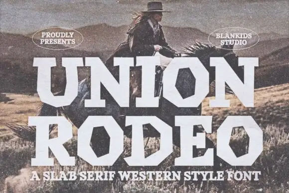
Broad geometric Western blocks with strongly polygonal bowls
Union Rodeo sets a western slab in huge white capitals, its corners chamfered and its stems notched, so the word looks stencilled on a barn door rather than set in a modern face.
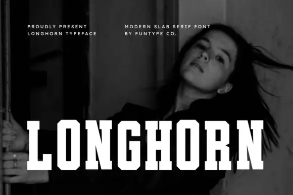
Very condensed clean slab
Longhorn is a very condensed slab in white over a black-and-white portrait: narrow capitals with thick square slabs, clipped rectangular bowls and flat terminals, set as one word across the lower third, with two small tracked notes at the upper left and right.
Ideas for this font
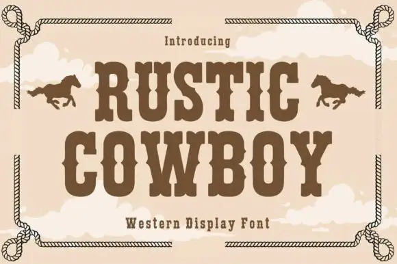
Condensed western display with a rope frame
Rustic Cowboy is a condensed western display in brown on tan: spurred slab letters with small wedge serifs inside a drawn rope border, with a galloping horse on either side.
Ideas for this font
Same independent foundry
Allow optional Google Analytics to measure visits and catalogue actions. Your search words and notes are not included. Privacy & storage



