Editorial Serif Anchor

Bunny + Aureline
Anchors Bunny's fluid strokes with crisp Roman proportions on wedding suites, headers and packaging.
Inspect Aureline specimenDisclosure: MakerFileHub may earn a commission from qualifying purchases via paid links on this page. How our links work.
Bubbly outlined script with an offset shadow
Bunny is a bubbly script drawn in two weights at once: a small solid line above and a large outlined version below, where thick blue strokes carry a heavy dark outline and a white halo.
Paid link
Get this fontProject & layout blueprintsAt-a-glance maker compatibility
Weld or Unite overlapping script joins into one continuous vector path before sending to the blade.
Visual anatomy & craft review
The upper word is the same alphabet set small and solid in black, which is what shows the underlying drawing: round bowls, tall looping ascenders and joins that swell where the pen turns. The lower word scales that drawing up and treats it as an object, with a dark contour offset down and right and a white keyline separating it from the pale ground, so the lettering reads as a sticker rather than as writing. The y drops a loop that swings under the b, and the two n's sit close with their arches touching. The dried frond on the right, the dotted edge at the left and the two-line credit beneath are the cover's arrangement; the outline and shadow are effects applied to the alphabet, not separate glyphs.
Bubbly · Outlined · Bouncy
Two-font hierarchy recipes
Tested contrast partners — pairing Bunny with grounded secondary typography.
Bunny + Aureline
Anchors Bunny's fluid strokes with crisp Roman proportions on wedding suites, headers and packaging.
Inspect Aureline specimen
Bunny + One More
Keeps small-scale dates, URLs, nutrition facts and care instructions crisp and legible below script titles.
Inspect One More specimenPractical applications
Concrete hierarchy, scale and production guidance tailored to Bunny’s stroke geometry.
An outlined bubbly word works as a sticker because the outline gives the die cutter a margin to follow, and the offset shadow adds depth without a second colour plate.
Hierarchy & layout recipe
Keep the word at 50 mm wide on a 60 mm sticker, hold 4 mm between the outermost contour and the cut line, and repeat the outlined version only twice on the sheet so the pieces stay distinct.
Pre-production check
The white keyline is what keeps the sticker legible on a coloured bag; check it after the cut, since a tight cut removes the halo entirely.
A bubbly outlined word reads as playful at a distance while the outline keeps the shape visible against a busy corridor wall, which matters when the sign hangs beside a noticeboard.
Hierarchy & layout recipe
Set the club name at 90 mm wide on an A4 sign, keep the meeting day in a plain sans at 25 mm, and hold 30 mm of margin so the outline is not cut by the frame.
Pre-production check
Laminating an outlined design can trap air under the keyline; use a matte pouch so the white halo does not read as a bubble.
The treated lettering carries the toy-like tone a children's label needs, and the outline lets the mark sit on a coloured fabric tag where a plain script would sink into the dye.
Hierarchy & layout recipe
Keep the mark at 30 mm wide on a woven tag, set the size and care information in a plain sans at 4 pt, and hold the outline 3 mm inside the tag edge so the stitching does not cross it.
Pre-production check
Woven tags simplify contours; if the halo cannot be woven, drop the outline and use the solid version rather than losing the shape at the mill.
Technical & licence verification
Confirm included OTF/TTF/WOFF formats, full glyph tables and licence coverage on the live store page before batch production.
Closest visual alternatives
Matched across letterform anatomy, stroke behaviour and craft applications.
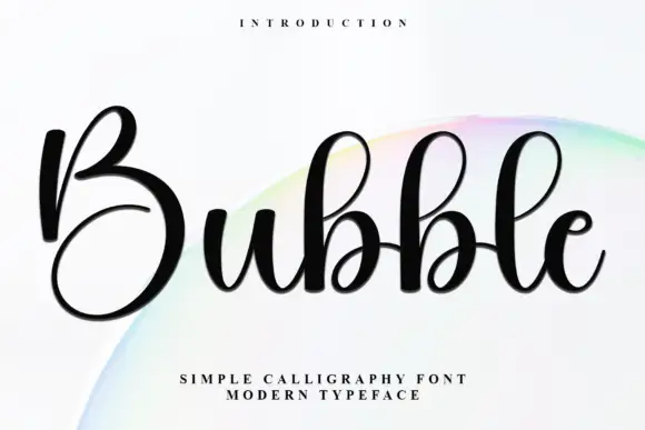
Thick rounded monoline script with ballooned curves
Bubble is a thick rounded monoline script whose curves swell wider than the stems, so the word reads as a chain of balloons rather than as a written line.
Ideas for this font
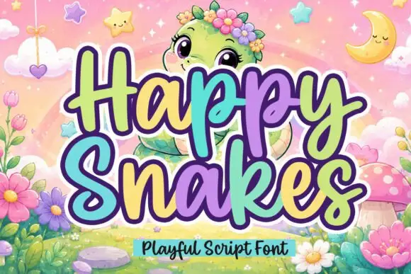
Playful rounded script with chunky loops and heart tittles
Happy Snakes is a chunky playful script with rounded loops, a heavy even weight and small heart tittles, drawn so two stacked words read as a solid friendly block.
Ideas for this font
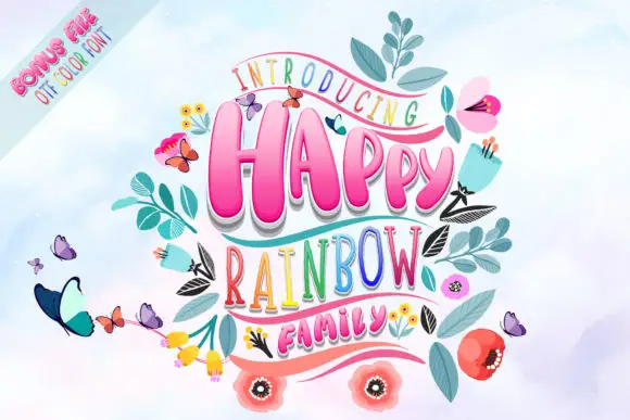
Playful family with contrasting display lettering
Happy Rainbow Family builds a compact three-row stack, where chunky rounded HAPPY and FAMILY carry soft shadows and the tall narrow RAINBOW sits between them in multicolour letters, surrounded by leaves, butterflies, pencils and flowers.
Ideas for this font
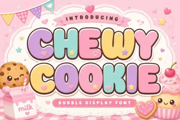
Squat bubble capitals packed tightly with heart accents between letters
Chewy Cookie is a squat bubble capital alphabet packed so tightly that the letters touch, with small hearts scattered into the gaps and a soft outline around the whole phrase.
Ideas for this font
Same independent foundry
Allow optional Google Analytics to measure visits and catalogue actions. Your search words and notes are not included. Privacy & storage



