Editorial Serif Anchor

Bubble Joy + Cronelo
Anchors Bubble Joy's fluid strokes with crisp Roman proportions on wedding suites, headers and packaging.
Inspect Cronelo specimenDisclosure: MakerFileHub may earn a commission from qualifying purchases via paid links on this page. How our links work.
Rounded upright notebook lettering with even strokes and open counters
Bubble Joy is rounded upright lettering in which the letters stand separately, the strokes stay even and the counters open wide, so a phrase reads as something written neatly in a notebook.
Paid link
Get this fontProject & layout blueprintsAt-a-glance maker compatibility
Weld or Unite overlapping script joins into one continuous vector path before sending to the blade.
Visual anatomy & craft review
The capital B closes two round bowls against a thick stem, and the lowercase after it keeps an easy roundness: the u and the b hold even arches, the l and the e stay plain, the j drops a curved tail and the y finishes with a shallow loop. Nothing connects and nothing slants, the weight is a consistent medium with fully rounded ends, and the x-height stays tall, which is what makes the face read almost like a rounded sans at small sizes. Counters open wide enough that a phrase copies cleanly at 12 pt and reads at 70 mm on a board. The spiral notebook ground, the doodles, the pencil and the flower border are presentation; the lettering is the two words.
Rounded · Upright · Notebook
Two-font hierarchy recipes
Tested contrast partners — pairing Bubble Joy with grounded secondary typography.
Bubble Joy + Cronelo
Anchors Bubble Joy's fluid strokes with crisp Roman proportions on wedding suites, headers and packaging.
Inspect Cronelo specimen
Bubble Joy + Lemon Milk Pro FTR
Keeps small-scale dates, URLs, nutrition facts and care instructions crisp and legible below script titles.
Inspect Lemon Milk Pro FTR specimenPractical applications
Concrete hierarchy, scale and production guidance tailored to Bubble Joy’s stroke geometry.
The even rounded hand keeps a worksheet friendly and legible, and the open counters survive photocopying at A4 where a tighter face plugs.
Hierarchy & layout recipe
Set the heading at 22 pt at the head of an A4 page, keep the tasks in a 11 pt sans at 15 pt leading, and hold 8 mm between the heading and the first task line.
Pre-production check
Photocopiers close small counters; check a copy at full size and open the a and e if the ink begins to bridge them.
The rounded upright letters read at a child's eye level and the even weight keeps a printed heading tidy at 60 mm on a board.
Hierarchy & layout recipe
Set the heading at 60 mm tall on a 900 mm classroom board, keep the list beneath in a plain 15 mm sans, and hold 20 mm between the heading and the first item line.
Pre-production check
Cut letters with rounded ends tear at the corners; check the vector at full size and leave a 3 mm arm at each rounded end before cutting.
The friendly weight reads at 12 pt on a round sticker, and the open counters keep a two-word name legible where a script would clot.
Hierarchy & layout recipe
Set the name at 12 pt on a 45 mm round sticker, keep the city in a 5 pt sans beneath it, and leave 5 mm inside the die so the rounded ends stay whole.
Pre-production check
Stickers applied by hand sit slightly off-centre; check a set of five and keep the lettering well inside the die so a tilt does not clip it.
Technical & licence verification
Confirm included OTF/TTF/WOFF formats, full glyph tables and licence coverage on the live store page before batch production.
Closest visual alternatives
Matched across letterform anatomy, stroke behaviour and craft applications.
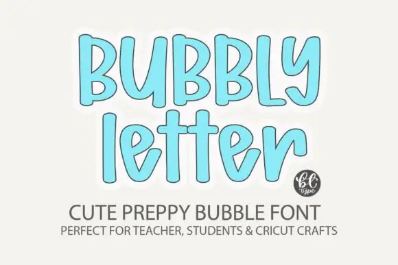
Soft tall bubble letters with narrow rounded strokes
Bubbly Letter shows upright rounded forms with gentle irregularity and long ascenders, where the lowercase e opens an angled inner cut and the y curls inward at its tail.
Ideas for this font
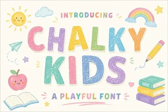
Textured chalk capitals with rounded frames and a broken inner fill
Chalky Kids is a rounded capital alphabet with a chalk texture inside the strokes, drawn so a word looks written on a blackboard rather than printed on paper.
Ideas for this font
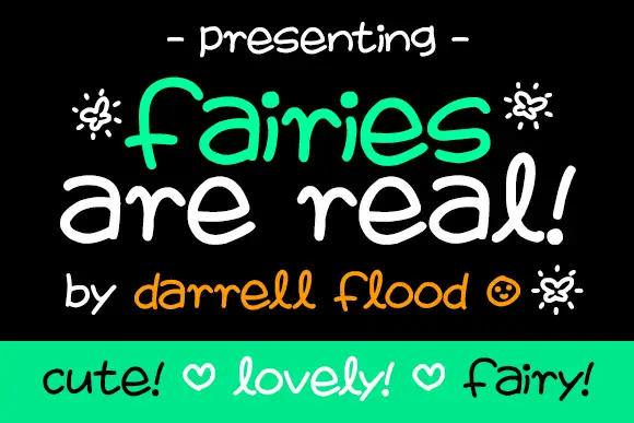
Broad loose marker curves with uneven heights and a bouncing baseline
Fairies Are Real is broad loose marker lettering whose letters stand separately, whose heights vary, and whose baseline bounces, so a phrase reads as something written on a poster in a hurry.
Ideas for this font
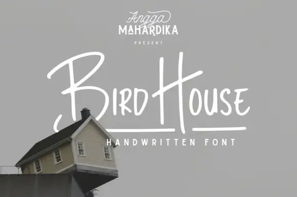
Thin informal marker mixed case with towering capitals and long cross-strokes
Bird House is a thin informal marker hand in which the first capital towers over a narrow lowercase body, the H rises especially high and a long cross-stroke travels across the second word, so a name reads as a quick marker sketch.
Ideas for this font
Same independent foundry
Allow optional Google Analytics to measure visits and catalogue actions. Your search words and notes are not included. Privacy & storage