Editorial Serif Anchor

Fairies Are Real + Auretha
Anchors Fairies Are Real's fluid strokes with crisp Roman proportions on wedding suites, headers and packaging.
Inspect Auretha specimenDisclosure: MakerFileHub may earn a commission from qualifying purchases via paid links on this page. How our links work.
Broad loose marker curves with uneven heights and a bouncing baseline
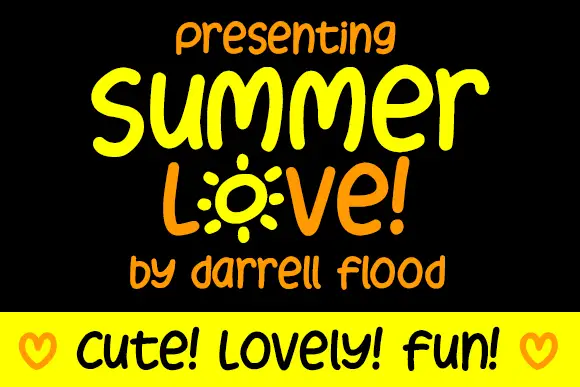
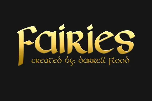
Fairies Are Real is broad loose marker lettering whose letters stand separately, whose heights vary, and whose baseline bounces, so a phrase reads as something written on a poster in a hurry.
Paid link
Get this fontProject & layout blueprintsAt-a-glance maker compatibility
Weld or Unite overlapping script joins into one continuous vector path before sending to the blade.
Visual anatomy & craft review
Nothing connects. Each letter is drawn with a broad round-tipped marker: the f carries a long crossbar and a curved top, the a keeps a round single-storey bowl, the r has a short arm, the i is a stem with a dot set high and the e closes into a loose spiral. The letters vary in height within the same word, which is what produces the bouncing line, and the weight stays broad and even throughout, so the phrase holds up at a distance despite the irregularity. Terminals are rounded, the counters are open and there is no contrast at all. Two colour inks appear in the sample but the letterforms carry the character on their own. The green band, the small doodles and the black ground are presentation; the lettering is the phrase.
Broad · Loose · Marker-like
Two-font hierarchy recipes
Tested contrast partners — pairing Fairies Are Real with grounded secondary typography.
Fairies Are Real + Auretha
Anchors Fairies Are Real's fluid strokes with crisp Roman proportions on wedding suites, headers and packaging.
Inspect Auretha specimen
Fairies Are Real + Godthem
Keeps small-scale dates, URLs, nutrition facts and care instructions crisp and legible below script titles.
Inspect Godthem specimenPractical applications
Concrete hierarchy, scale and production guidance tailored to Fairies Are Real’s stroke geometry.
Broad marker letters read across a hall and look as if a teacher wrote them, which is the tone a school poster wants, and the separate letters are easy for young readers to follow.
Hierarchy & layout recipe
Set the headline at 72 pt on an A2 poster, set the week's programme in a plain 14 pt sans, and hold 25 mm between the headline and the first line of the programme.
Pre-production check
School printers thin a broad marker stroke unevenly; print one copy on the classroom machine and confirm the open counters of the a and e are still clear.
The loose marker letters read at a distance and give a themed party a hand-made banner rather than a printed template, and the bouncing line fills a wide sheet.
Hierarchy & layout recipe
Set the greeting at 80 mm tall on a 1.2 m banner, set the name at 50 mm beneath it, and leave 35 mm at each end so the broad terminals stay inside the hem.
Pre-production check
Fabric printing rounds the marker edges slightly; check the proof at final size and confirm the counters do not close at 80 mm.
Broad marker shapes cut cleanly from card and hold up against a lit cake, and the separate letters make a short name easy to read at topper size.
Hierarchy & layout recipe
Set the name at 45 mm tall on a 120 mm topper, keep the age in the same face at 25 mm, and leave 5 mm of material around each letter so the card does not tear.
Pre-production check
Card toppers tear at the poke hole; check the vector against the hole position and move the shortest letter away from it before cutting.
Technical & licence verification
Confirm included OTF/TTF/WOFF formats, full glyph tables and licence coverage on the live store page before batch production.
Closest visual alternatives
Matched across letterform anatomy, stroke behaviour and craft applications.
Angular playful capitals with long horizontal extensions
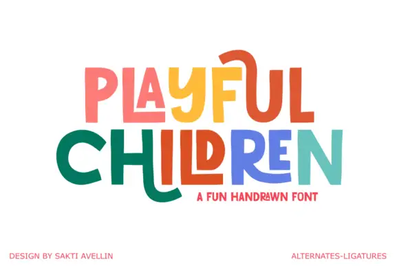
Playful Children is a hand-drawn capital alphabet in which the letters are angular, the arms run long and some strokes extend past the letter body, so a word reads as something drawn with a ruler-free marker.
Ideas for this font
Textured chalk capitals with rounded frames and a broken inner fill
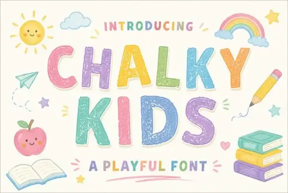
Chalky Kids is a rounded capital alphabet with a chalk texture inside the strokes, drawn so a word looks written on a blackboard rather than printed on paper.
Ideas for this font
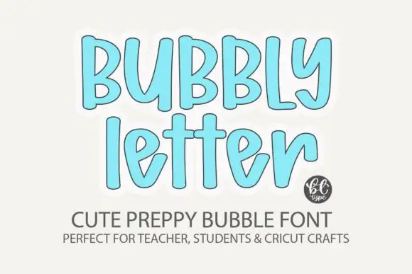
Soft tall bubble letters with narrow rounded strokes
Bubbly Letter shows upright rounded forms with gentle irregularity and long ascenders, where the lowercase e opens an angled inner cut and the y curls inward at its tail.
Ideas for this font
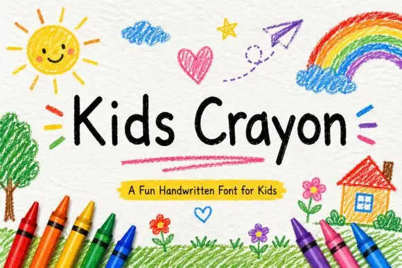
Rounded separate handwriting with uneven letter heights and soft terminals
Kids Crayon is rounded handwriting in which the letters stand separately, the heights drift a little and the strokes end softly, so a phrase reads as something written by a child rather than drawn for one.
Ideas for this font
Same independent foundry
Allow optional Google Analytics to measure visits and catalogue actions. Your search words and notes are not included. Privacy & storage