Modern Grotesque Body

Bohemian Struggle + Modern Limited
Creates crisp high-hierarchy contrast beneath Bohemian Struggle headlines across menus, websites and labels.
Inspect Modern Limited specimenDisclosure: MakerFileHub may earn a commission from qualifying purchases via paid links on this page. How our links work.
Soft chunky retro letters with uneven serifs and rounded bowls
Bohemian Struggle is a soft chunky face in which the bowls are round, the serifs sit unevenly and the strokes stay heavy, so a word reads as lettering drawn on a sixties shop poster.
Paid link
Get this fontProject & layout blueprintsAt-a-glance maker compatibility
Sturdy stroke walls and open counters weed cleanly on adhesive vinyl, HTV apparel film, and cut cardstock.
Visual anatomy & craft review
The B closes two plump bowls with uneven feet, the o holds a round counter, the h keeps a soft shoulder, the e loops back and the m carries three even arches, all at a heavy weight with a low contrast and serifs that differ in size from letter to letter. That unevenness is the character: it keeps the face from reading as a mechanical slab at 40 pt and gives it the look of drawn lettering. Because the strokes are generous, the face holds at 18 pt on a card and at 60 mm on a bag. The maroon ground, the cream ink, the rounded frame and the two caption lines are presentation; the display face is the two words.
Retro · Chunky · Soft
Two-font hierarchy recipes
Tested contrast partners — pairing Bohemian Struggle with grounded secondary typography.
Bohemian Struggle + Modern Limited
Creates crisp high-hierarchy contrast beneath Bohemian Struggle headlines across menus, websites and labels.
Inspect Modern Limited specimen
Bohemian Struggle + Handmade Calligraphy
Adds a warm human signature touch for 1-to-3-word callouts without competing against structured serif capitals.
Inspect Handmade Calligraphy specimenPractical applications
Concrete hierarchy, scale and production guidance tailored to Bohemian Struggle’s stroke geometry.
The soft chunky letters read at 12 cm on a printed or painted sign, and the uneven serifs give a small café a period character at a distance.
Hierarchy & layout recipe
Print a 700 by 350 mm panel: set the café name at 12 cm across the upper half, set the hours in a 4 cm sans below, and keep 8 cm of border so the uneven feet stay clear of the frame.
Pre-production check
A painted version of an uneven serif doubles the variation; check one letter at full size and keep the drawing from the print rather than redrawing freehand.
The soft weight reads on a kraft label at 13 pt, and the rounded bowls give a plain bakery product the period shop feel of a printed wrapper.
Hierarchy & layout recipe
Print a 60 by 45 mm kraft label: set the product at 13 pt, set the weight in a 5 pt caps serif beneath, and keep 5 mm of margin so the round bowls are not cut by the label corner.
Pre-production check
Kraft flattens a low-contrast face into a stamp; check a printed label on the actual stock and keep the face above 12 pt.
The chunky strokes screen-print as a single shape at 50 mm, and the uneven serifs read on coarse canvas where a fine serif would sink in.
Hierarchy & layout recipe
Screen a 380 by 420 mm tote: print the word at 50 mm through a 110-thread mesh, keep the uneven feet at 2 mm minimum, and stay 40 mm below the handle seam so the print does not distort in the press.
Pre-production check
A coarse weave rounds the uneven feet into a uniform line; check a pull on the actual bag and keep the size above 45 mm.
Technical & licence verification
Confirm included OTF/TTF/WOFF formats, full glyph tables and licence coverage on the live store page before batch production.
Closest visual alternatives
Matched across letterform anatomy, stroke behaviour and craft applications.
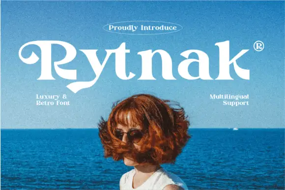
Heavy retro serif
Rytnak is a heavy retro serif in white over a photograph of a figure against a blue sea: fat stems, a hooked R, a pointed y tail and wide bowls, set as one word with a tracked line above in an oval rule and two small notes at the sides.
Ideas for this font
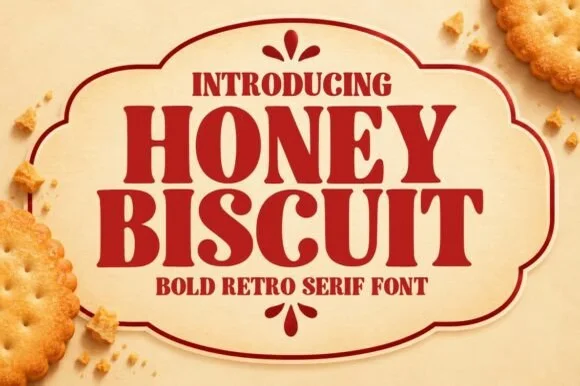
Bold retro serif with heavy bracketed slabs and narrow counters
Honey Biscuit is a bold retro serif in which the bracketed slabs are heavy, the stems are fat and the counters pinch narrow, so a word reads like a printed biscuit tin rather than a book title.
Ideas for this font
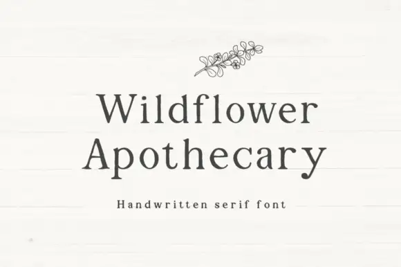
Handwritten serif with slight irregularity
Wildflower Apothecary is a handwritten serif in charcoal on a white board: serif letterforms drawn by hand with a slight wobble, a moderate contrast and open counters, with a fine line drawing of a wildflower sprig above the words.
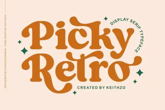
Curved retro serifs with extended terminals
Picky Retro is a chunky retro display serif in burnt orange: fat bracketed strokes, curved serifs that drop below the baseline, and long ball terminals that turn the P and the R into flourishes.
Ideas for this font
Same independent foundry
Allow optional Google Analytics to measure visits and catalogue actions. Your search words and notes are not included. Privacy & storage